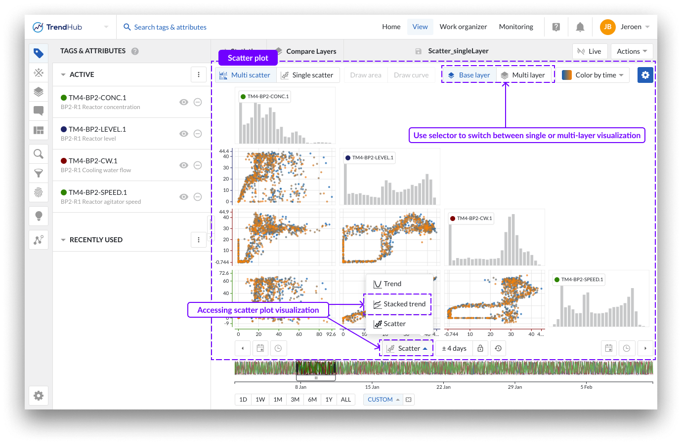
The scatter plot
The visualization mode in this article is focused on "Scatter" visualization. This mode can be selected by clicking the focus chart visualization mode button option below the chart. A multi scatter grid will be opened, where each row and column is assigned to one of the visualized tags or attributes. Each single plot shows the pairwise relationships between two tags or attributes which can help identify operational regimes.
By default, the scatter plot will open as a multi-scatter visualization (i.e. multiple tags), only showing the base layer. Use the buttons at the top right to switch to a multi-layer visualization.
Note
In the multi-scatter grid, each individual plot is restricted to a maximum of 1,000 data points. However, when only a single scatter is visualized, the number of points can increase to as many as 200.000, depending on the length of the visualized period.
In single-layer mode, scatter plots display data exclusively from the base layer. You can visualize pairwise relationships between up to 15 different tags or attributes simultaneously, along with the distribution of each individual tag or attribute within the selected time window.
Coloring of data points
There are three options for coloring data points in scatter plots:
No coloring
Coloring by time (default)
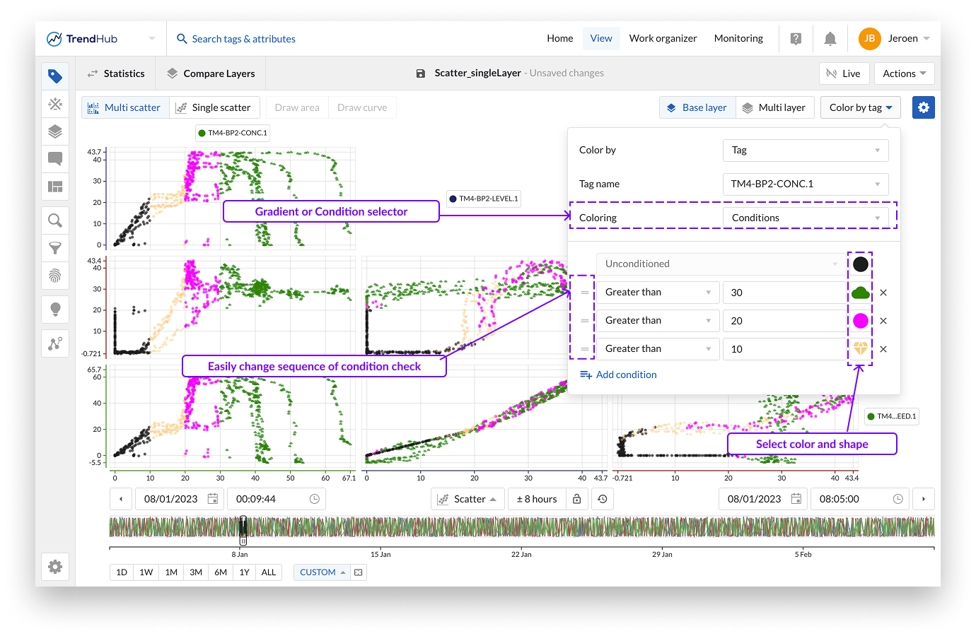
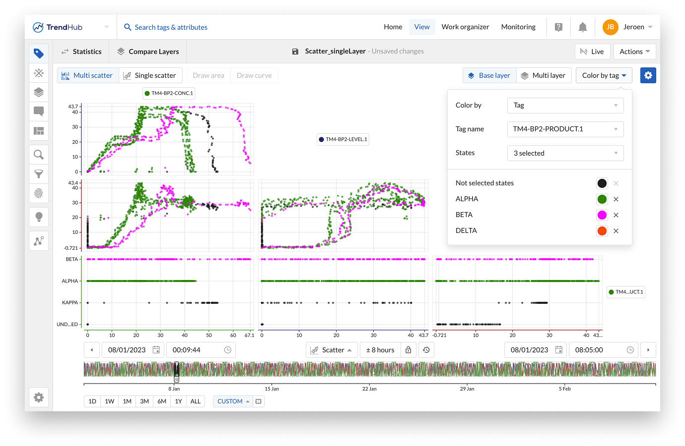
Coloring by tag
By default, data points are colored based on time, transitioning from blue to orange—representing the shift from the oldest to the most recent data points in the selected period.
When coloring by tag, you can select any of the visualized tags to color the scatter plot based on its values.
For analog and discrete tags, you can choose:
Gradient coloring
Condition-based coloring (ideal for creating color categories based on numerical conditions)
If a condition is met, the corresponding color is applied. You can add multiple conditions, and only the first matching condition is used. The first option is always Unconditioned, which means its color is applied by default or when no other conditions are met. Use the icons in front of the condition to easily reorder the conditions and assess the affect.
For digital or string tags, you can select up to 10 states to assign unique colors.
Additionally, when using conditions or digital/string states, you can assign distinct markers to each condition or state for enhanced visual differentiation.
Note
When coloring by tag, TrendMiner projects a 3D representation onto a 2D plane. Since the data is down sampled to 1,000 points in the multi-scatter grid, the visualized data points may vary depending on the selected coloring tag.
Additional formatting options
Additional formatting options can be accessed via the blue settings button located at the top right of the Focus Chart. For the single layer scatter, plot the following options can be enabled or disabled:
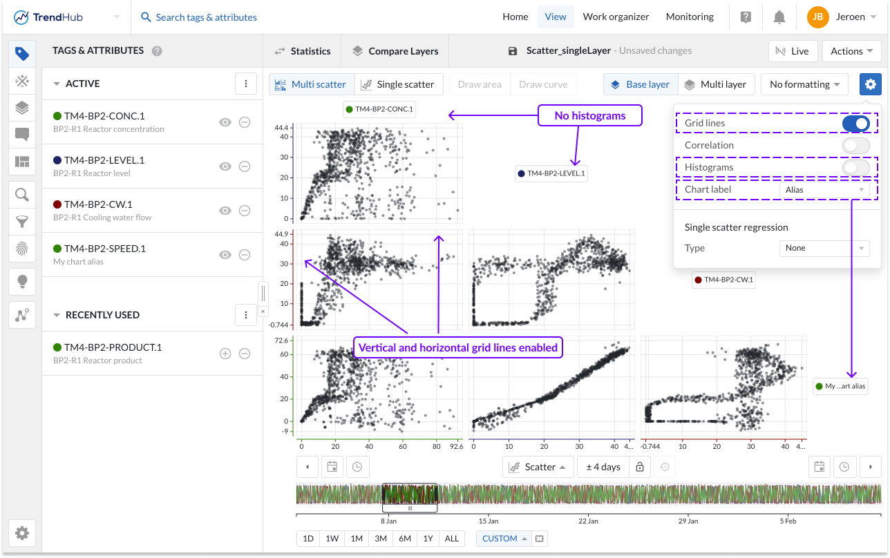
Gridlines: Once the "Gridlines" option is enabled, gridlines appear on the single scatter charts, making it easier to read values on the chart.
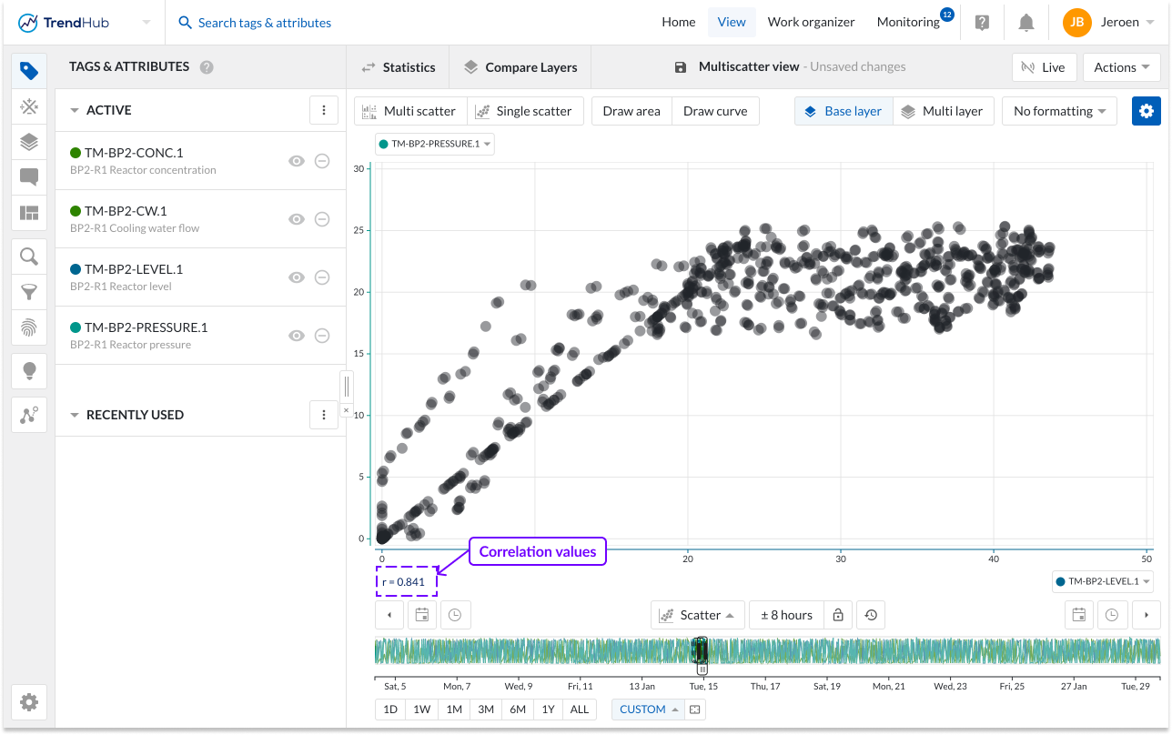
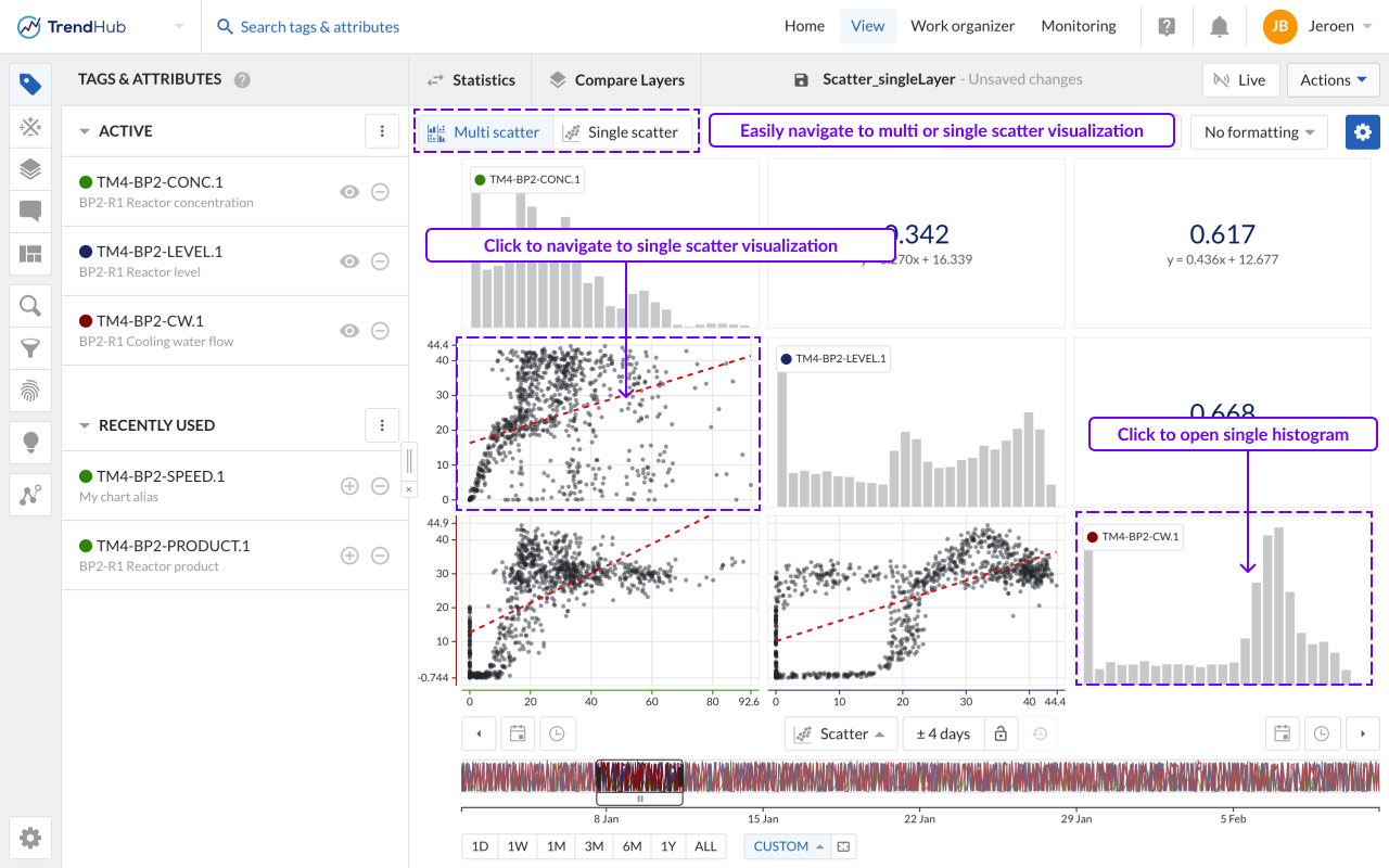
Correlation: When the option "Correlation" is enabled, additional tiles are displayed. These tiles represent the correlation coefficient together with its equation value for a specific scatter plot.
You can easily see which correlation tile is linked to which scatter plot by hovering over the tiles. The two linked tiles will be highlighted with a blue border.
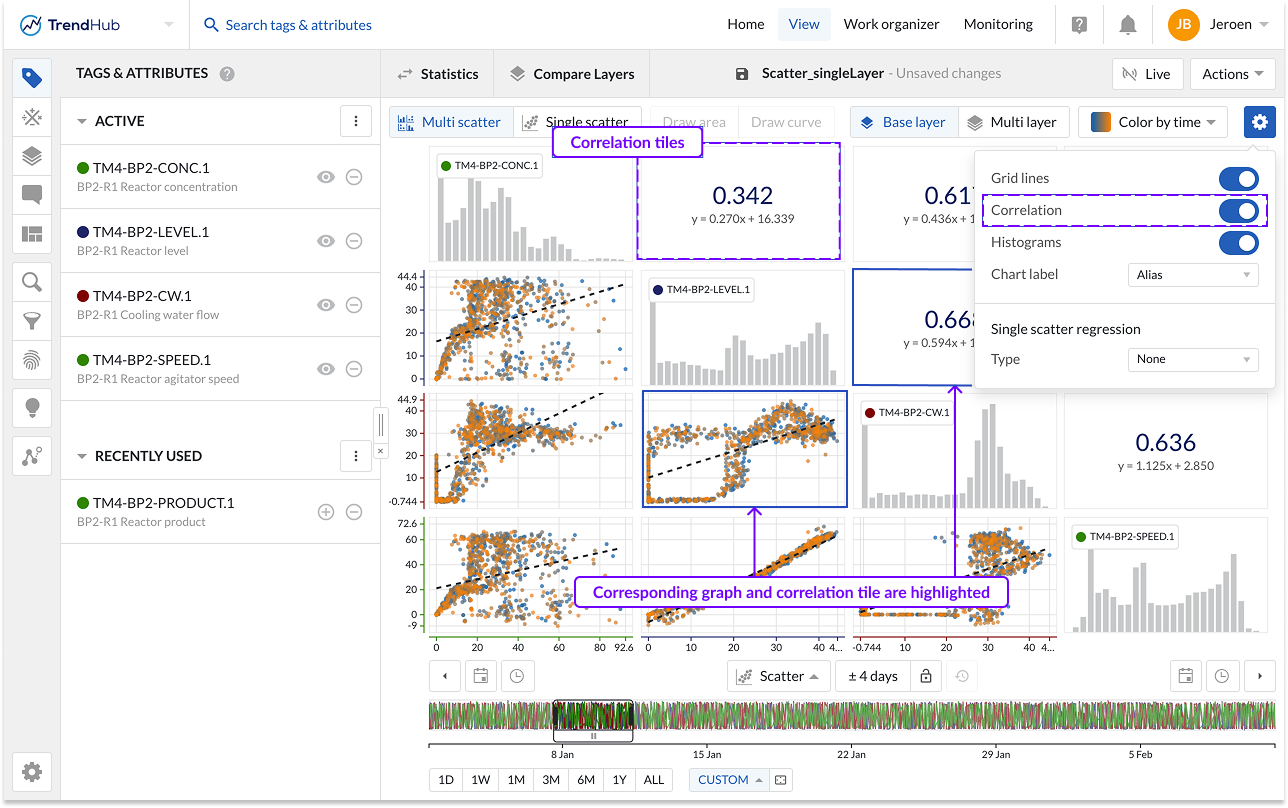
When a single scatter plot without histograms is visualized, the correlation tile is not shown. Instead, you can see the correlation coefficient on the left below the chart.
Show Histograms: The "Show histograms" option can show or hide the histograms. The histogram plots represent an approximate distribution, in bins, of the numerical data of the visualized tags or attributes.
Chart Label: Specify how tags or attributes should be visualized on the scatter chart. The chart alias is selected by default. In case no alias is set, the tag name will be used as fallback mechanism.
Single Scatter Regression: Specify the regression type to be used. See the section about available actions on a single-scatter plot for more details.
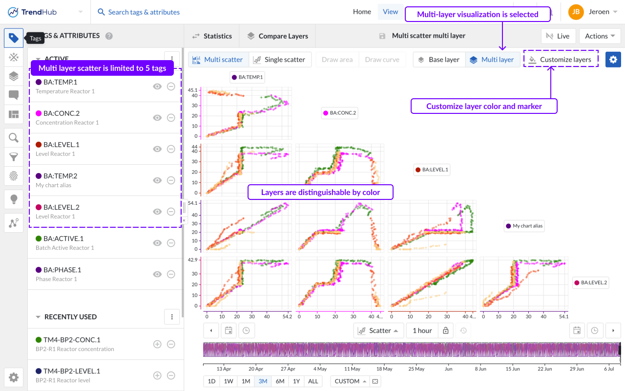
The multi-layer visualization allows users to visualize the data of all available layers at once. This visualization can only be accessed when at least 2 visible layers are present. A call to action will be shown when only the base layer is visualized. Up to 20 layers can be visualized. The number of tags or attributes is limited to 5 when entering the multi-layer visualization. When more than 5 tags are set as visible in the Tags & Attributes menu, the first 5 will be displayed. The chart labels can be clicked to easily change the visualized tag.
Note
In the multi-layer visualization, only 5 tags can be visualized at once.
Note
Similar to layers on the trend chart, all layers span the complete length of the base layer, even though they might be originating from search results which do not have the same duration.
Coloring of the data points
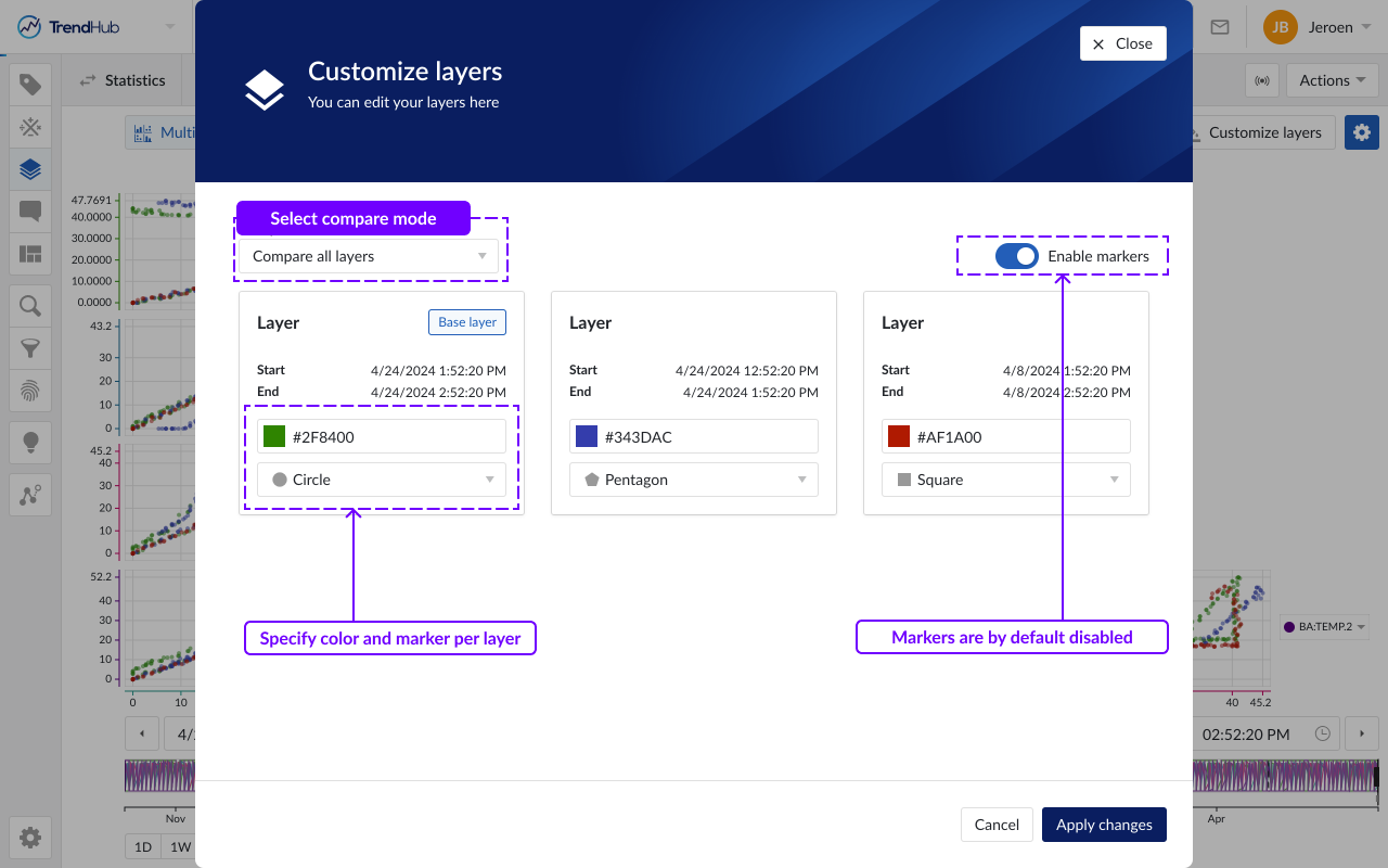
In the multi-layer visualization, data points belonging to one layer will have the same color. The customize layers button opens a popup. which allows you to define how all sublayers, will be compared to the base layer.
Compare all layers (default option)
One color can be assigned to every single layer.
Base vs the rest
Two colors can be defined: one for the base layer and one for the other sublayers.
In the 'Compare all layers' option, one color can be assigned to every single layer. For each layer, the visualized period of the layer is shown, as well as the layer’s name. By assigning the same color to periods representing the same ‘good’ or ‘bad’ behavior, this feature can be used to define deviating patterns between both behaviors.
In the Base vs the rest option, all sublayers will be visualized with the same color. This can, for example, be used to verify if the base layer’s behavior is deviating from other layers representing ‘good’ behavior.
Initial colors are automatically assigned based on a predefined set. When assigning custom colors to visible layers, these settings will be remembered in the current session.
By default, all data points are visualized as dots. To enhance the visual distinction of layers, the 'Enable markers' toggle can be activated, which will assign a unique marker to each layer.
Tip
You can change the name of a layer in the layers menu or via the compare table. Providing meaningful names will help you to easily identify layers when customizing their appearance in the scatter plot.
Additional formatting options
Additional formatting options can be accessed via the blue settings button located at the top right of the Focus Chart. For the multi layer scatter, plot the following options can be enabled or disabled:
Gridlines: Once the "Gridlines" option is enabled, gridlines appear on the single scatter charts, making it easier to read values on the chart.
Chart Label: Specify how tags or attributes should be visualized on the scatter chart. The chart alias is selected by default. In case no alias is set, the tag name will be used as the fallback mechanism.
When enabling or disabling options in the blue gear icon, these personal settings will be stored and reused in your next TrendHub session.
Formatting configurations are saved with a view and take precedence over the personal settings. This means that when you, or a colleague opens one of your (shared) views, the chart settings of the saved view will be enabled, and not the most recently stored personal setting.
Multiple levels of visualization are possible in both scatter plot visualizations. Depending on the number of visible tags or attributes, some 'levels' can be blocked and are not accessible until more data references are added.
Navigating through the levels can be done by clicking the plots themselves or using the available buttons called "Multi scatter" and "Single scatter" situated at the top left of the charting area.
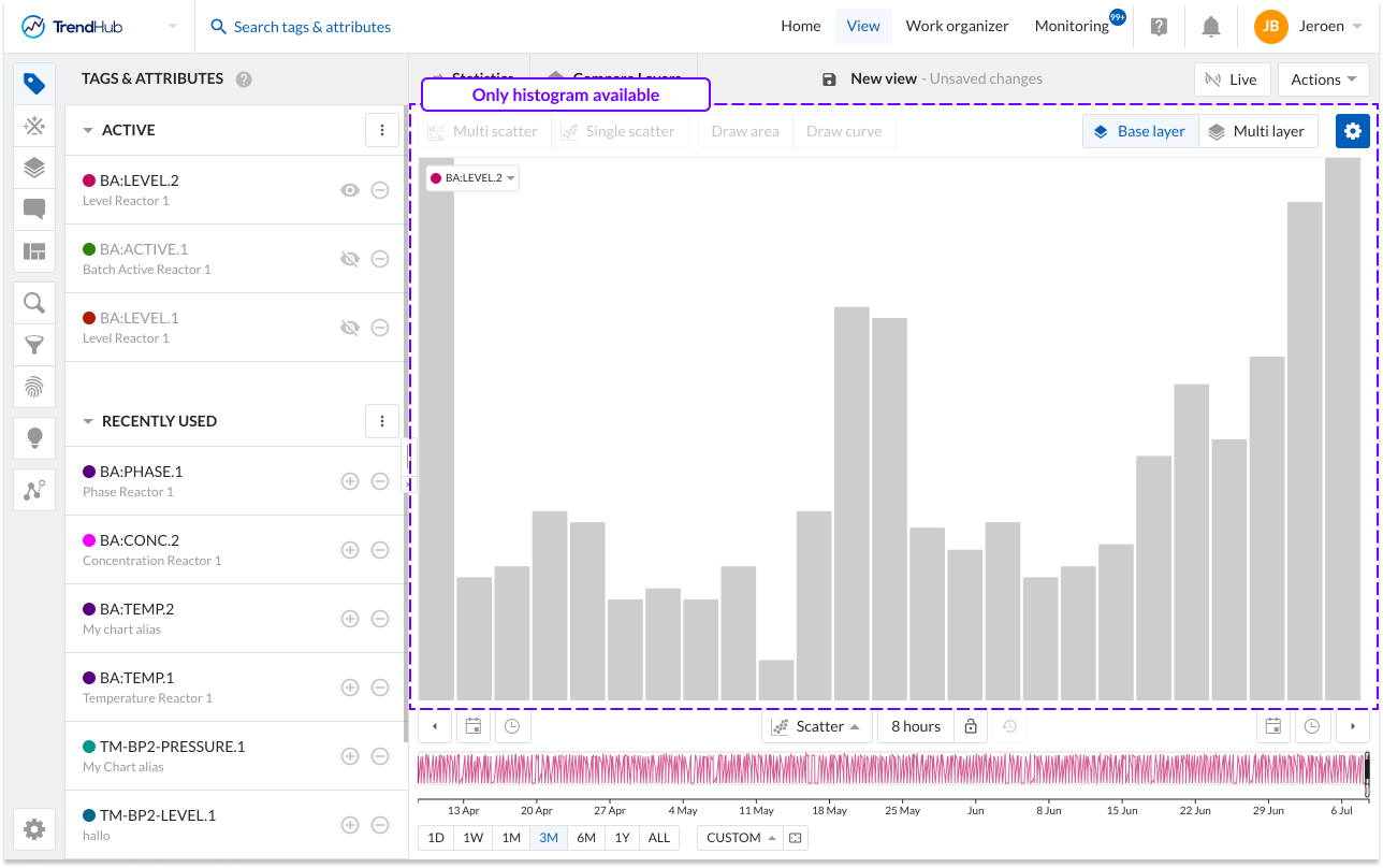
Single histogram plot: When there is only one visible tag or attribute present a histogram is visualized (Not applicable to the multi-layer visualization). In case the histogram selection is disabled, a call to action will be shown. Hovering over the bins of the histogram will reveal the specific bin ranges.
In the following example, only a histogram can be visualized, and both navigation buttons are disabled.
Single scatter plot: When the scatter plot is selected with two visible tags and/or attributes, a single scatter plot is visualized.
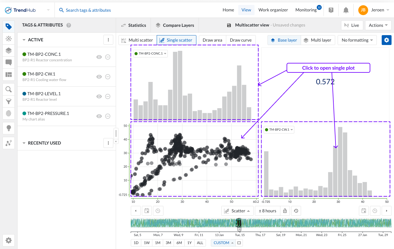
When histograms are enabled, a clickthrough is possible on the scatter plot and the histogram. Returning to the single scatter plot with both histograms is achieved by clicking the navigation button "Single scatter" (Not applicable to the multi-layer visualization).
Multi Scatter plot: With two or more visible tags and/or attributes, a switch to scatter plot will visualize a multi scatter grid containing multiple scatter plots. As an indication, the 'Multi scatter' navigation button is highlighted when the multi-level is shown.
In this overview:
Clicking on a histogram, navigates to a single histogram plot of the corresponding tag or attribute (Not applicable to the multi-layer visualization)
Clicking on a scatter plot navigates to a single scatter plot with both corresponding tags or attributes. On this level you can again navigate one level deeper into a single histogram or maximize the scatter plot.
Returning to the other overviews (single or multi-level) is possible by clicking on any of the navigation buttons.
Note
A tool tip will be displayed when hovering on a disabled button, to indicate the required actions needed to unlock that button.
The single scatter plot operates distinctly from the multi-scatter grid, offering specific actions that are exclusively available in this visualization mode.
Number of data points
The multi-grid view is excellent for assessing correlations across multiple tags simultaneously, while the single scatter plot provides a more detailed evaluation of specific pairwise relationships.
In the multi-grid view, the number of data points is capped at 1,000 per individual plot. However, when you zoom into a specific single scatter plot, you can visualize more data points depending on the duration of the visualized period and the involved tags. In case only analog or discrete tags are involved, the scatter plot can show up to 200,000 points. In case digital or strings tags are used (as variables or as color by tag), the scatter plot can show up to 50,000 points.
When adding multiple layers, the maximum of 200,000 data points is distributed among the different layers. Therefore, if you visualize four layers on a single scatter plot, the maximum number of points per layer can reach up to 50,000.
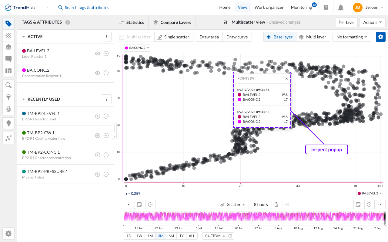
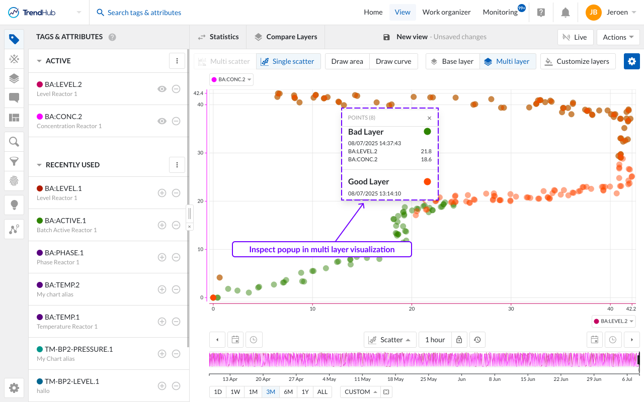
Inspecting values
When you zoom in on a single scatter visualization, you can easily access the precise details of each data point by hovering over the values. This action triggers a popup that displays the values of both data references (tags and attributes) along with the timestamp of the occurrence. If multiple layers are visualized, the popup will also show the layer name, color, and marker.
In instances where data points overlap, the popup will present a list of all data points within that specific area. Additionally, you can lock the popup in place by clicking on the chart.
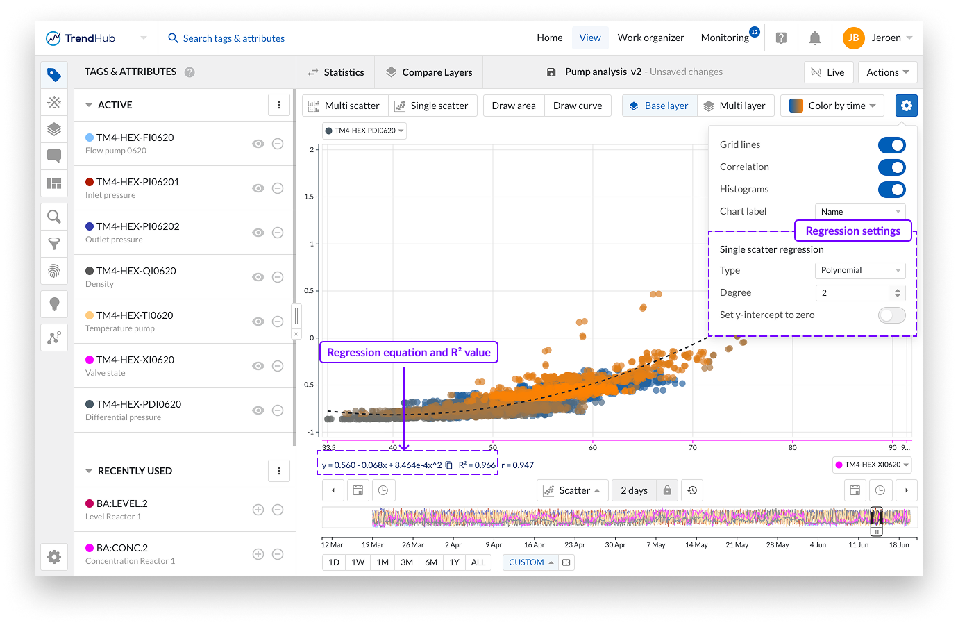
Adjusting the Regression Type
When working with a single scatter plot, you have the flexibility to adjust the plotted regression line. The available options include:
None: No regression line will be displayed.
Linear
Logarithmic
Polynomial (Degree 2 to 6)
Exponential
Power
Additionally, there is an option to force the intercept through 0 or 1, if applicable.
The resulting equation, along with the R² value, will be displayed beneath the single scatter plot or within the correlation tile, depending on whether the histograms are enabled or disabled.
Certain types of regression do not accommodate negative values for either the predictor or the response variable. In such instances, if negative values are identified, they will be excluded from the analysis, and the regression will be computed solely on supported values.
Note
The various types of regressions are only applicable to a single scatter, single layer visualization.
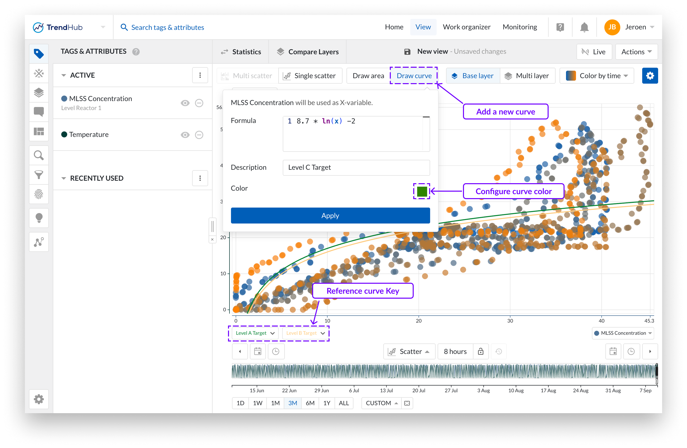
Drawing a reference curve
Users frequently want to compare the behavior of a process or piece of equipment against a reference, which can be mathematically defined. This equation may be provided by your equipment supplier, derived empirically.
In a single scatter plot, you can add reference lines by clicking the "Draw curve" button. From the dropdown menu, you can specify the equation, provide a description, and choose the color of the reference line. The equation should be defined using 'X' as the variable.
The legend for the reference line will appear below the graph or in the correlation tile, utilizing the curve description provided. You can add up to five reference lines simultaneously.
Reference lines are linked to the visualized X-variable. If you change the visualized variables, the reference lines will be removed.
Editor Errors
When drawing a curve all, errors are all captured under the statement. “Syntax Error.” The most common culprits of this error message are:
Missing or mismatched parentheses: Expressions require correct pairing of parentheses to define scope and precedence.
Incorrect use of math functions: For example, the
powfunction expects two parameters (e.g.pow(2, 4)), and using the wrong number of arguments will result in a syntax error — e.g.pow(2)orpow(2,4,6)will throw an error.Unsupported keywords: Before parsing, we check for the presence of unsupported keywords. If a word is used that is not in the list of supported functions, an error will be thrown. Supported keywords:
floor, log10, acos, atan, cbrt, ceil, cosh, log2, sinh, sqrt, tanh, abs, cos, exp, log, sin, tan, pow, max, min, ln, PI, RInvalid variable usage: Only
xorXare allowed as variables. Using any other variable name will also result in a syntax error
Note
Decimals must be entered using a point (.) as the separator, while the comma (,) is reserved for built-in mathematical functions.
Note
When you save a view as a single-scatter visualization, the selected regression and the drawn regression lines will be included as part of that view.
Drawing an area
The 'Draw area' button gives you the ability to create, update or remove an area on a single scatter plot (with or without histograms), as long as the draw option is enabled (highlighted in blue). A drawn area is required when performing an operating area search.
Create an area by clicking anywhere on the single scatter plot. After the first click you will see a blue dot appearing, this dot (or corner) is connected to your mouse pointer with a line. The following clicks will place a new dot that interconnects with the previous dot and starts to form the area. To complete the drawn area, a double click is required. This will place a final dot and connects the first placed dot with the final dot.
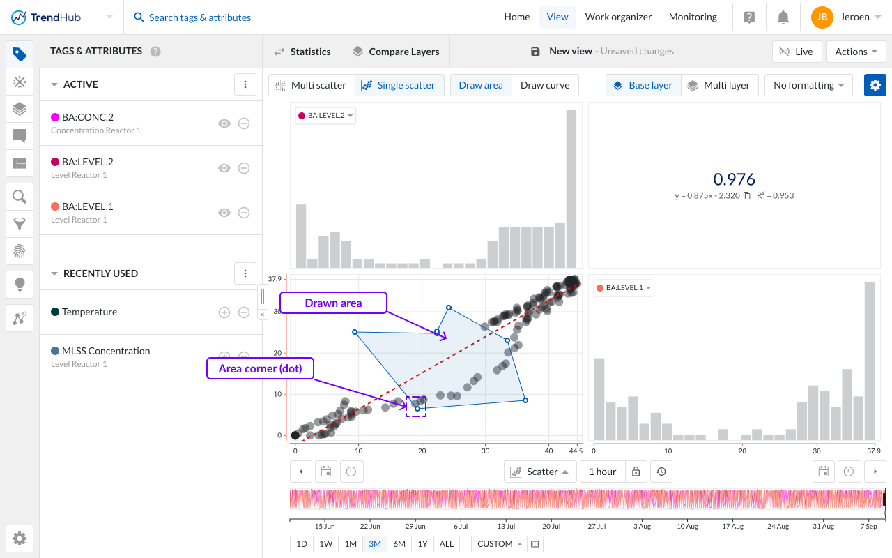
An area can easily be adjusted by dragging the corners of the area. While doing this, the dot (corner) will immediately move along and update the area. Once dropped, the area update is completed.
The area can also be moved to a better fitting location or for fine-tuning. This is done by clicking somewhere on the drawn area and moving it over to the desired location.
As a final option, you can remove the drawn area and start creating a new one. This is done by hovering over the drawn area which reveals a popup with a remove option.
Note
The draw mode can only be enabled when visualizing a single scatter plot and only one area can be drawn.
Tag selection - All - or the first 5 when using the multi layer view - visualized tags are displayed in the multi scatter plot. The order of the charts matches the order of tags in the Active Tag List. To change the chart order, simply rearrange the tags in the Active Tag List.
In a single scatter view, you can select a different tag directly from the chart by clicking the tag label. A dropdown will appear, showing all currently visualized tags for easy selection.
Time Navigation - The buttons underneath the focus chart remain fully functional in the scatter plot mode and can be used to modify the visualized time range. Read the time navigation article to learn more.