Focus Chart
Navigation and chart settings
TrendMiner's easy to use time navigation will help you move quickly through all your data that is being visualized, to find trends that help you define a problem or to confirm a hypothesis.
Data is visualized on the Focus chart and the Context chart. The Context chart sets the scene and defines the data on which specific searches and filters will be applied. The Focus chart represents the biggest part of the application and shows the time series data for the period of interest. Both levels can be used to navigate in time.
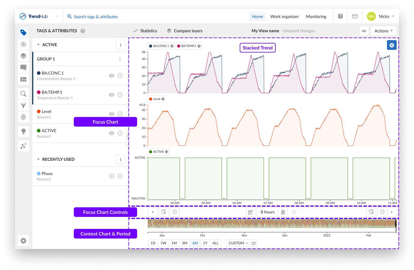
The focus chart itself offers various controls for time navigation.
Chart zooming (in and out) can be done in scroll fashion with your mouse or touchpad.
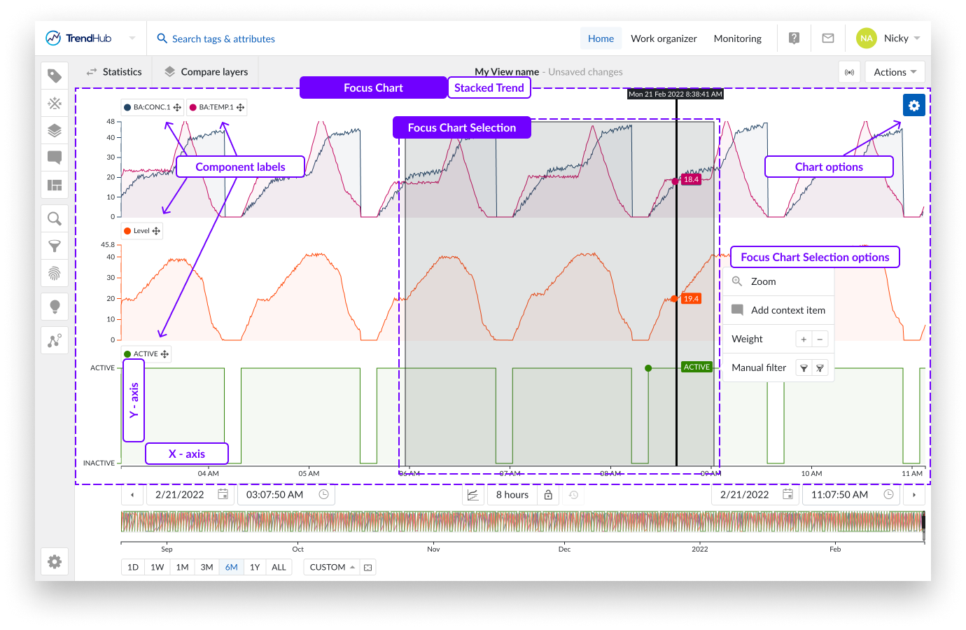
You can also zoom in on the chart when a selection is created on the focus plot. This is done by a click and drag action on the focus chart, creating a greyed selection. By doing this you are highlighting your interest in the period. When the area is selected, a selection menu appears including a zoom option.
Note
The selection's options popup list hides after a brief moment in time when the mouse pointer leaves the selection or the options popup. Hovering over the selected area, visualizes the options popup again.
Panning is another way to quickly move through time or to increase the current time period. This is done using drag and drop functionality added to the time axis.
Depending on the state of the lock (Focus chart controls) the behavior is different.
Closed lock
The whole period is moving to the left or right (period stays fixed).
Moving to the right shows older data.
Moving to the left shows newer data.
Open lock
The period gets bigger, loading more content on one side.
Moving the axis to the right adds older data to the focus chart, the end date stays fixed.
Moving the axis to the left adds future data to the focus chart, the start date stays fixed.
Note
Note: The default value of the lock button is set to unlocked.
Below the focus chart there are options which give you the ability to move through the time on the focus plot.
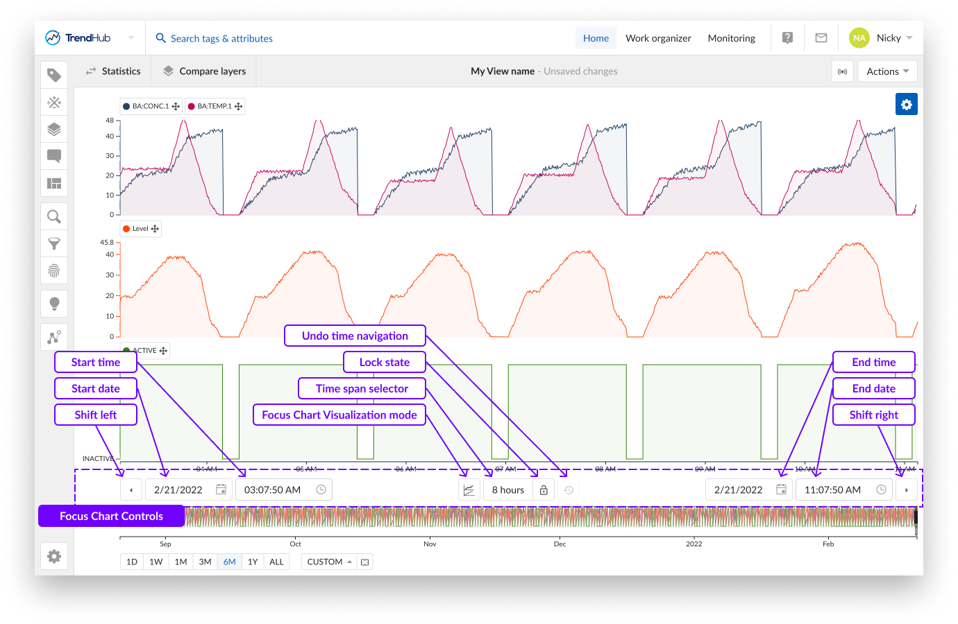
The shift buttons (arrow buttons), the leftmost and rightmost buttons will shift the focus chart into their respective directions. The response here depends on the state of the lock button, mentioned earlier.
When the button is unlocked, both buttons will add 20% of the current window size to the period. When the lock button is locked, the buttons will move the chart to the left or right, by 20%.
Next to the shift buttons on the left and right, you will find the date and time pickers. Use these buttons to select the start and end time of the focus chart.
Between the date and time pickers you have further options. The focus chart visualization mode button provides a list of available chart visualizations. The options here include:
Trend: Trend line visualization for all tags and attributes in one swim lane.
Stacked trend: Trend line visualization with an individual swim lane per tag or attribute.
Scatter: (Multi) scatter plot visualization.
Note
More information about the charting visualization modes can be found here.
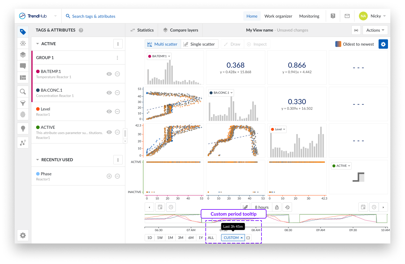
To the left of the focus chart visualization button, sits the time span selection option. By selecting the time span picker, you open an option to apply preset time frames to the focus chart, enabling a quick and effortless way to frame the time span you wish to analyze.
The start time is updated when using this option, but the end date remains the same.
The following time frames are included: 1 - 2 - 8 hour(s), 1 - 7 - 30 day(s) or the possibility to enter specific time periods.
With the custom time period you can select the exact period you wish to see displayed on the focus plot. To input a period simply use y for year, M for month, w for week, d for day, h for hour, m for minute and s for second.
E.g.: for a period of 1 week, 2 hours, 2 minutes, and 10 seconds, simply input the following:
1w 2h 2m 10s, then press enter.
Once you press enter, the focus chart expands or contracts to the period you requested.
Note
Clicking on the lock icon in unlocked mode will lock the current selected time span, as opposed to the predefined time span.
The lock button itself is located to the right of the time span selection button.
The final chart control button, is the undo time navigation button, located to the right of the lock button. This option is by default disabled but can restore any functional change to your current view regarding the previous state of the date and time settings, thereby undoing any time navigation action.
Note
When you load a new view, enable predictive mode, or enable a live mode view, the undo time navigation button is reset.
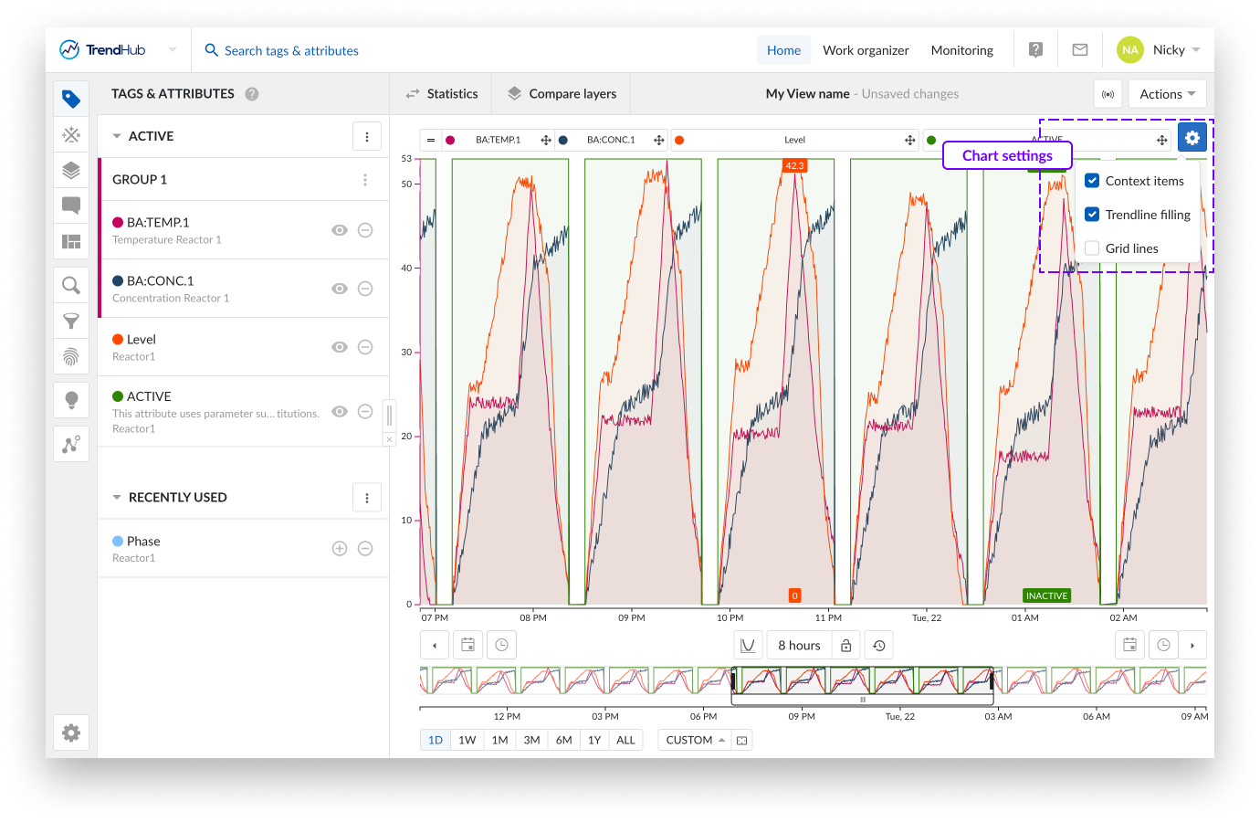
Located at the top right of the focus chart, you will find the settings button of the focus chart.
Per chart there are a couple of settings available to fine-tune the chart to your liking. For the 'Trend' and 'Stacked trend' chart, the following settings are available:
Context items: displays context items.
Trendline filling: fills the area under the trendlines.
Gridlines: enables grid lines on the chart.
For the 'Scatter' chart the following settings are available:
Colored points: Data points are given a color going from blue to orange which indicates the transition from the oldest to newest points in time.
Correlation: Shows the correlation coefficient together with its equation value.
Grid lines: Enables grid lines on the chart(s).
Show histograms: Visualizes histograms on the different scatter plot levels.
More details about the chart visualizations and their options can be found on this link.
The context chart shows an overview of the relevant data to examine (applicable on searches and filters). Below the chart you will find tools that can help you set your context chart, and also help you understand the link between the context and focus chart.
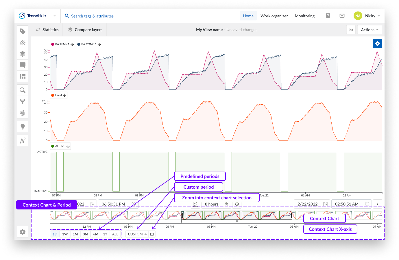
The context period is the period that is visualized in the context chart and is the period that is used when performing searches or activating filters in TrendHub.
There are multiple ways to change the context period.
Note
Each update with these buttons immediately adjusts the context period and chart. Any changes made can be reverted with the "undo time navigation" button.
Note
The default value of the context period, when logging in to TrendHub, is set to 6 months.
Beneath the context chart, you will see options that indicate a period of time. The first group of options are predefined periods. Clicking these buttons zooms the context chart into one of the following periods:
One day (1D), now moment - 1 day
One week (1W), now moment - 7 days
One month (1M), now moment - 1 month
Three months (3M), now moment - 3 months
Six months (6M), now moment - 6 months
One Year (1Y), now moment - 1 year
All data (ALL), Start of index horizon to now moment
Note
The months / year durations mentioned are effectively a month or a year. E.g.: 3 months --> from 2nd of January 2022 08:30:00 to 2nd of April 2022 08:30:00.
On the right of these predefined buttons, a "Custom" button, allows the setting of a customized context period.
With the first option "Context period range", you can enter a custom period which behaves the same as the predefined buttons. Meaning, you can set the desired last 'custom range' (E.g.: 5d 8h 50m 42s) which results in the now moment - entered value.
The second option "Custom context period" lets you define the start AND end date, and time for the context period.
Note
When the custom button is set, the entered value will be displayed in a tooltip when hovering on the button.
Another way to update the context period is to use the button "Zoom context chart to selected area" which is located to the right of the "custom" button. Clicking this button will zoom your context chart into the period you have visualized on the focus chart.
As a final option you can adjust the context chart by dragging the time axis of the context chart. Similar to the focus plot, where you can increase or move the time axis depending on the state of the lock.
The context chart provides a rough indication of the evolution of the time series data in the selected context period. The period which is visualized on the focus chart is indicated on the context chart.
The following actions can be used to modify the focus chart:
Selecting a region on the context chart.
Adjusting the selected region by using the edges.
Moving the selected period by moving the white box underneath.
Selecting the complete context chart by clicking on the outside of the selected region.
Note
For easy navigation to a period of interest, it is often best to first select a longer period by using the context chart, then work a more accurate selection on the focus chart.
The scatter plot
Modes of Chart Visualization
As soon as a tag or attribute is added and active, it is visualized on the focus chart. The focus chart can visualize your data in three different ways:
Stacked trend plot
Trend plot
Scatter plot
The visualization option in this document is focused on "Scatter" visualization. This option can be selected by clicking the focus chart visualization mode button option below the chart.
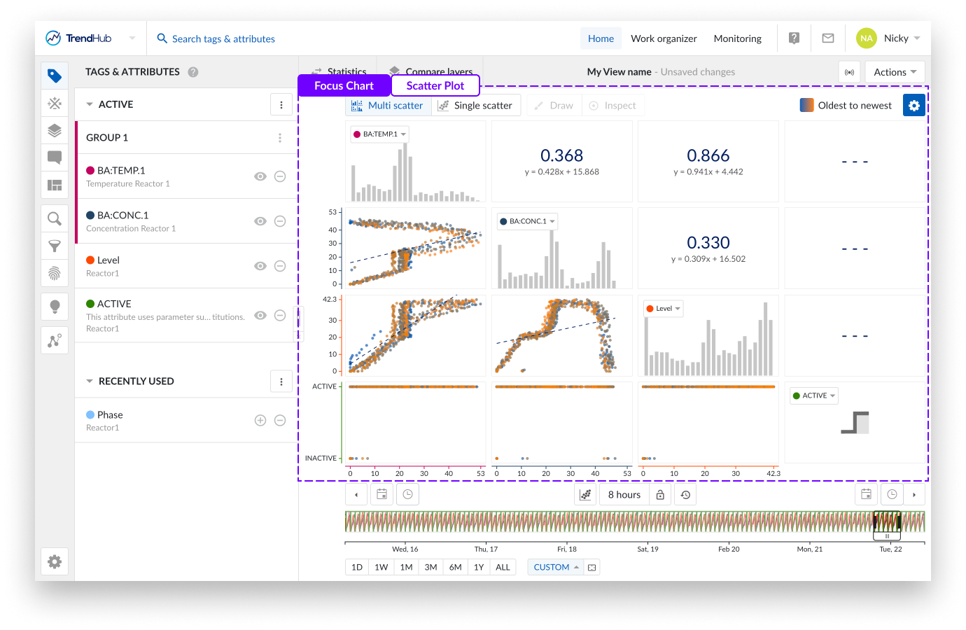
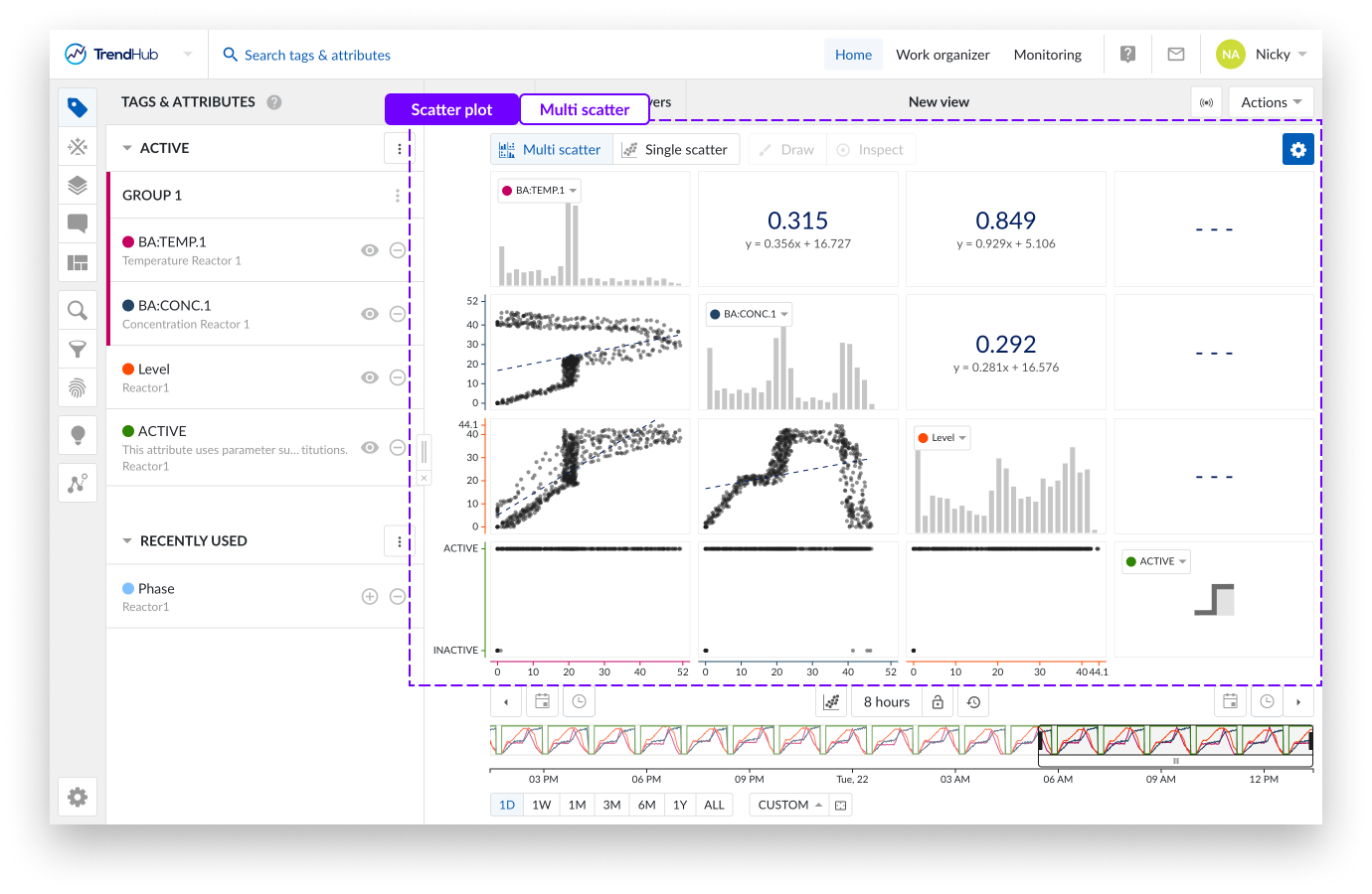
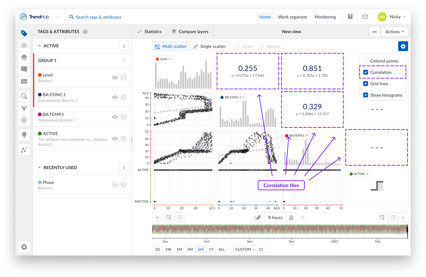
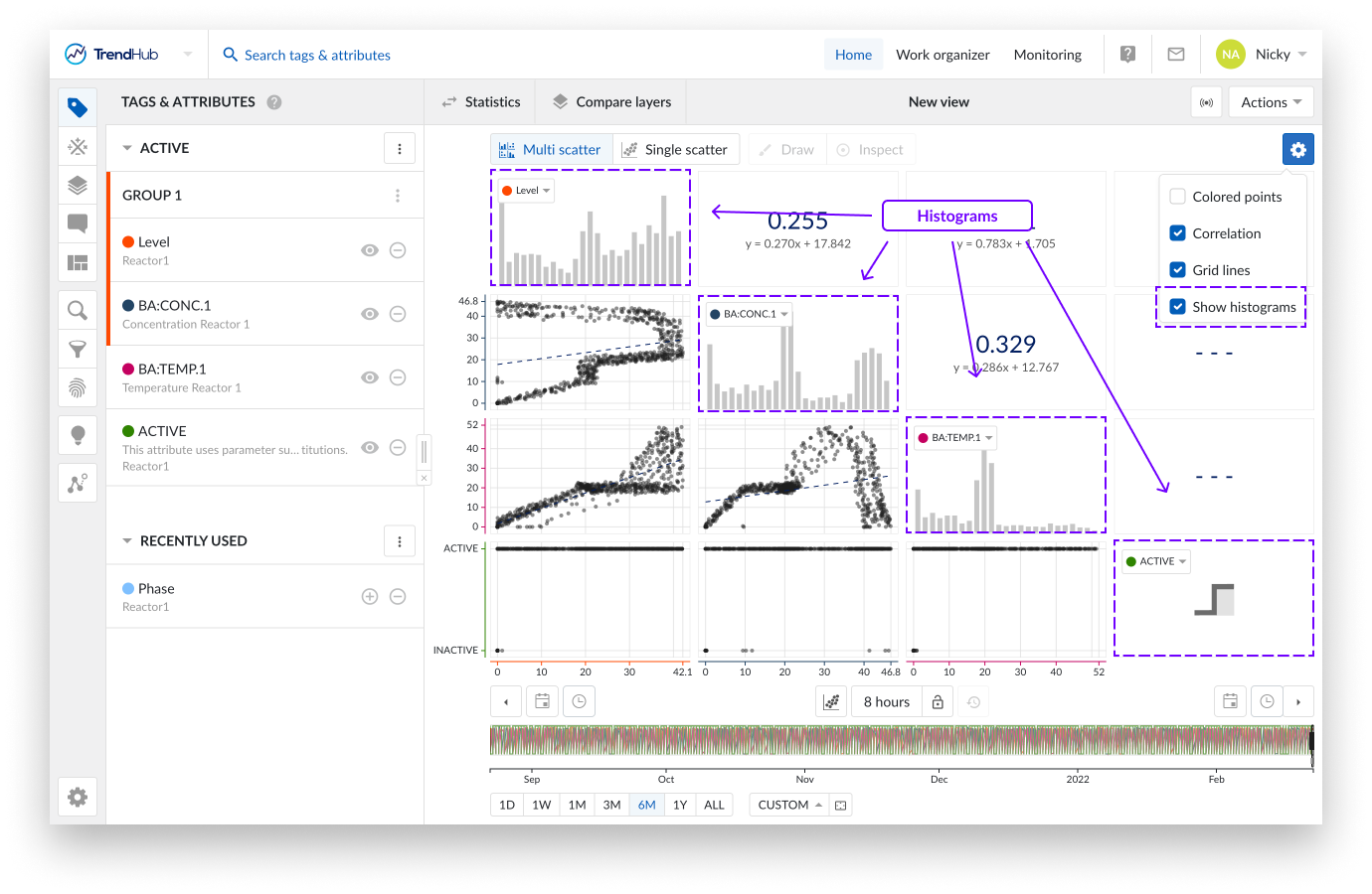
The image above shows an overview of what the multi-level scatter plot looks like.
The scatter plots visualize the correlation between the values of two tags and/or attributes, and can help identify operational regimes.
The histogram plots represent an approximate distribution, in bins, of the numerical data of the visualized tags or attributes.
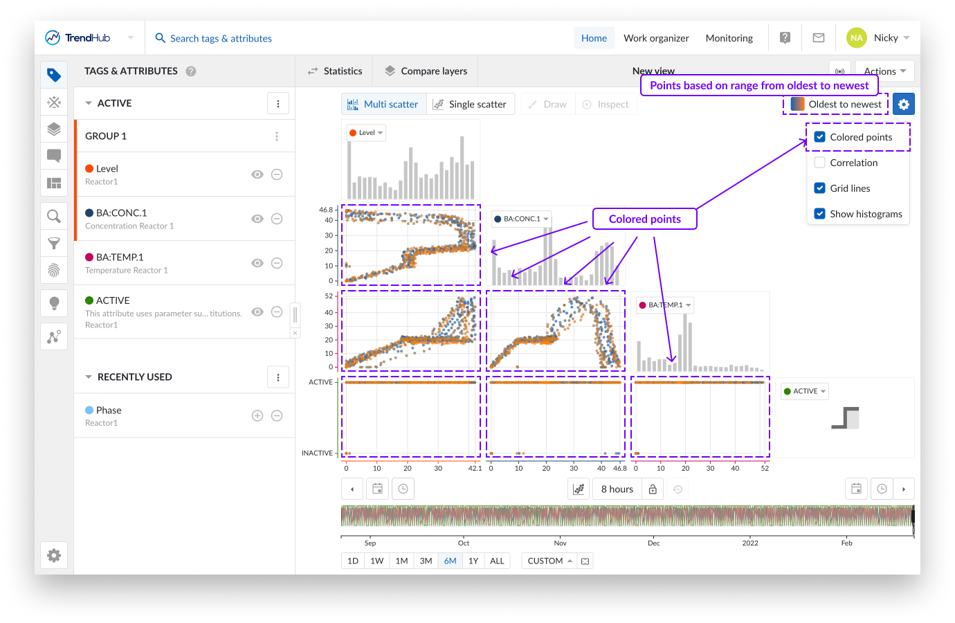
Multiple levels of visualization are possible in the Scatter plot visualization mode. Depending on the number of visible tags or attributes, some 'levels' can be blocked and are not accessible until more data references are added.
Navigating through the levels can be done by clicking the plots themselves or using the available buttons named "Multi scatter" and "Single scatter" situated at the top of the charting area.
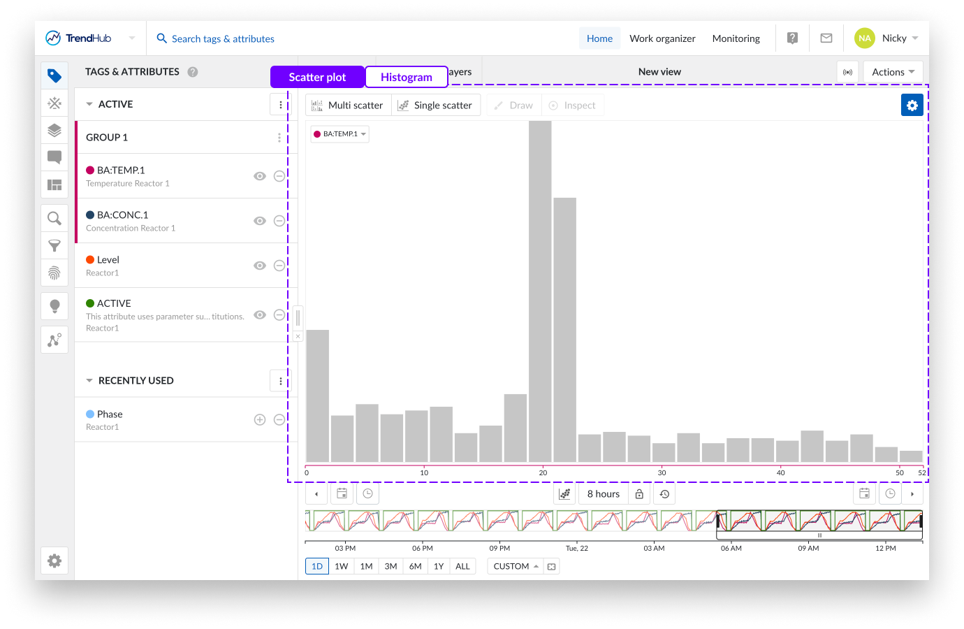
Single histogram plot: When there is only one visible tag or attribute present, and the scatter plot visualization is selected, a histogram is visualized.
In the following example, only a histogram can be visualized, and both navigation buttons are disabled.
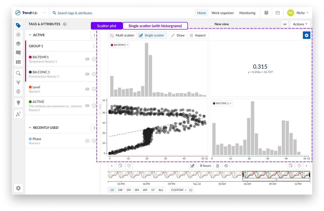
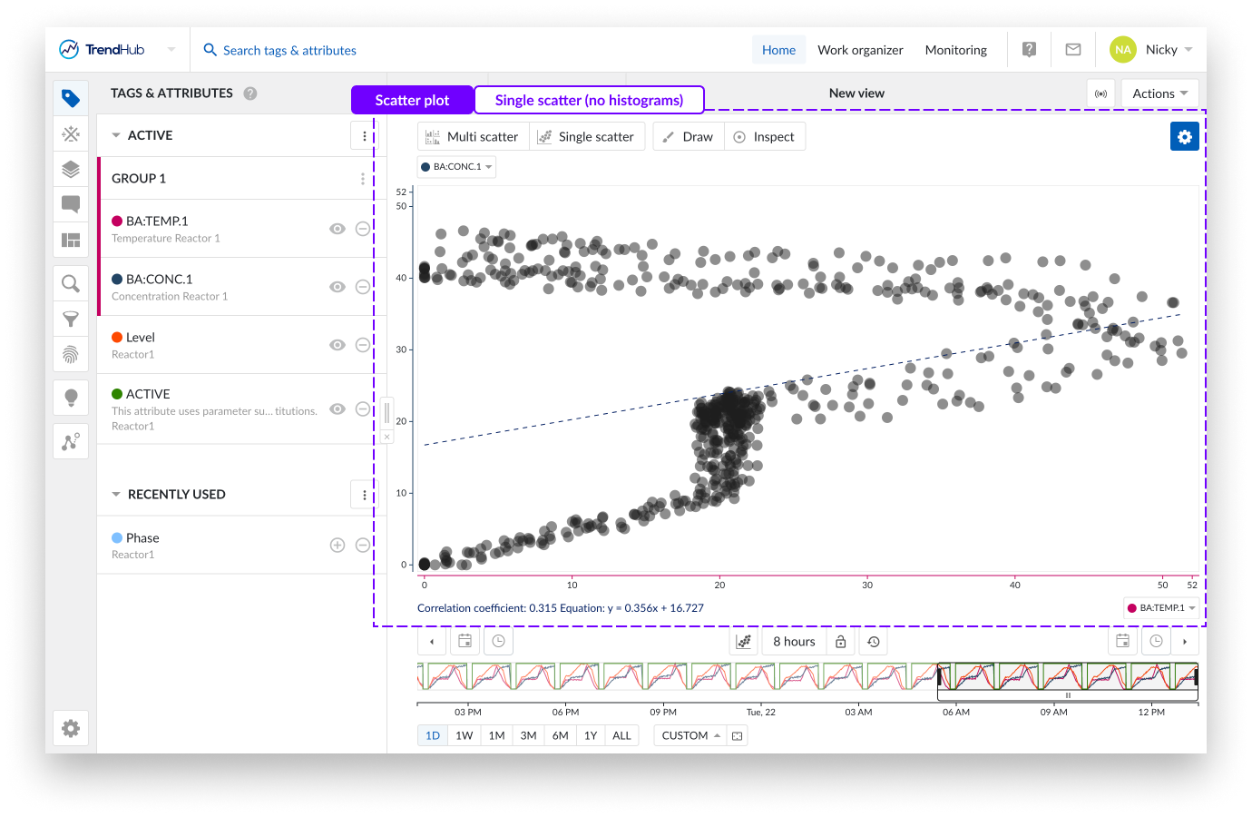
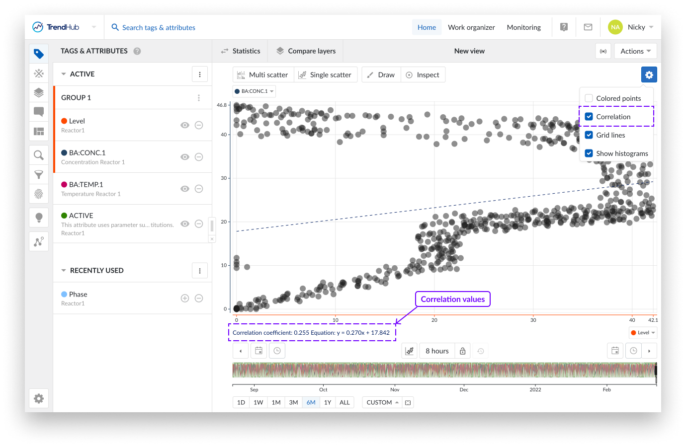
Single scatter plot : When the scatter plot is selected with two visible tags and/or attributes, a single scatter plot with two histograms is visualized.
As an indication, the "Single scatter" navigation button is highlighted when the single level is shown.
In this case, you can clickthrough to visualize any of the two histograms or to maximize the scatter plot on the charting plot. Returning to the single scatter plot with both histograms is done by clicking the navigation button "Single scatter".
Multi Scatter plot: With two or more visible tags and/or attributes, a switch to scatter plot will visualize a multi-level scatter plot overview. As an indication, the "Multi scatter" navigation button is highlighted when the multi-level is shown.
In this overview:
Clicking on a histogram, navigates to a single histogram plot of the corresponding tag or attribute.
Clicking on a scatter plot navigates to a single scatter plot with both corresponding tags or attributes. On this level you can again navigate one level deeper into a single histogram or maximize the scatter plot.
Returning to the other overviews (single or multi-level) is possible by clicking any of the navigation buttons.
Note
A tooltip will be displayed when hovering on a disabled button, to indicate the required actions needed to unlock that button.
At the top of the scatter plot multiple actions are available.
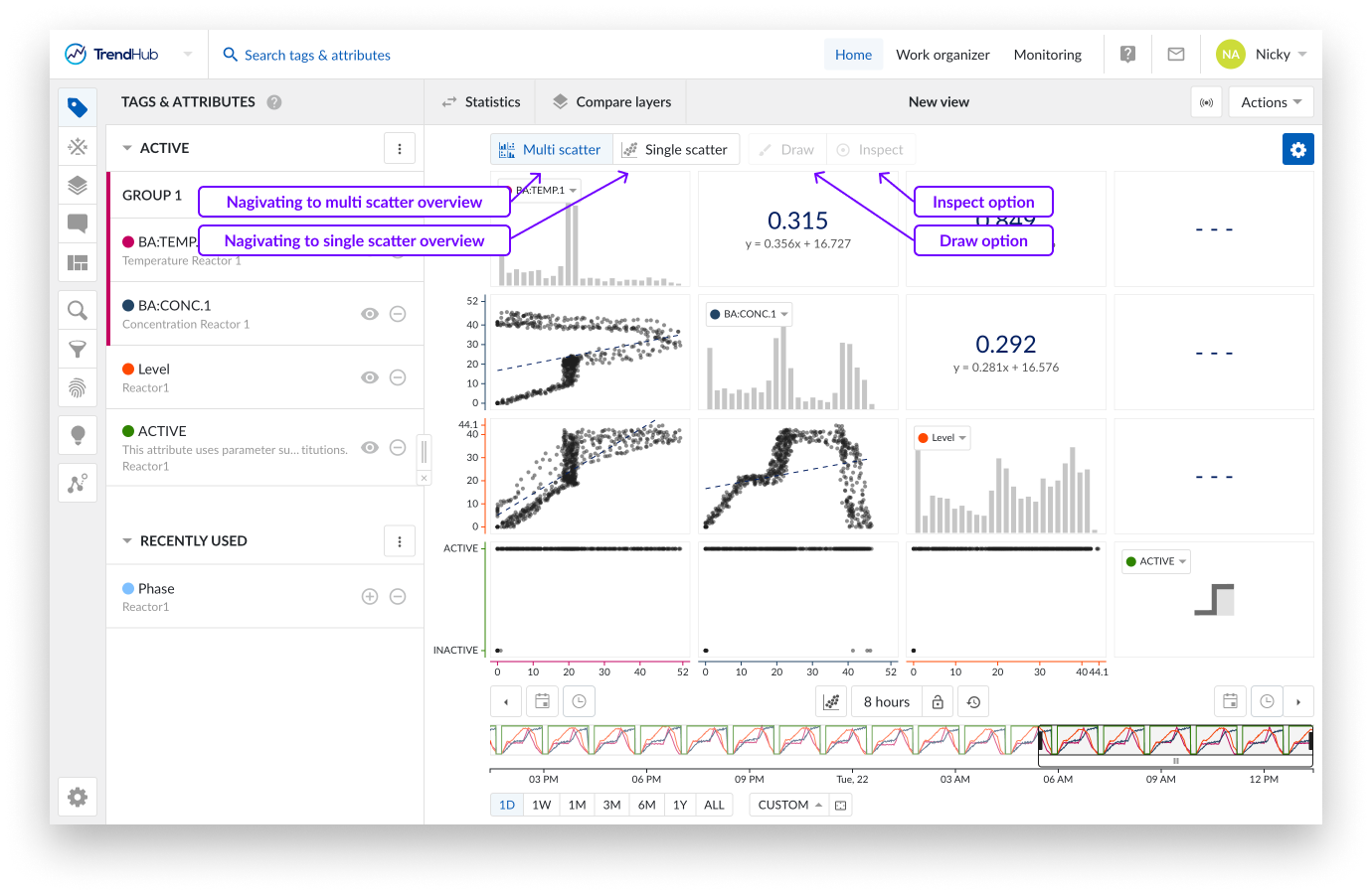
These buttons are highlighted when you are located at one of the scatter view types. Choose between multi scatter overview or single scatter overview.
The Draw button gives you the ability to create, update or remove an area on a single scatter plot (with or without histograms), as long as the draw option is enabled (highlighted in blue).
Create an area by clicking somewhere on the single scatter plot. After the first click you will see a blue dot appearing, this dot (or corner) is connected to your mouse pointer with a line. The following clicks will place a new dot that interconnects with the previous dot and starts to form the area. To complete the drawn area, a double click is required. This will place a final dot and connects the first placed dot with the final dot.
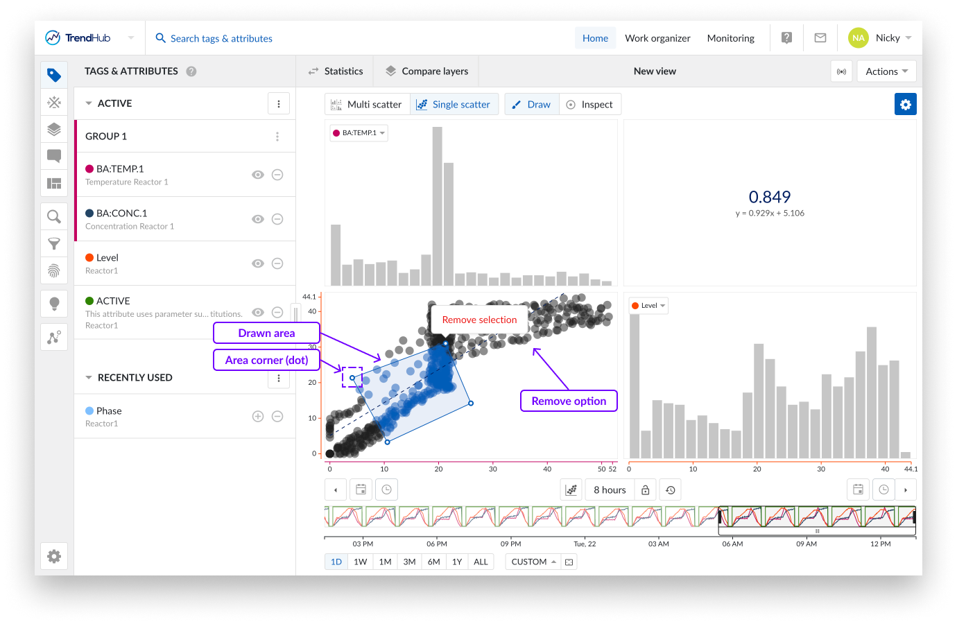
Made a mistake while drawing your area? An area can easily be adjusted by dragging the corners of the area. While doing this, the dot (corner) will immediately move along and update the area. Once dropped, the area update is completed.
The area can also be moved to a better fitting location or for fine-tuning. This is done by clicking somewhere on the drawn area and moving it over to the desired location.
As a final option, you can also remove the drawn area and start creating a new one. This is done by hovering over the drawn area which reveals a popup with a remove option called "Remove selection".
Note
For now, one area can be drawn at a time and can be used in the Operating area search.
Inspect enables you to dive deeper into the details of the visible data points on single scatter plots (with or without histograms).
When this option is enabled, more detail and information is shown. On the single scatter plots, a popup is shown where you can see the values of both data references (tags and attributes) and the timestamp of occurrence for the point that is being hovered upon.
Hovering over a number of data points will trigger a popup that will contain information, in the form of a scrollable list, on all the data points in the area you are hovering over.
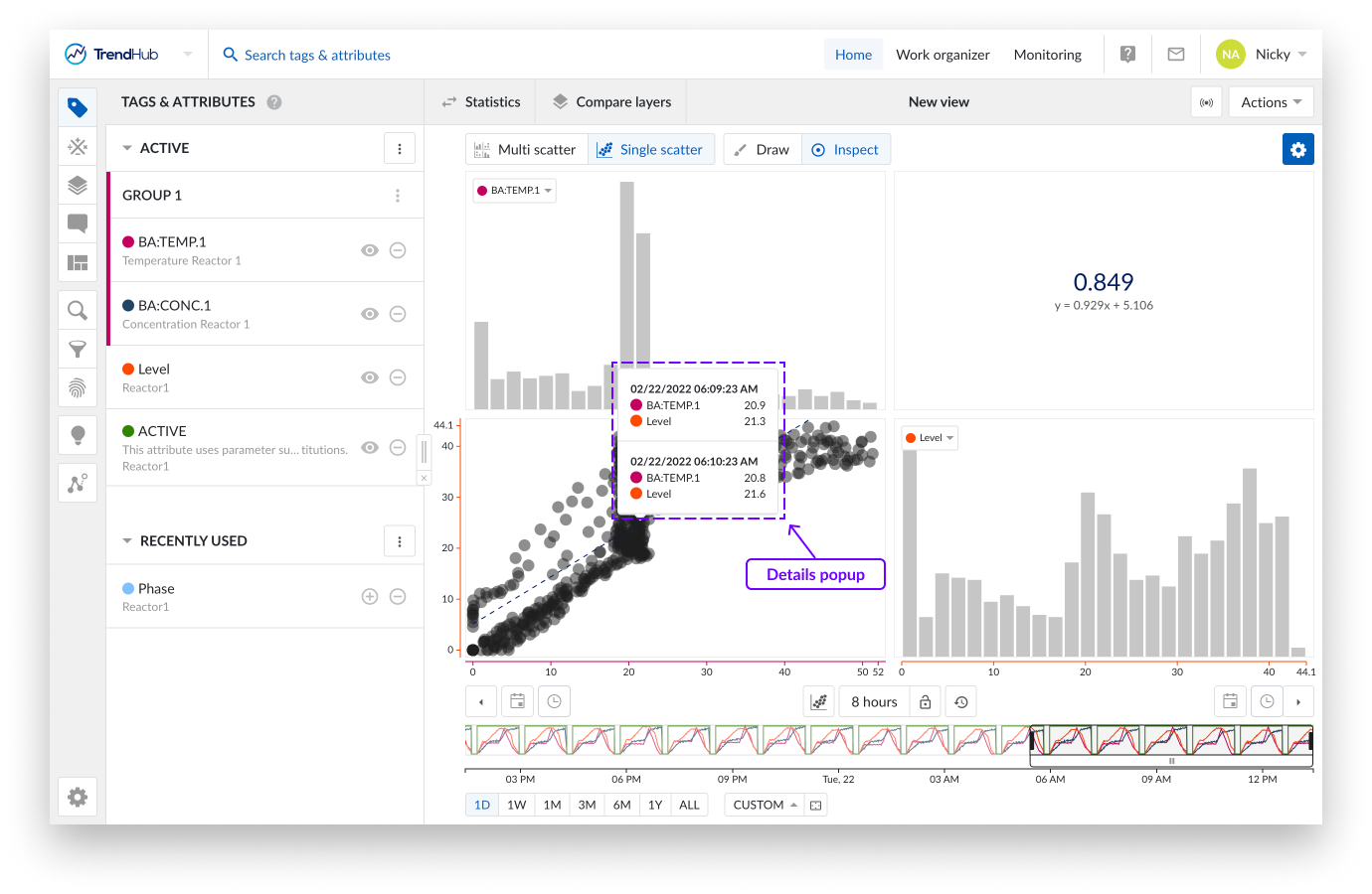
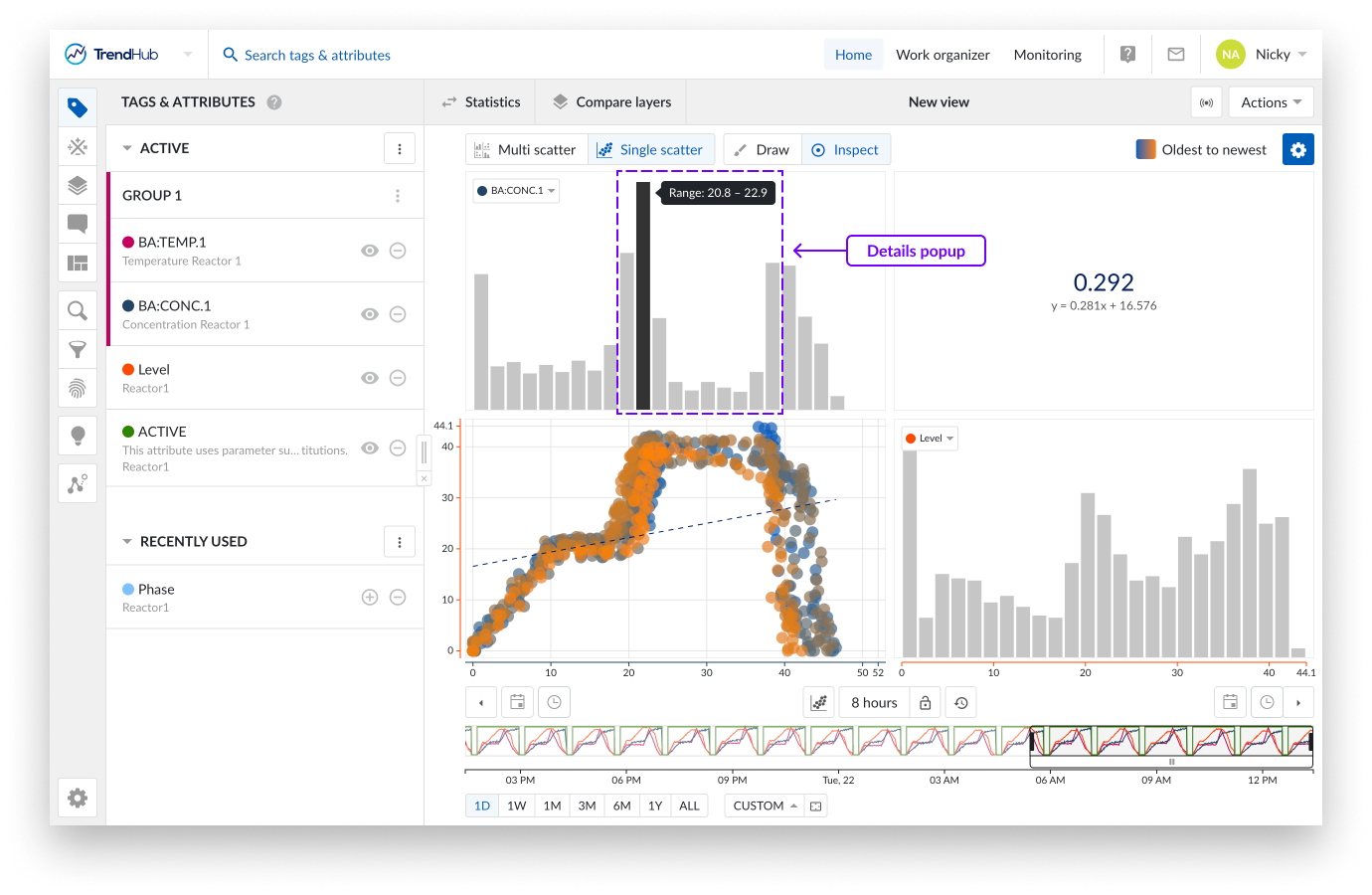
When your single scatter plot also presents two histograms, hover over the bins of the histogram to reveal bin range.
On the scatter plot update tags and/or attributes using their labels. This comes in handy when you have a single scatter plot, or a fully visualized histogram shown. In these cases, you can simply switch to another tag or attribute using their label.
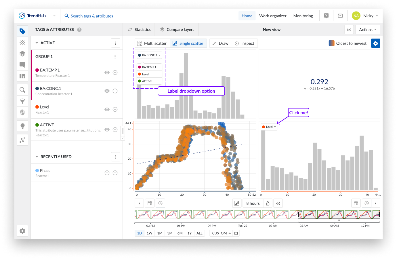
Clicking on one of the labels shows you a list of all the other visible tags and attributes. Selecting one of the other data references in the list will update the current scatter plot or histogram with the data of the newly selected tag or attribute.
The settings are found at the top right of the focus chart under the blue settings button. For the Scatter chart we have the following available settings:
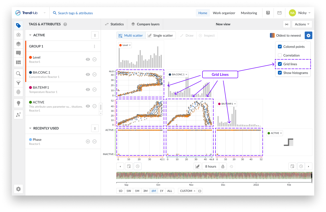
Colored points: When enabling the "Colored points" option, the color of the scatter plot data points are displayed in blue to orange, instead of the default grey/black color. The blue to orange color code indicates the transition from oldest to newest points in time.
Note
This option is disabled by default.
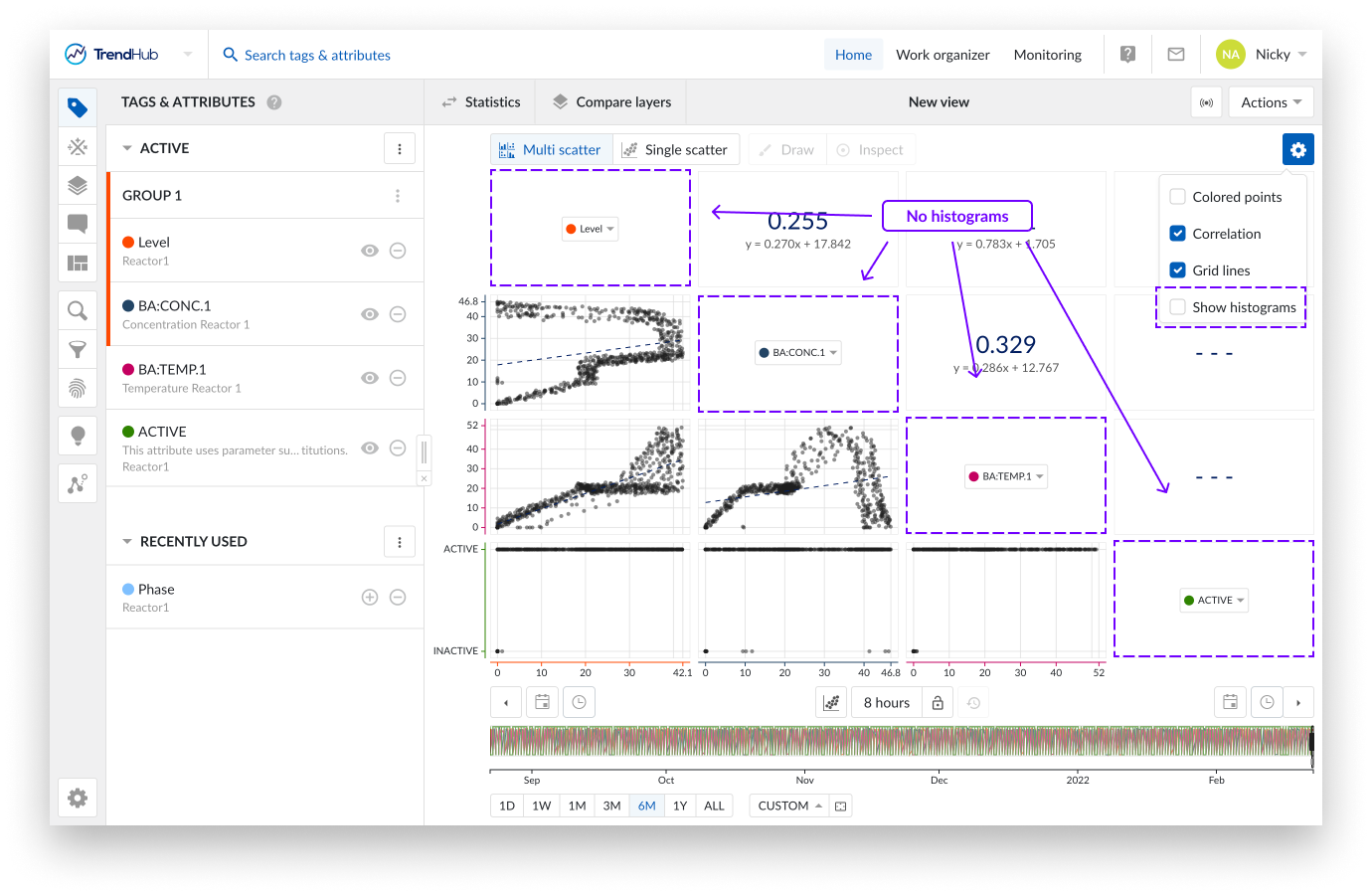
Correlation: When the option "Correlation" is enabled, additional tiles are displayed. These tiles represent the correlation coefficient together with its equation value for a specific scatter plot.
You can easily see which correlation tile is linked to which scatter plot by hovering over the tiles. The two linked tiles will be highlighted with a blue border.
When a single scatter plot without histograms is visualized, the correlation tile is not shown. Instead you can see the correlation coefficient and its equation value on the left below the chart.
Note
This option is enabled by default.
Gridlines: Once the "Gridlines" option is enabled, gridlines appear on the single scatter charts, making it easier to read values on the chart.
Note
This option is disabled by default.
Show Histograms: The "Show histograms" option can show or hide the histograms.
Note
All the settings of the chart are saved for your user only. The options will be saved and reused in the next session.
Note
All chart settings are also saved inside a view. Meaning, when a colleague opens one of your views, your chart settings will be enabled for their view. Your settings are yours, as long as your colleague does not save that view as one of their own views.
Time range selection: The buttons underneath the focus chart remain fully functional in the scatter plot mode. Read the time navigation article to learn more.
Data and image export
TrendHub has different options to export data, which can be grouped into 2 categories:
Exports of TrendHub Views
Exports of search results
All export options related to TrendHub Views can be found in the actions list of your view bar.
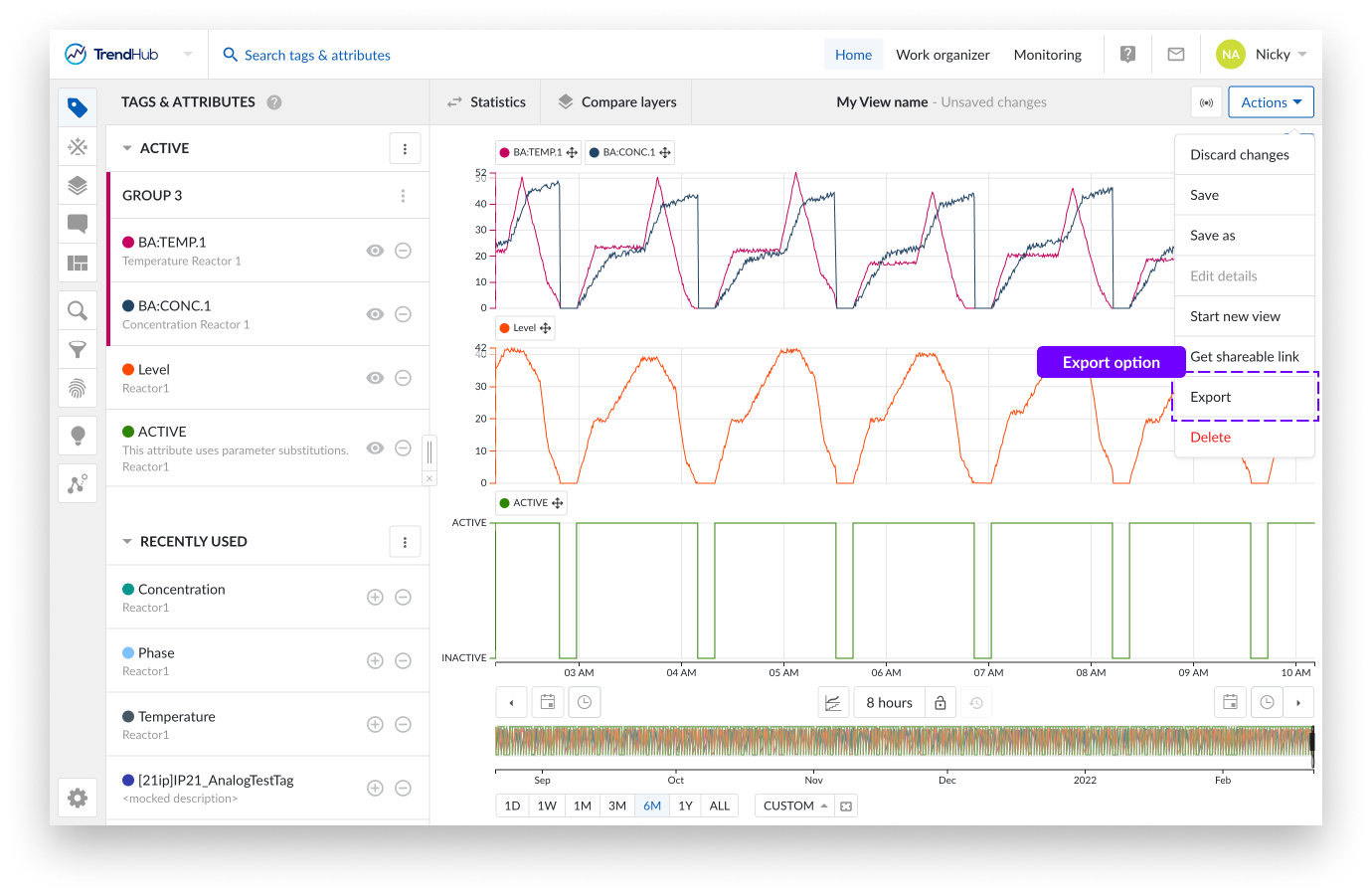
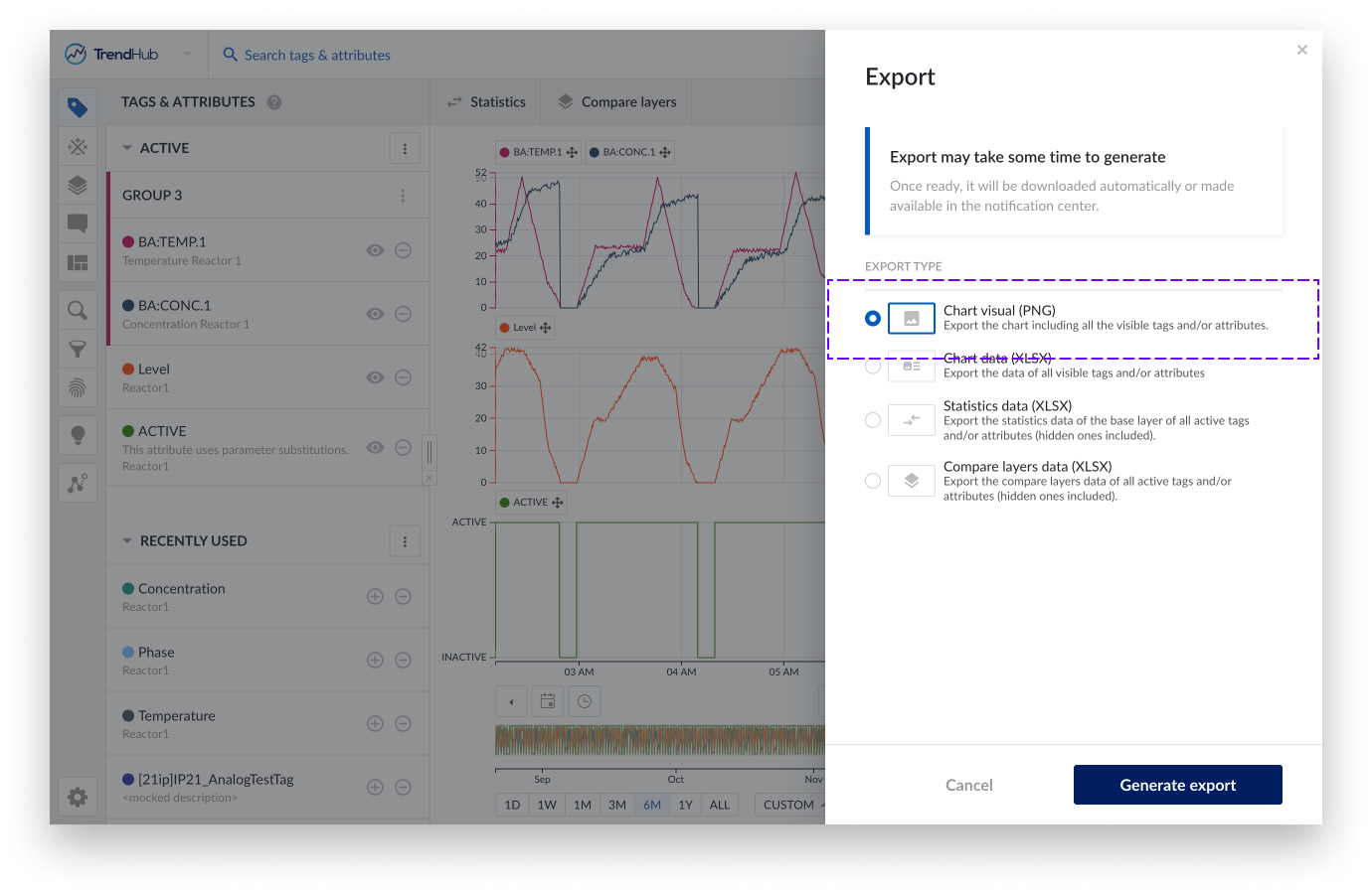
Clicking the export button reveals a side panel where you can choose one of the following possibilities:
Chart visual: Export the focus chart graph including all visible tags and/or attributes.
Chart data: Export interpolated index data from the focus chart for all visible tags and or attributes.
Statistics data: Export the statistics data of the base layer for all active tags and or attributes (hidden ones included).
Compare layer data: Export the compare layers data of all active tags and/or attributes (hidden ones included).
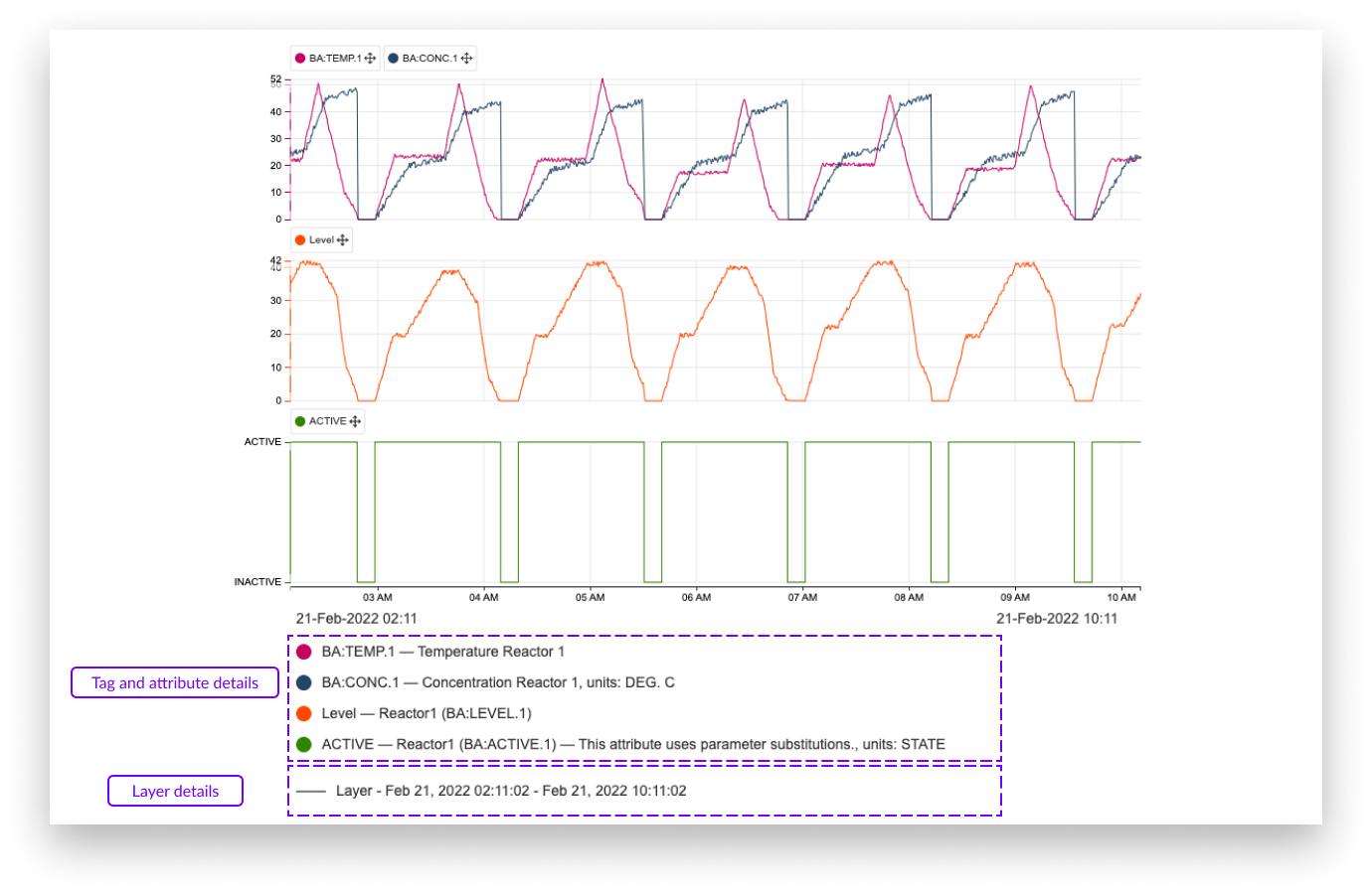
The focus chart image export contains any visible detail of the focus chart, going from any visualization mode to even a context item or a data scooter. Settings are also included in the visual chart export.
The screenshot below shows an example of a visual chart export. Details of the tags and attributes are shown below the chart itself. They include:
Color of tags or attributes
Name of the tag or attribute
The parent's name of an attribute (not applicable for tags)
Description of tag or attribute (if available)
The shift of the tag or attribute (if applied)
Units of measurement (if available)
Also included in the export is information about the layers.
Note
Chart visual export will download automatically once ready.
Line style of the layers
Name of the layer (default value 'Layer')
Start and end date and time of the layers
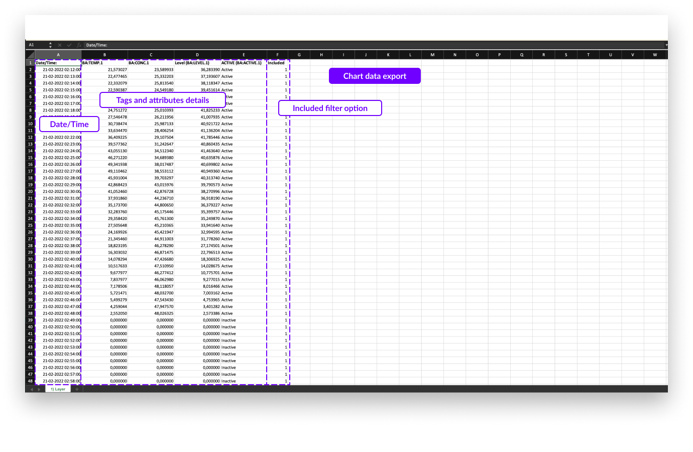
The focus chart data export contains the interpolated indexed data of the visible tags and attributes for the current period of the focus chart and all the active layers (one layer per Excel sheet).
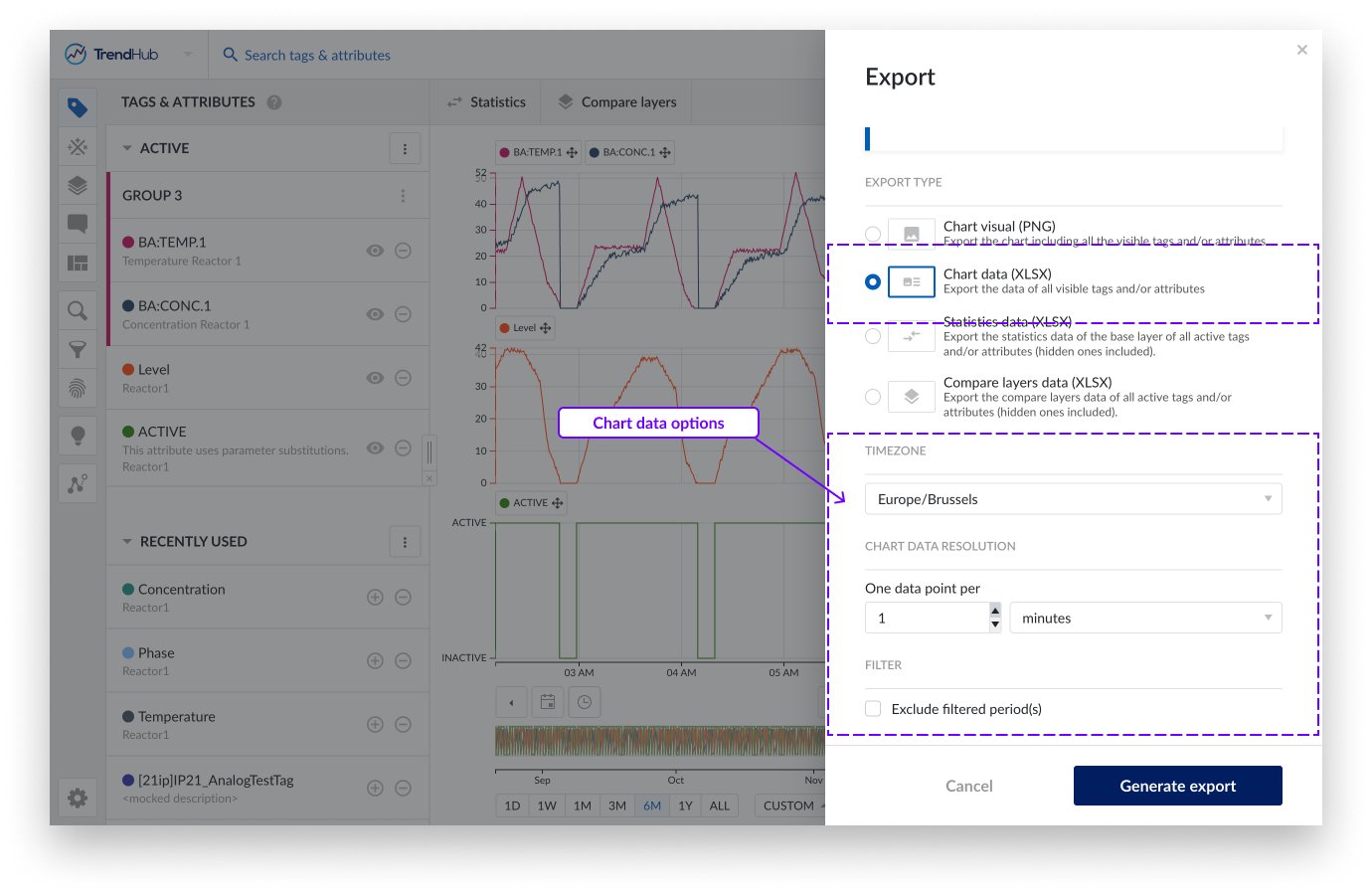
The chart data export has some extra settings that can be adjusted / applied before exporting your data.
Timezone, this setting lets you choose the desired time zone. This setting is also saved for your user which means that in the next session, it is automatically set to the last used timezone. This is useful when sharing exported files with colleagues in different areas. This setting is also saved for your user which means that in the next session, it is automatically set to the last used timezone.
Chart data resolution, this setting lets you adjust the resolution of points to be included in the Excel file. The minimum resolution however is set to the indexing resolution which depends on your setup (1 minute by default).
Note
The resolution is limited to the limit of Excel where up to one million rows are allowed.
Filter, when having periods filtered out, you can exclude these periods in the export file. Learn more about filters in this document. (Link to filters document).
Note
Retrigger the chart data resolution option after checking the exclude filter option. Since less data points will be exported, the chart data resolution can potentially be increased.
In the image of the export file below, you can see one column shows the date and time followed by all visible tags and/or attributes. The last column "Included" in the file indicates if the period was filtered (0) or not (1).
Each sheet of the export file shows additional layers (if present).
Note
Chart data export can be downloaded in the notification center once created. The download stays available for 7 days before it 'expires'.
The statistics table data export exports all descriptive statistics of the base layer. This export only has one setting that can be adjusted.
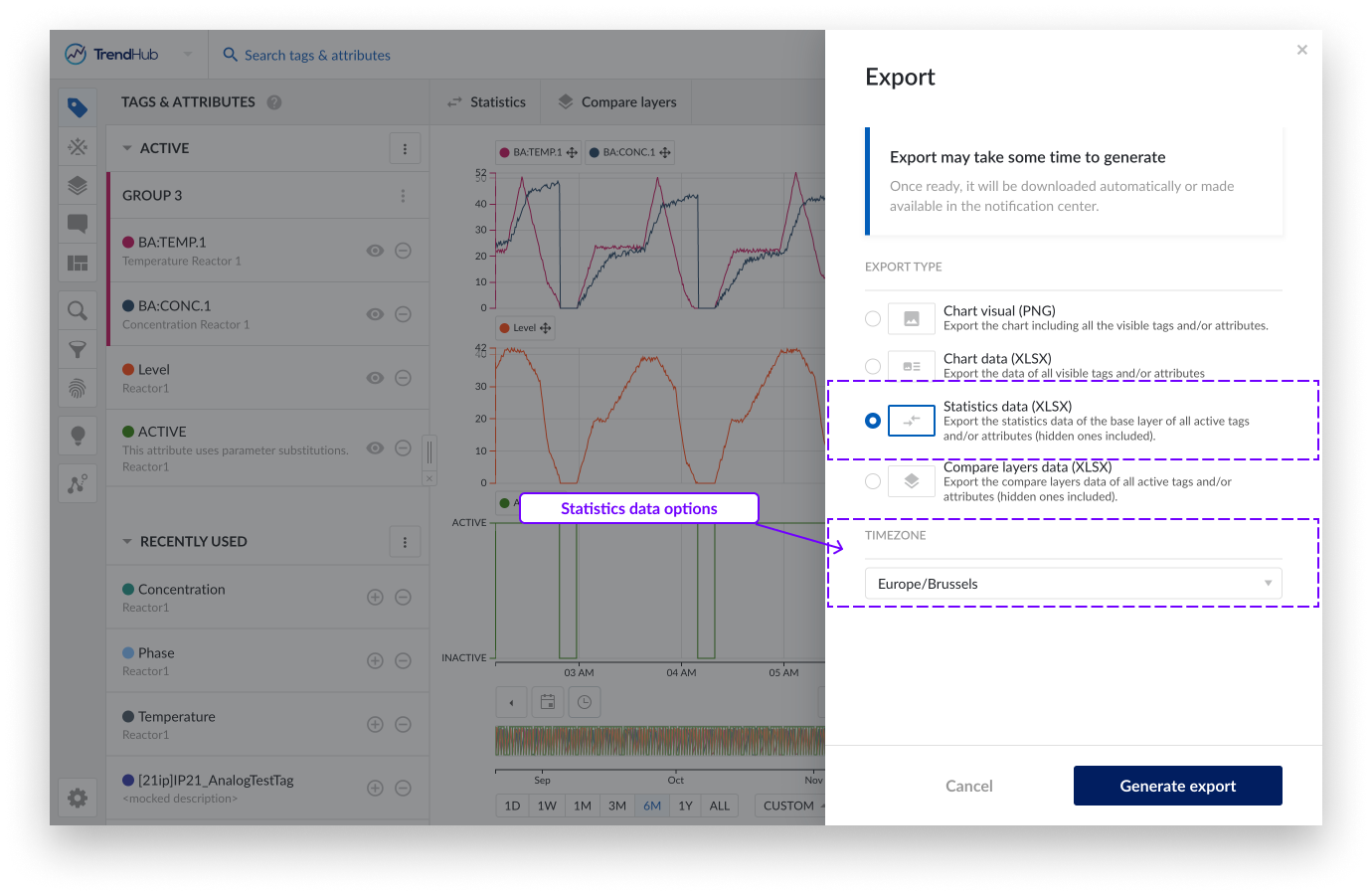
Timezone, this setting lets you choose the desired time zone. This setting is also saved for your user which means that in the next session, it is automatically set to the last used time zone.
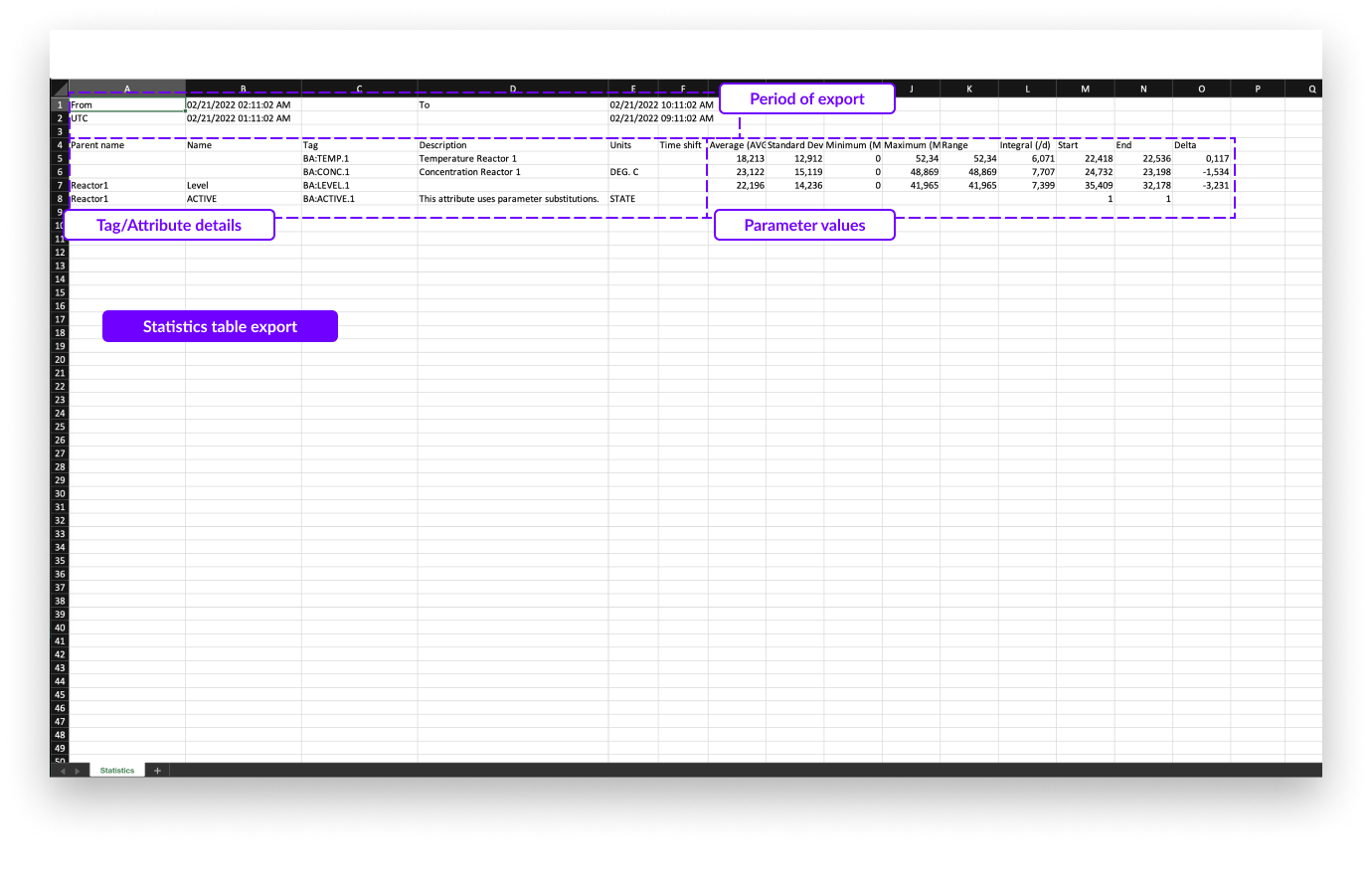
In the export file below, the following information is shown:
Note
Statistics table export will download automatically once ready.
Start and end date and time of the focus chart in the selected time zone.
Start and end date and time of the focus chart in UTC format.
All information about the tags and attributes is shown, including:
Parent name (only applicable for attributes)
Attribute name (only applicable for attributes)
Tag name
Description (if available)
Units of measurement (if available)
The time shift of the tag or attribute (if applied)
All descriptive statistics.
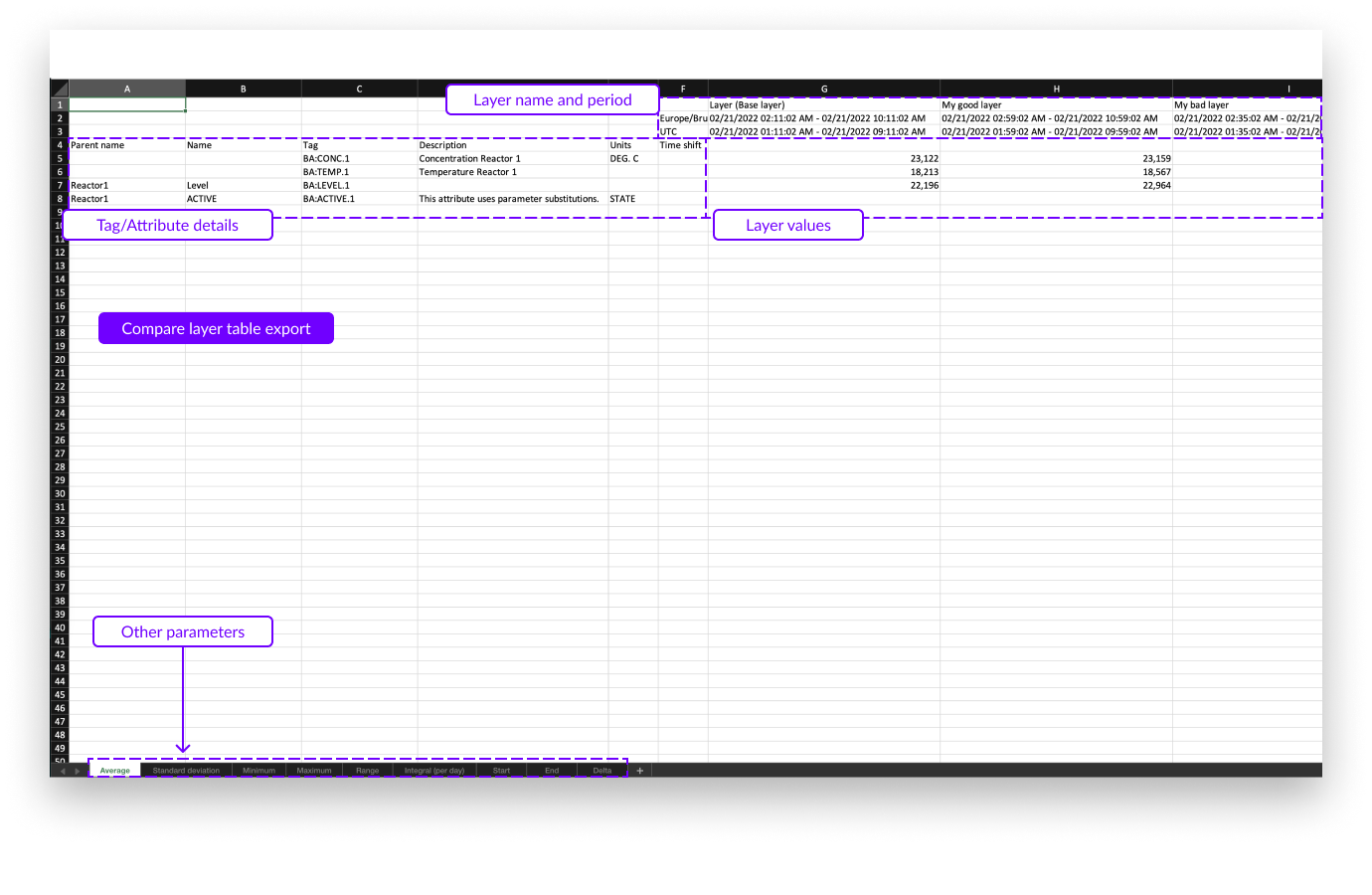
The compare layer table data export looks similar to the statistics table export. Again, all key parameters are present in the export but now one per sheet in the Excel file. In this export only the timezone setting can be adjusted.
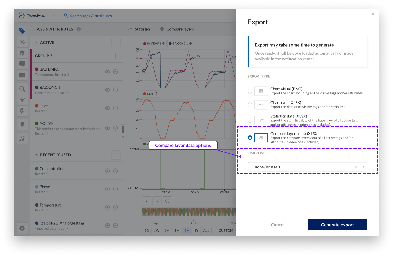
Timezone, this setting lets you choose the desired time zone. This setting is also saved for your user which means that in the next session, it is automatically set to the last used time zone.
In the export file below, the following information is shown:
The tag and/or attribute details on the left, including:
Parent name (only applicable for attributes)
Attribute name (only applicable for attributes)
Tag name
Description (if available)
Units of measurement (if available)
The time shift of the tag or attribute (if applied)
Layers details on the right which contain the following:
Note
Compare layer table export will download automatically once ready.
Layer name (and mentioning of base layer)
Start and end date and time of the layer in the selected time zone
Start and end date and time of the layer in UTC format
Value of the current statistics
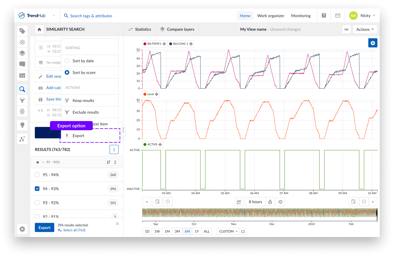
You can also export search results into an Excel file. Please read the this document to learn more about performing searches in TrendHub.
As soon as a search is executed, the search results, with all available calculations, can be exported. To export search results, simply click the three-dot options button in the results header, followed by the "Export" option.
You can now select the results you wish to export and select the desired timezone before the export is started.
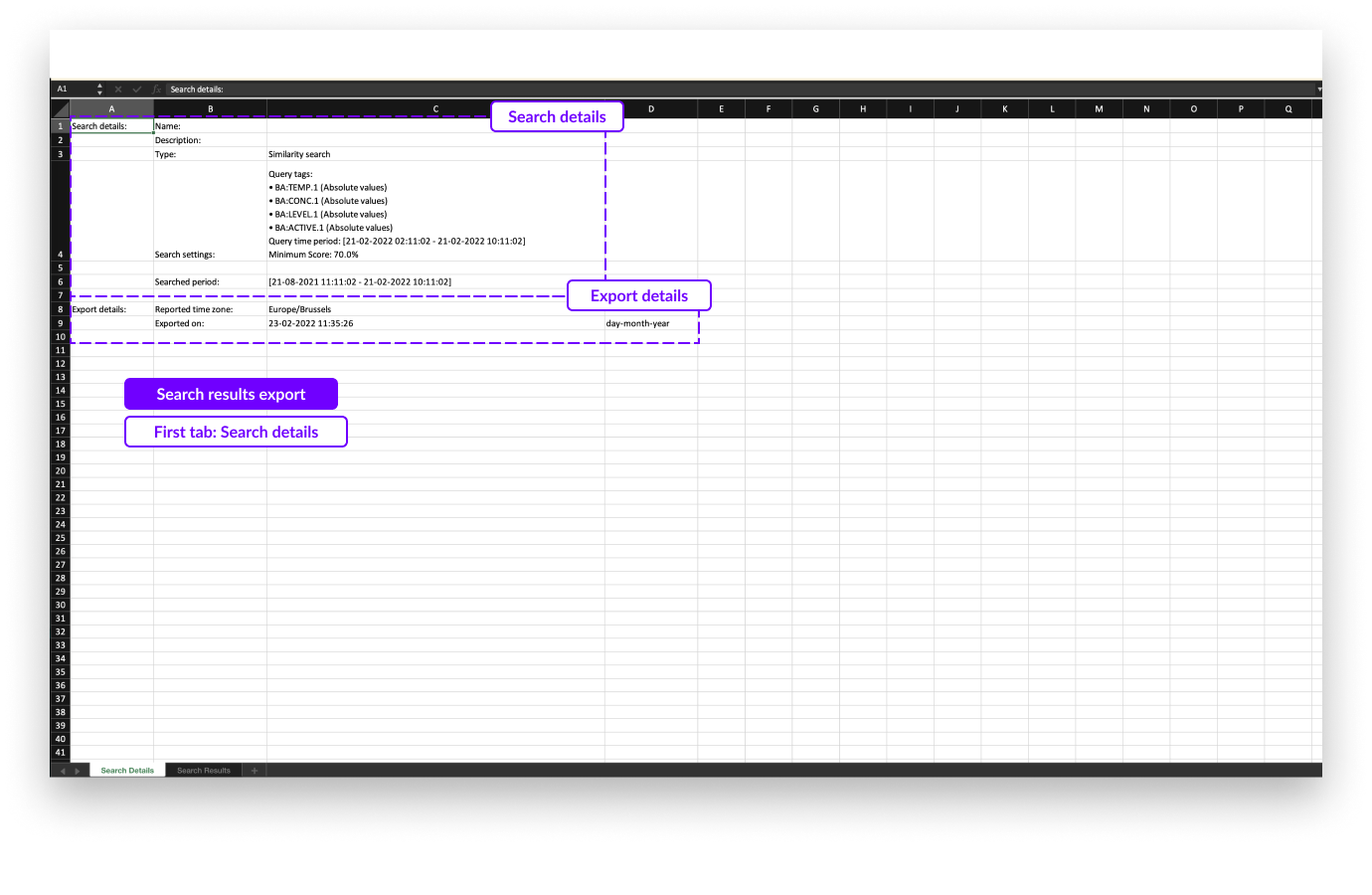
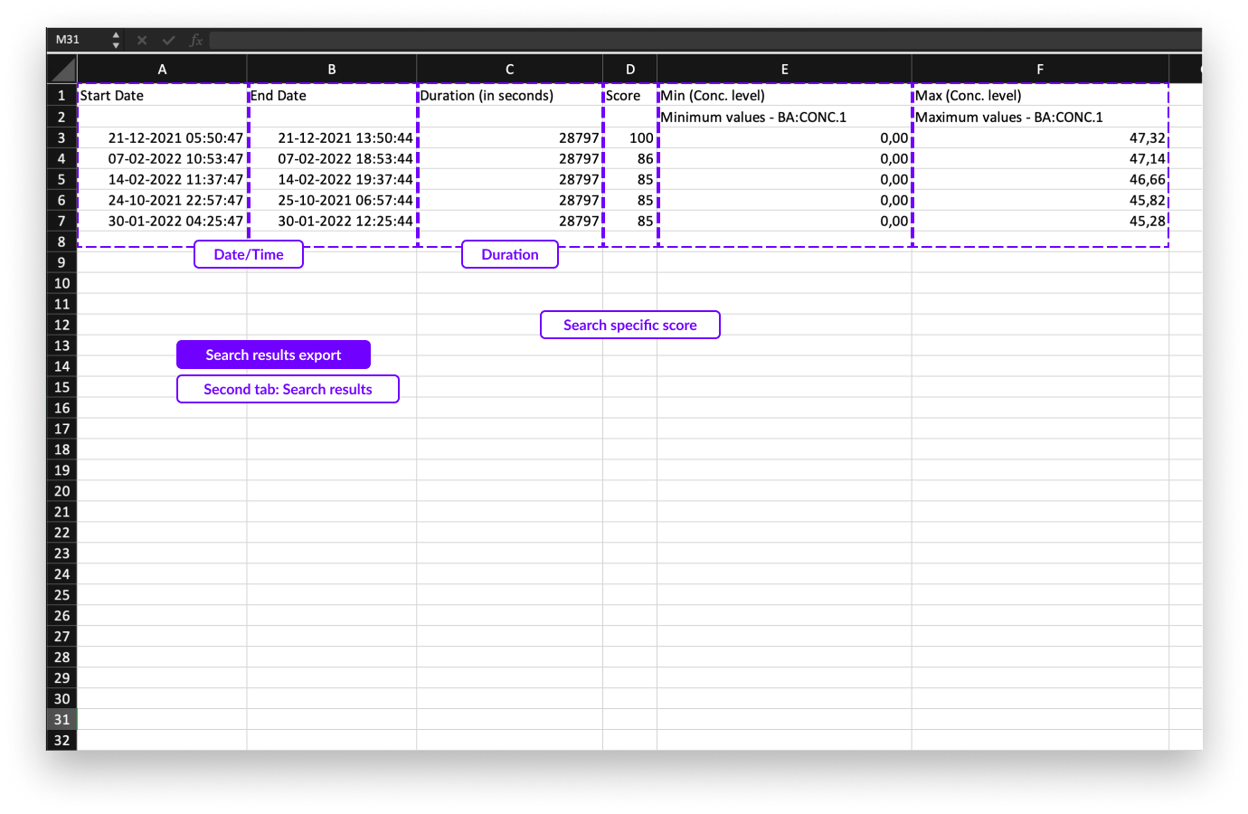
The exported Excel file consists of 2 tabs:
A first, summary tab containing the details of the search conditions
A second tab containing the details of the search results
On the first tab you will see the following details about the search:
Name of the search (if available; this only applies for saved searches)
Description of the search (if available; this only applies for saved searches)
Search type
Settings of the search including
Queried tags
Queried time period (similarity search)
Minimum score (similarity search)
Weights and period of weights (similarity search)
Searched period (Context period)
Export details like timezone and export date
On the second tab of the export file, you can find the following information of the search results:
Start and end dates in the first two columns
The duration of the search result
Search specific parameter (E.g., score for similarity search results)
1 additional column per available calculations
Note
Search export can be downloaded in the notification center once created. The download also stays available for 7 days before it 'expires'.
Visualization modes and data scooters
As soon as a tag or attribute is added and active, it's visualized on the focus chart. The focus chart can present your data as a:
Stacked trend plot
Trend plot
Scatter plot
The stacked trend plot is the default visualization mode. The mode can be changed by clicking the focus chart visualization mode button underneath the chart.
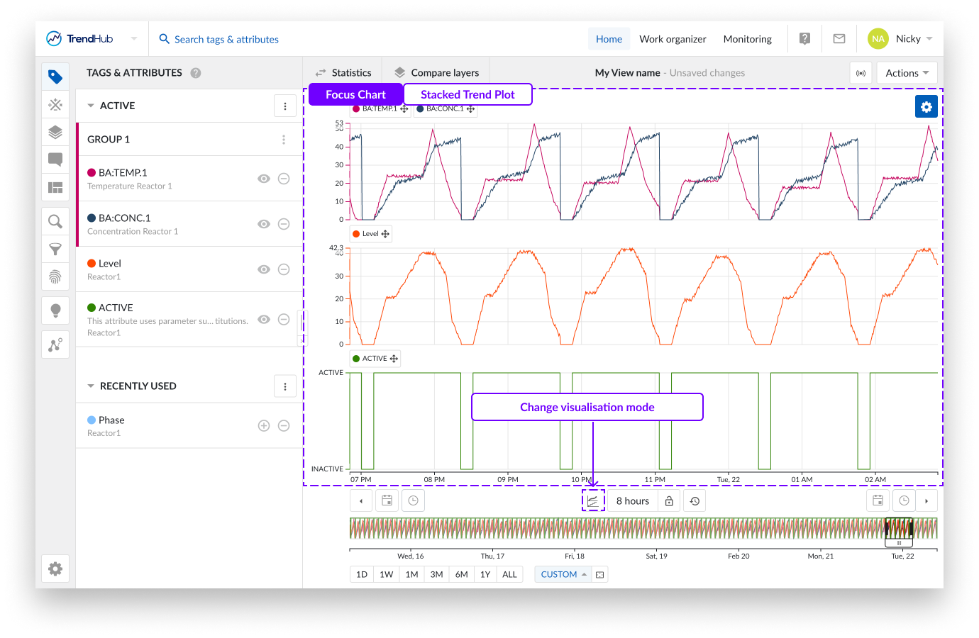
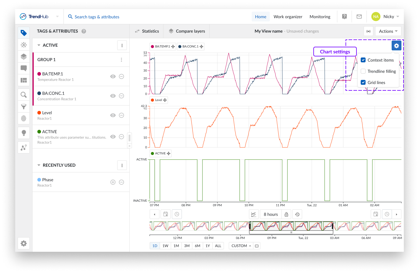
In stacked trend plot mode, each tag or attribute receives an individual swim lane on the chart to visualize its time series data.
As displayed on the image above, you can see three swim lanes. By default, each of these swim lanes represent one tag or attribute. On the left of each row, the y-axis is located. By default, the y-axis of each tag is set to the auto scale setting which makes sure all data is visible. The auto scale updates when needed.
The scale setting can be changed for each tag individually (auto or manual scale) and will be remembered for future sessions. Beneath all the swim lanes an x-axis is shown, which represents the date and time range of the visualized focus chart.
A second visualization option is Trend.
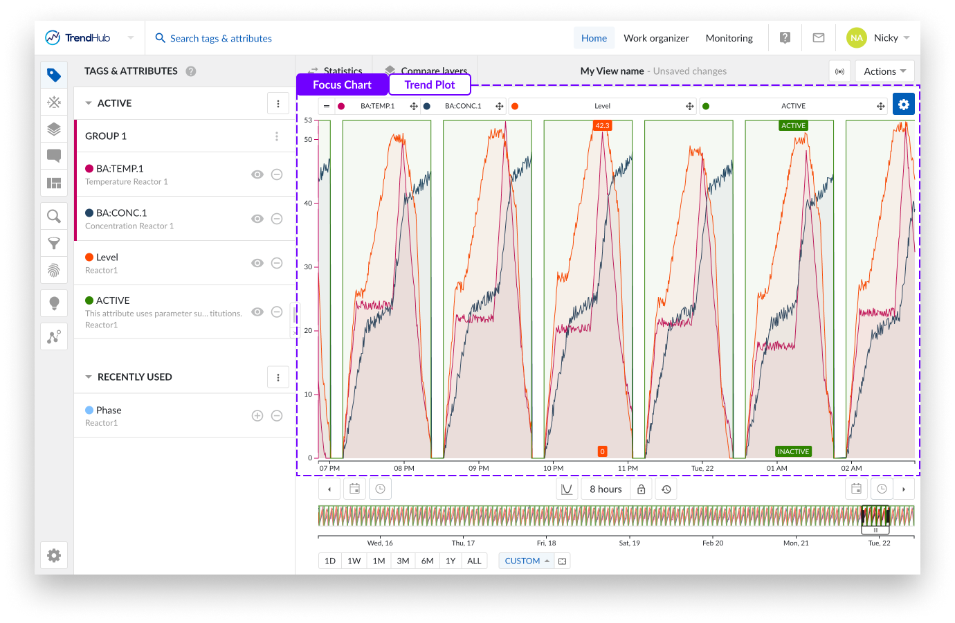
In the above image, you can see the equivalencies with the stacked trend. The main difference is that for this chart, all tags and attributes are shown in one large swim lane with labels set above the chart.
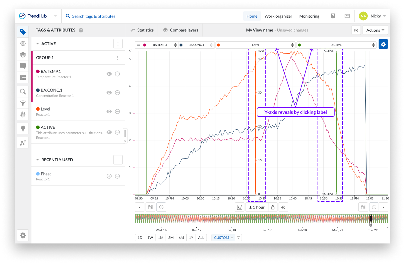
Another feature only available in the Trend plot is the ability to visualize (or hide) a y-axis for the second and following tags or attributes on the chart. This is done by clicking the label of that tag in the focus chart.
The third visualization option is the scatter plot. The (multi) scatter mode highlights correlations between the different visualized tags for the selected time period. More details about the scatter plot can be found on thislink.
Focus Chart Actions
In the visualization modes you can reorganize the tag labels on the chart by grabbing them and dropping them on another location.
By doing this the order of tags and attributes can be changed (i.e., the list visualized on the tags and attributes menu). This happens when you drop a label next to a trend plot or above/beneath another label on the stacked trend plot.
Creating groups is also possible. You can do this by dropping a label on top of another label. Once a group is created, the scale setting of the first tag in the group is used for the whole group. Group scale settings can also be adjusted. Click the group in the tags & attributes list to do this.
You can also adjust x axis settings by panning.
Note
For more information about grouping please check the following link. For information about panning read here.
Per chart there are different settings you can modify to fine-tune the chart to your liking. The settings are found at the top right of the focus chart behind the blue settings button.
For the "Trend" and "Stacked trend" chart the following settings are available.
Note
The settings of the different visualisation modes are saved separately for your user, which means you can have one setting enabled for one mode while that same setting is disabled for the second mode. The options will be saved and reused in your next session.
Note
All chart settings are saved inside a view. Meaning, when a colleague opens one of your shared views, your chart settings will be enabled for that view.
Context items: When enabling the "Context items" option, the context items associated with the period you have visualized will appear on the chart. This option is enabled by default for both time series visualization modes.
Note
Many context items will impact the performance of the chart.
Trendline filling: By checking the "Trendline filling" option, the area under the curve of each tag and attribute will be filled with a shaded color. This option is enabled by default for the Trend charts.
Gridlines: Selecting this option places gridlines onto the chart, making it easier to read the values. This option is disabled by default for both time series visualization modes.
Data Scooters
Data scooters are boxes on the focus chart that contain the values of all the visible tags and attributes at a specific time on the base layer.
For analog tags, values are linearly interpolated. For discrete, string and digital tags, the value of the last recorded point is displayed.
You can create an unlimited number of data scooters to compare your values of the base period at every moment in time.
Adding data scooters is done by double clicking anywhere on the focus chart (Trend and Stacked trend plot).
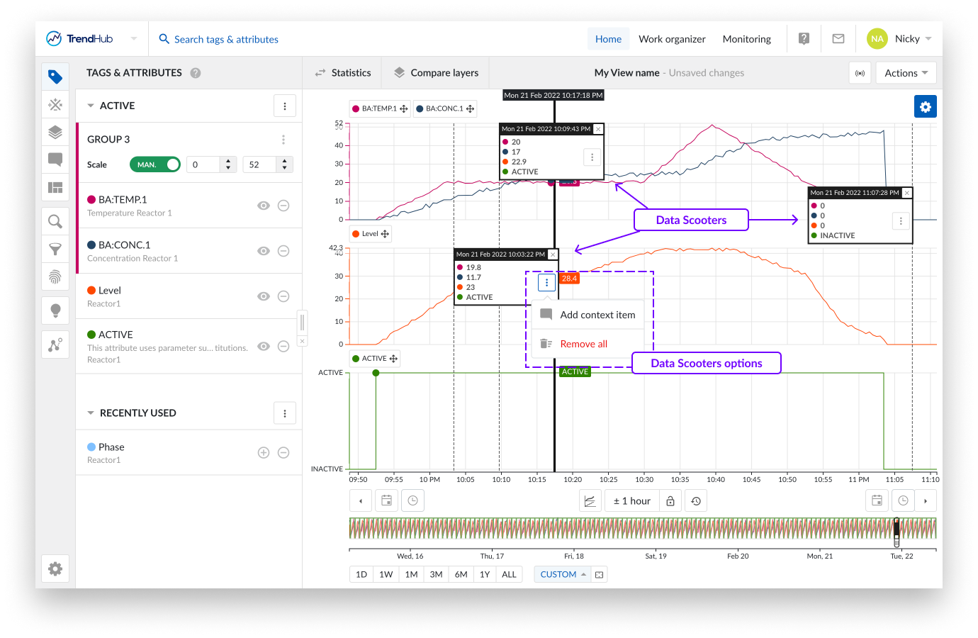
A data scooter with the wrong timestamp can be frustrating. Because of this reason each data scooter can be grabbed and dragged to another position on the focus chart.
When a data scooter is created, you will see the three vertical dots button. Clicking this button reveals the options for the data scooter:
Add context item
Remove all
Is a data scooter showing the start of something that is going wrong? Mark it with a context item. Clicking the data scooter's "Add context item" button will start the creation of a context item.
The advantage of creating a context item in this way is that the start date and time are automatically filled out for the context item you are trying to create, after entering a context item type. An end date and time can be set after the creation of the context item.
More information about the creation of context items can be found here.
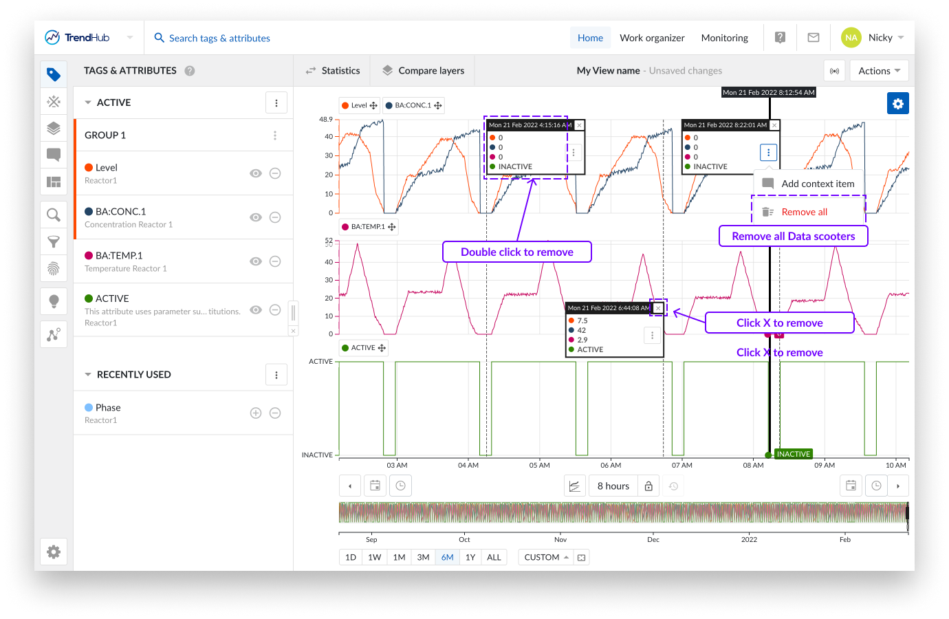
A single data scooter can be removed in two ways. Double click anywhere on an existing data scooter, or click on the cross button in the top right corner of the data scooter.
It is also possible to remove all data scooters at once. To do this, click on the three vertical dots button in any of the available data scooters, which reveals the data scooters option list. Click the "Remove all" option to remove all data scooters.
Note
When data scooters are used on large zoomed out periods with rapidly varying data, the accuracy of the values displayed on the data scooters are limited. Best results are obtained by zooming in on the desired period.
You can create a selection on the focus chart by dragging and dropping your mouse over the focus chart. While doing this you can immediately see a grey box appear on the top left corner of the length of period you are creating.
Once completed, you can see a "highlighted" period, and a popup that provides you with actions that can be applied to the highlighted period.
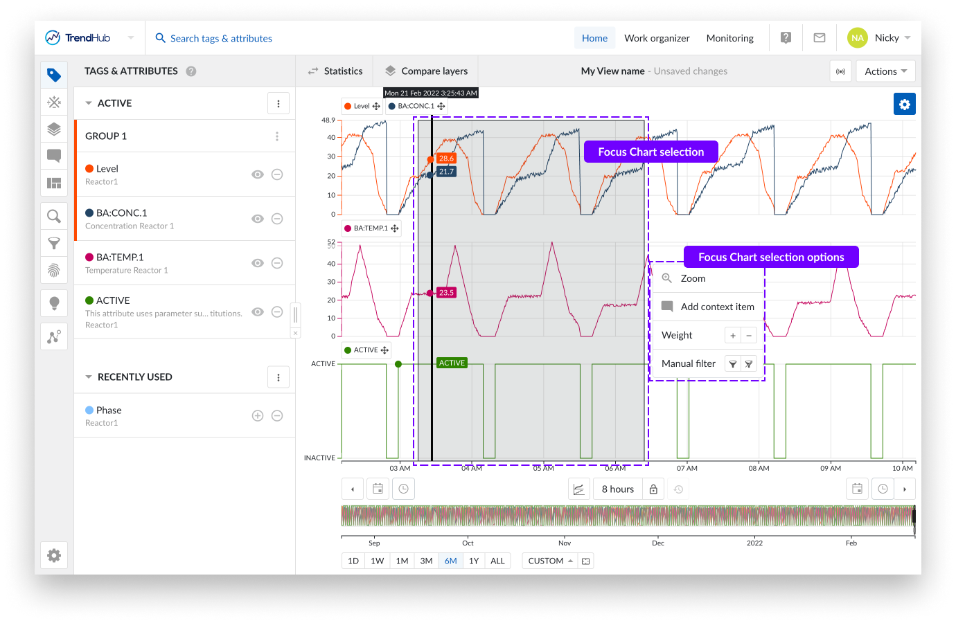
You have the following options:
Zoom: This option will zoom into the selection on the chart you have created.
Add context item: Did something happen in the selected period? Mark it with a context item. Clicking this option will start the create context item flow.
The big advantage of creating a context item in this way is that the start / end date and time are automatically filled out for the context item you are trying to create, after you enter a context item type.
More information about the creation of context items can be found here.
Weight: Increase the density of the tags and attributes in that period. Weights are used in similarity searches, to increase the importance of that selected period.
More information about weights and similarity search can be found here.
Manual filter: With this filter option, you can exclude the selected period (or include it again). Filtering out periods removes them, ensuring that they are not used in any subsequent analyses in TrendHub (e. g., statistics / compare layer table, searches, etc.)
Filtered out period settings can be saved, meaning you can use them in later sessions.
More information about filters can be found here.
Data Scooters
Data scooters are boxes on the focus chart that contain the values of all the visible tags and attributes at a specific time on the base layer.
For analog tags, values are linearly interpolated. For discrete, string and digital tags, the value of the last recorded point is displayed.
You can create an unlimited number of data scooters to compare your values of the base period at every moment in time.
Adding data scooters is done by double clicking anywhere on the focus chart (Trend and Stacked trend plot).
A data scooter with the wrong timestamp can be frustrating. Because of this reason each data scooter can be grabbed and dragged to another position on the focus chart.
When a data scooter is created, you will see the three vertical dots button. Clicking this button reveals the options for the data scooter:
Add context item
Remove all
Is a data scooter showing the start of something that is going wrong? Mark it with a context item. Clicking the data scooter's "Add context item" button will start the creation of a context item.
The advantage of creating a context item in this way is that the start date and time are automatically filled out for the context item you are trying to create, after entering a context item type. An end date and time can be set after the creation of the context item.
More information about the creation of context items can be found here.
A single data scooter can be removed in two ways. Double click anywhere on an existing data scooter, or click on the cross button in the top right corner of the data scooter.
It is also possible to remove all data scooters at once. To do this, click on the three vertical dots button in any of the available data scooters, which reveals the data scooters option list. Click the "Remove all" option to remove all data scooters.
Note
When data scooters are used on large zoomed out periods with rapidly varying data, the accuracy of the values displayed on the data scooters are limited. Best results are obtained by zooming in on the desired period.
You can create a selection on the focus chart by dragging and dropping your mouse over the focus chart. While doing this you can immediately see a grey box appear on the top left corner of the length of period you are creating.
Once completed, you can see a "highlighted" period, and a popup that provides you with actions that can be applied to the highlighted period.
You have the following options:
Zoom: This option will zoom into the selection on the chart you have created.
Add context item: Did something happen in the selected period? Mark it with a context item. Clicking this option will start the create context item flow.
The big advantage of creating a context item in this way is that the start / end date and time are automatically filled out for the context item you are trying to create, after you enter a context item type.
More information about the creation of context items can be found here.
Weight: Increase the density of the tags and attributes in that period. Weights are used in similarity searches, to increase the importance of that selected period.
More information about weights and similarity search can be found here.
Manual filter: With this filter option, you can exclude the selected period (or include it again). Filtering out periods removes them, ensuring that they are not used in any subsequent analyses in TrendHub (e. g., statistics / compare layer table, searches, etc.)
Filtered out period settings can be saved, meaning you can use them in later sessions.
More information about filters can be found here.