Event analytics
Event analytics allows you to analyze search results based on aggregated values of each search result. The start date, end date and duration, or score (in case of a similarity search) of each result is combined with the defined calculations on top of search results and can be presented in different visualizations.
The visualization modes can be used to provide ad hoc insights by evaluating how subset selections (i.e. refinements) in one metric are reflected in others, which allows you to test hypotheses or find possible root causes. Refinements are caried to all visualization modes enabling you to switch between the different visualization modes based on your needs. Refinements can also be applied on the search result list by clicking "Apply Refinements". This will update the search result list based on the active refinements after which you can continue your analysis based on a subset of the results.
Event analytics pane
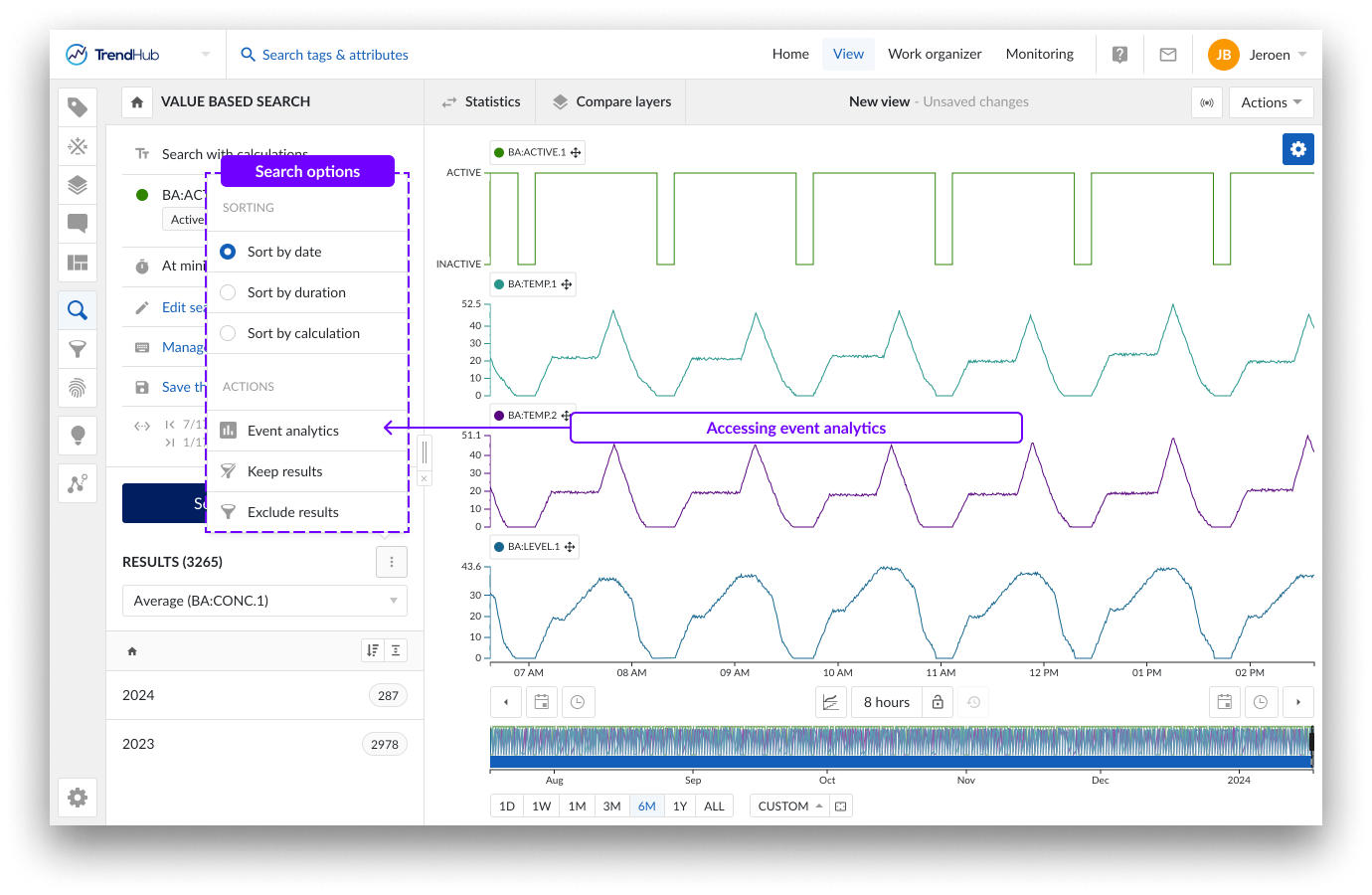
The event analytics pane can be accessed through the search result option menu.
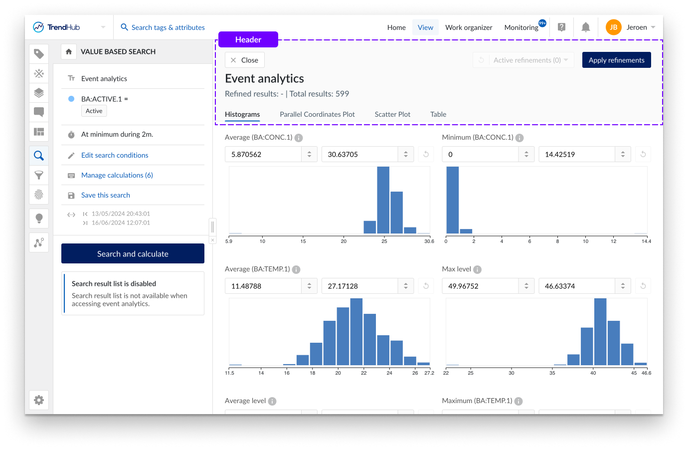
When the event analytics pane is opened, the search result list is disabled.
The header contains all information regarding the active refinements and provides options to reset refinements and to apply refinements to the search results list. Please refer to the Refining results section to learn more about ad hoc and applied refinements.
The event analytics pane can be closed by using the "Close" button or the "Apply refinements" button in the header. Switching to another TrendHub menu will also automatically close the event analytics pane.
Visualization modes
The event analytics pane offers 4 different modes of visualization:
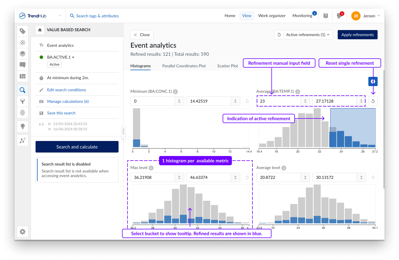
The histogram tab provides a visual representation of the data distribution for all calculations on analog or discrete tags as well as the duration of search results or the similarity score. Hovering over a single bucket provides information on the ranges of each bucket, as well as the total number of results residing within this bucket.
A subset of the data can be chosen by making a selection on the histograms or by setting the ranges manually in the numeric input fields. Histograms with active selections can be identified by the blue shaded area. When selecting subsets (i.e. making refinements), the remaining results are indicated in blue and reflected on all histograms. The number of refined results is also indicated in the tooltips.
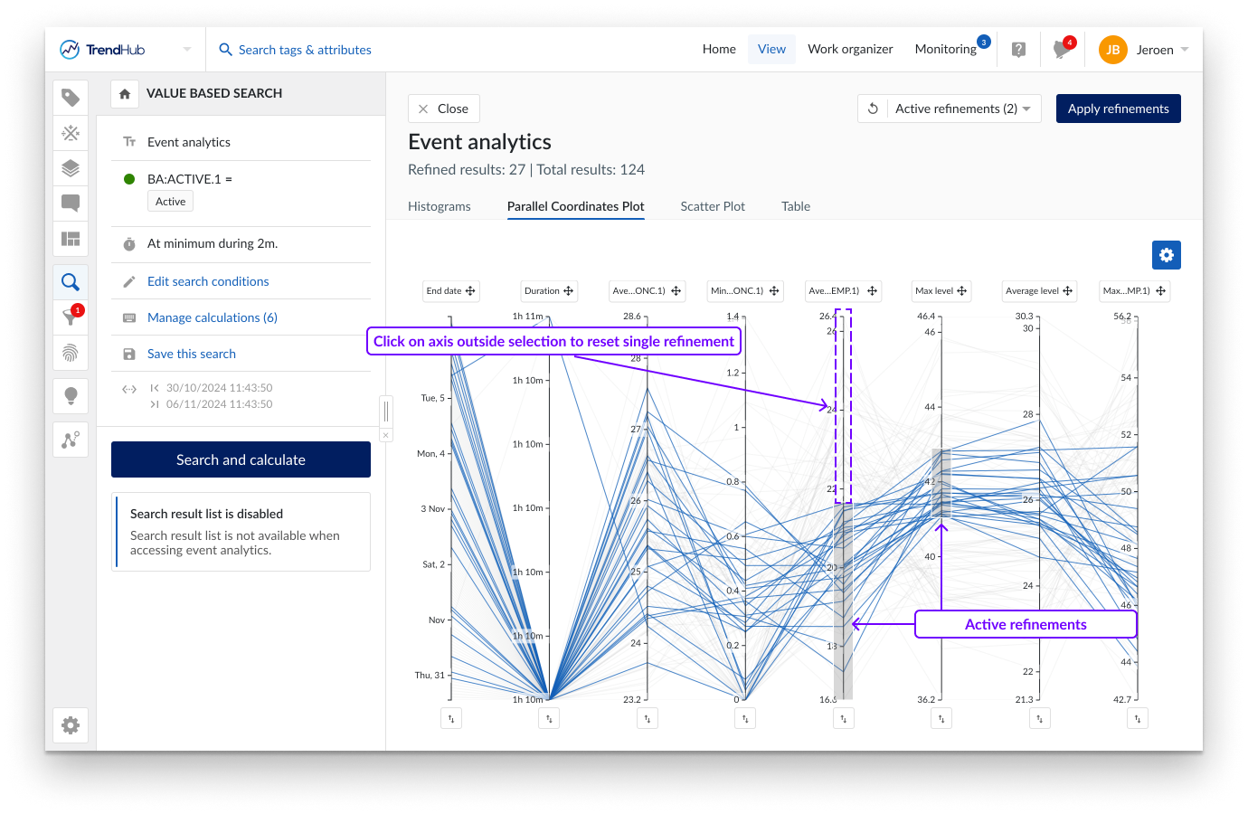
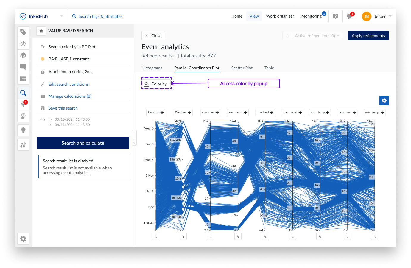
A parallel coordinates plot is a graphical method used for visualizing multivariate data. In contrast to the histogram visualization, the parallel coordinates plot shows every single search result. It consists of parallel axes, one for each metric (duration, similarity score and calculations on analog or discrete tag) and lines connecting the different axes. One blue, continuous line represents one search result. This type of plot is particularly useful to understand the relationships and trends within the search results. Look for patterns such as convergence, divergence, or parallelism of lines. These patterns can reveal correlations, clusters, or outliers in your data.
Calculations based on string or digital tags are not visualized on an axis but can be used to color the lines based on specific string values. See the section below for more details.

By default, the axes will be ordered as defined by the order of the calculations. You can move them to any location of preference by dragging the axis label. Swapping the direction of the axis is possible by clicking the button underneath an axis. These modifications are remembered within the current analysis. As soon as the search is re-executed, all these modifications are reset.
Caution
A search result is only visualized on the parallel coordinate plot if all calculations have values. In the case that one of the calculations does not have a value (e.g. due to missing indexed data or infinite values), the complete search result will be omitted from the plot. This is a key difference to the histogram visualization.
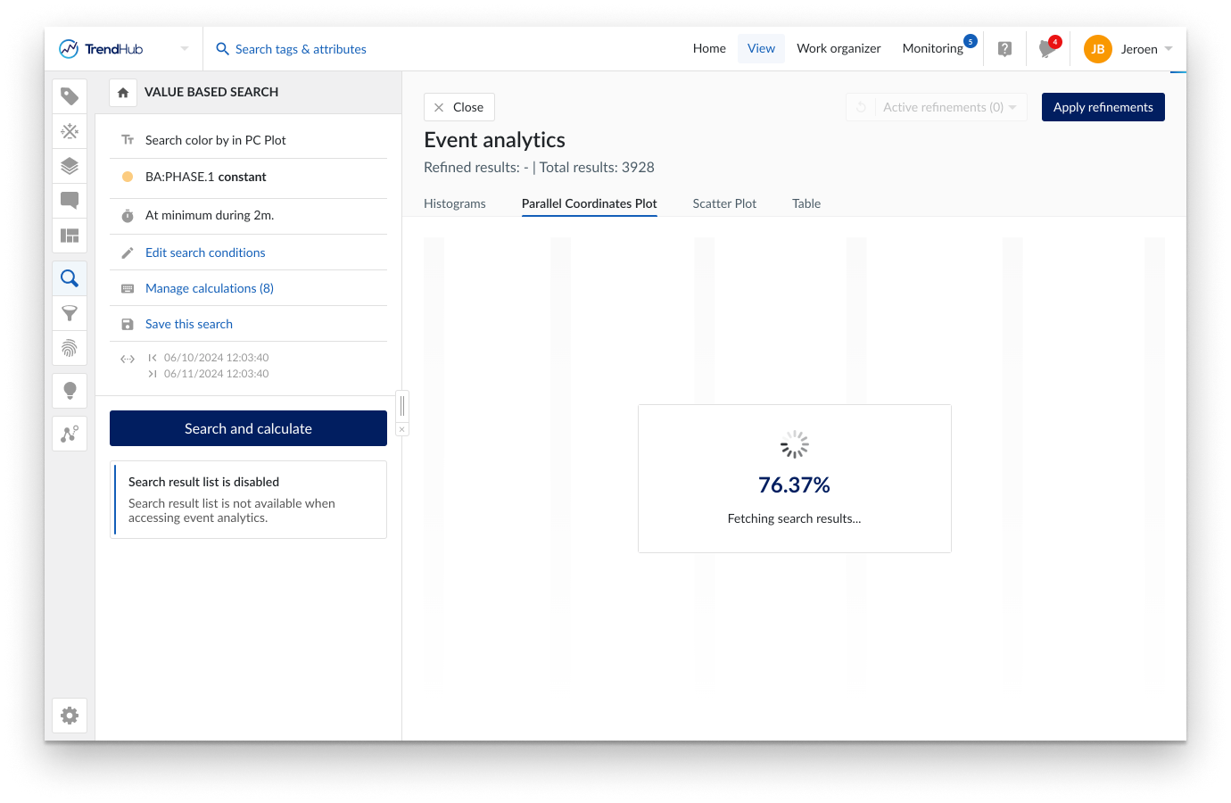
Since all results will be shown as single data points, the initial rendering of the plot can take time. A loading screen will be shown while fetching the data. When complete, the graph is displayed. At this point you can switch between the histogram, parallel coordinates plot and scatter plot tab.
A subset of the data can be chosen by selecting on an axis (i.e. making refinements). Remaining results are visualized in blue. These refinements can be made on different axes to combine different criteria. By clicking on an axis outside the selected region, the refinement is removed. Clicking the general reset button at the top right, removes all active refinements.
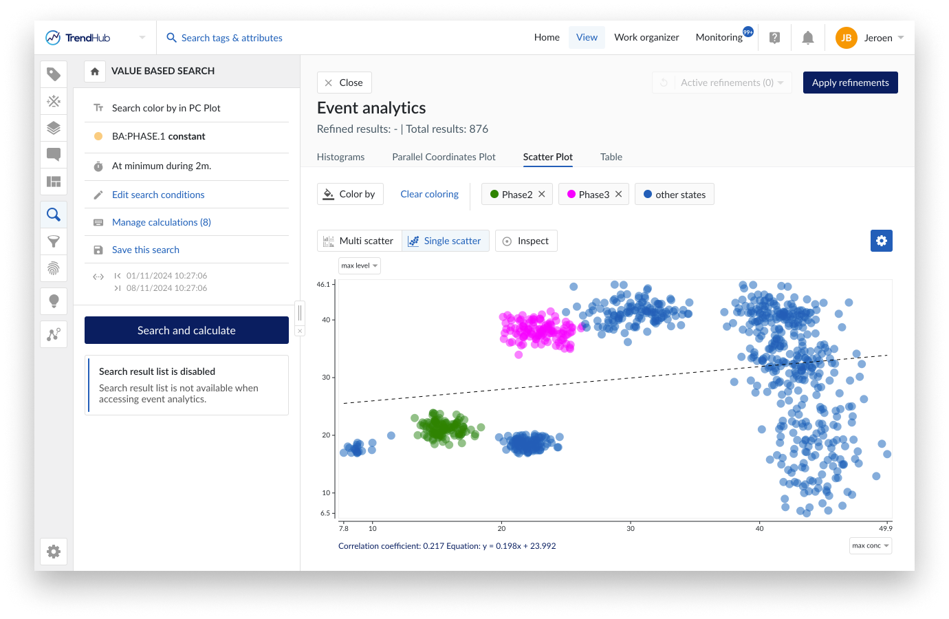
The (multi) scatter plot is an additional graphical method used for visualizing multivariate data. Unlike the parallel coordinates plot, which connects all metrics through parallel axes, the scatter plot focuses on showing the relationships between two variables at a time, representing each search result as a dot on a two-dimensional graph. This type of plot is particularly useful for identifying correlations, clusters, and outliers within your data.
In this visualization mode, multiple scatter plots are displayed simultaneously, allowing you to compare several pairs of variables at once. To ensure the plot remains clear and interpretable, only the relationships for the first five available refinement options will be shown (i.e. duration or score and the first 4 or 5 calculations depending on the type of search). If you wish to explore other variables, you can easily do so by clicking on the label of a metric. A drop down menu will appear, allowing you to select from all available options.
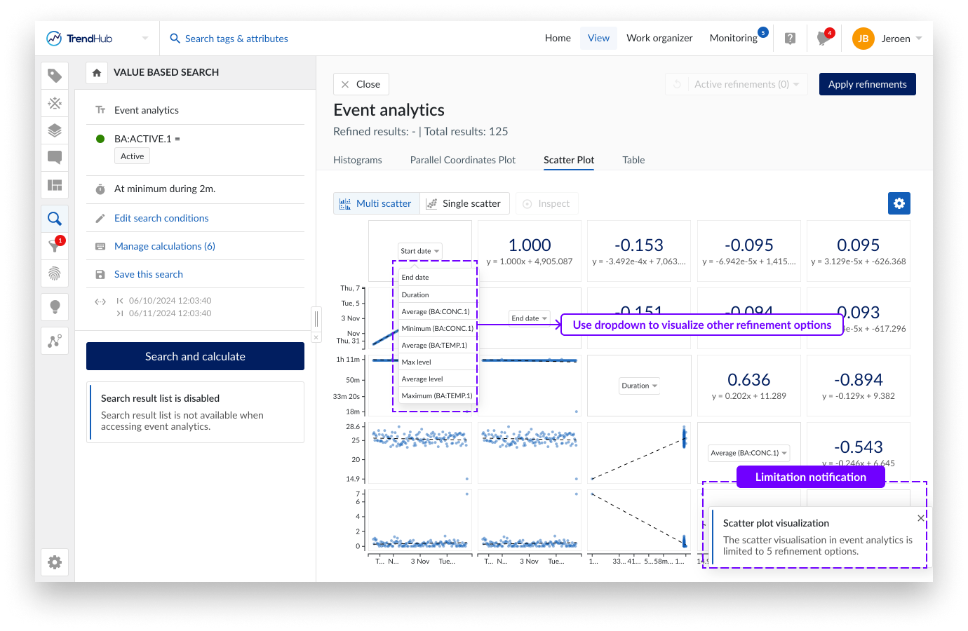
Calculations based on string or digital tags can not be visualized as an axis on the scatter plot. However, similar to the parallel coordinates plot, the dots can be colored based on specific string values. See the section below for more details.
Caution
A search result is only visualized on a single scatter plot if both metrics have a value. In case of missing data or infinite values for some tags, the total number of visualized dots can therefore be different in each single scatter plot.
Since all results will be shown as single data points, the initial rendering of the plot can take time. A loading screen will be shown while fetching the data. Once the plots are ready, you can seamlessly switch between this visualization mode and others, such as the histogram or parallel coordinates plot, using the tabs provided.
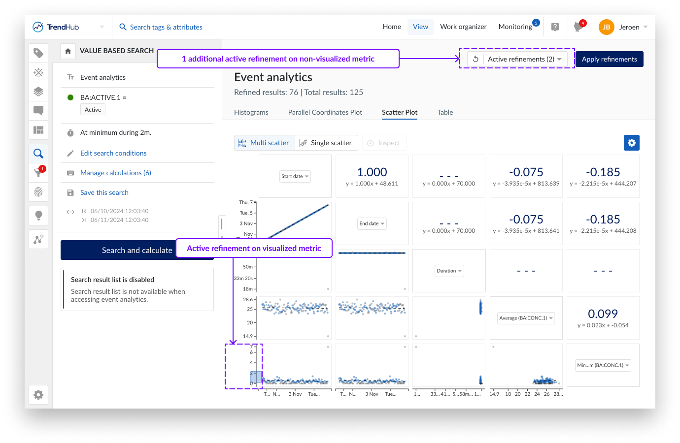
You can interact with the scatter plots by making refinements directly on the axes. These refinements help you focus on specific ranges or subsets of your data, enabling a more detailed analysis. Remaining results are visualized in blue. Refinements can be made on different axes to combine different criteria. By clicking on an axis outside the selected region, the selection is removed.
Since only 5 metrics are shown in the multi scatter plot, refinements can be active, even though no brushing is visible on any of the axes in the scatter plot. The active refinement dropdown button on the top right, however, will always indicate the total number of active refinements.
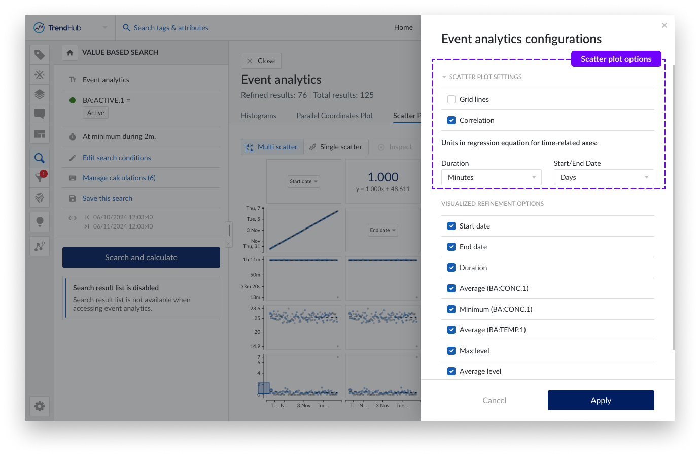
Grid lines and correlation information can be enabled/disabled via the gear icon.
Time units to be used when calculating the regression equation can be adjusted as well. For start and end date, the Epoch time is used in the regression equation. January 1st of 2024 at 4 AM GMT would therefore correspond to a time of 1704081600 seconds or 19723,17 days.
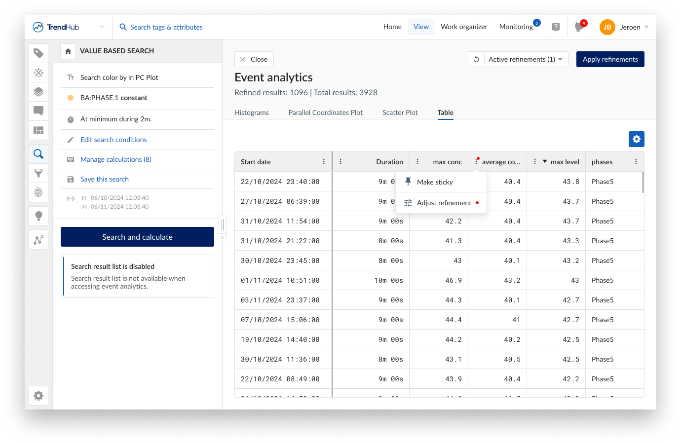
The final tab provides a tabular overview of all results with all available properties. In contrast to all other tabs, the table will only show the refined result list. This allows you to zoom in on the details of a subset of results after applying refinements. Refinements can be added or modified by using the option buttons in the table header. Active refinements are highlighted with a red dot.
Specific columns can be made sticky to ensure they stay visible when scrolling through all the properties. Columns can also be sorted, reordered and resized. These modifications are remembered within the current analysis. As soon as the search is re-executed, all these modifications are reset.

Switching between tabs
When executing a search, and opening the event analytics frame, the Histogram tab will be displayed by default. (Applied) active refinements will be transferred when switching between the tabs. This allows you to iteratively select and analyze your data based on the visualization mode which is most suitable at any given point. As long as the search is not re-triggered, the event analytics pane will open in the most recently viewed visualization mode.
Any applied visualization customization will also be remembered when switching tabs. These customizations will reset when re-triggering the search.
Customization options
The following table provides an overview of the customization options per visualization type. A couple of options are described in more detail in the subsections below.
Option | Histogram | Parallel coordinate plot | Scatter plot | Table |
|---|---|---|---|---|
Coloring based on string values | No | Yes | Yes | No |
Selecting visualized refinement options | Yes | Yes | Yes | Yes |
Reordering of refinement options | No | Yes | Yes | Yes |
Changing direction of axis | No | Yes | No | Yes |
Enabling correlation information | NA | NA | Yes | NA |
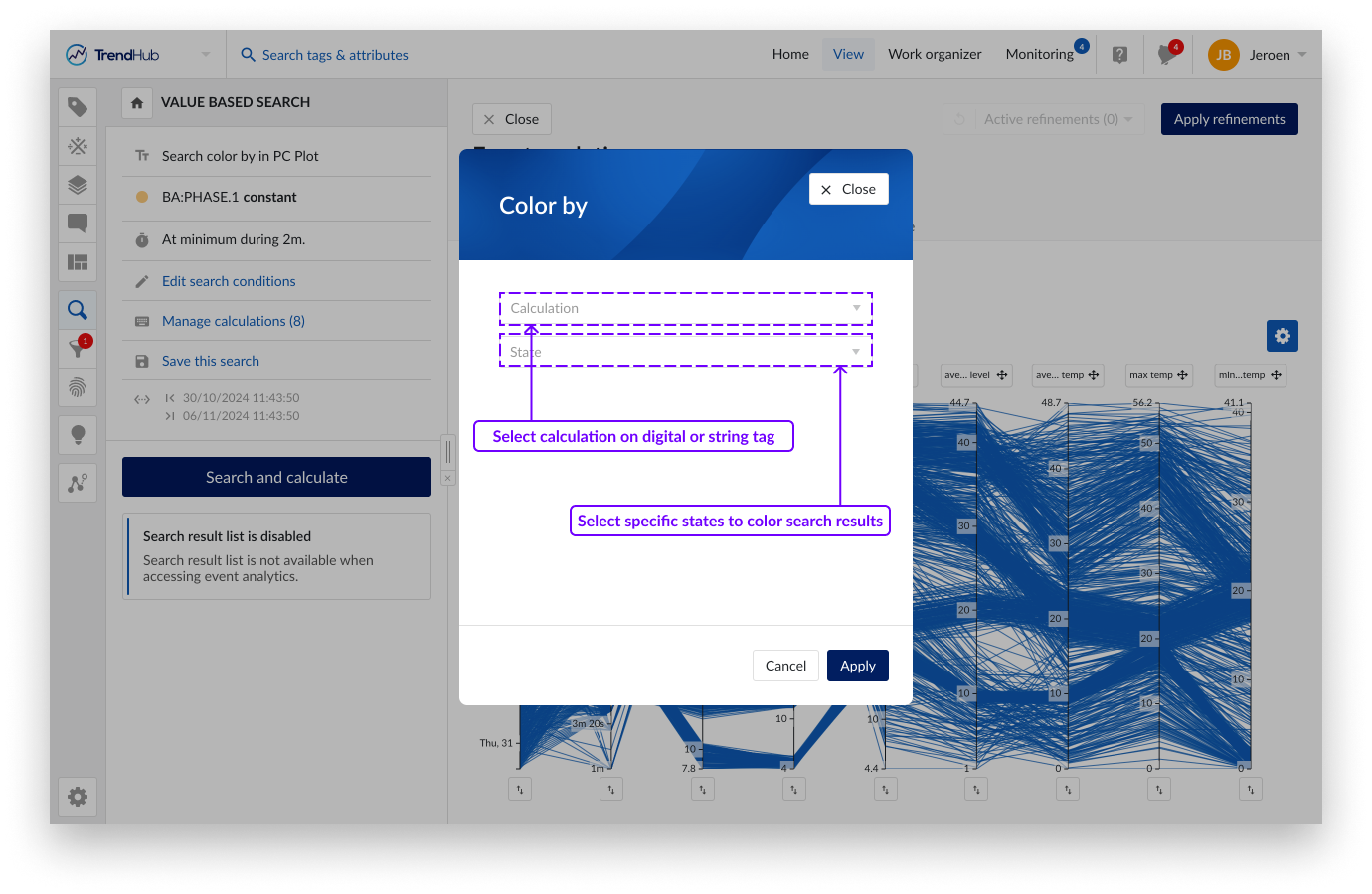
Calculations based on string or digital tags do not show up as an axis on the parallel coordinate plot nor on the multi scatter plot. However, they can be used to color the lines or dots based on specific string values. When a calculation on a digital or string tag is available, a "Color by" button will appear on top of the parallel coordinates plot and the multi scatter plot. Clicking this button will open a popup where you can select a calculation and the corresponding string values you want to distinguish by color. A maximum of 10 different string values can be selected.
A unique color will be assigned to each selected value based on a predefined set of colors. Search results with a string value not part of the 10 selected states will be grouped in other states and shown in blue. When making refinements, unselected results will become grey.
To help identify a specific state, you can hover over the corresponding label in the legend, which will highlight the results on the plot. Color highlighting of a single state can be removed by clicking the cross on the label. Use the "Clear coloring" button to remove all color formatting.
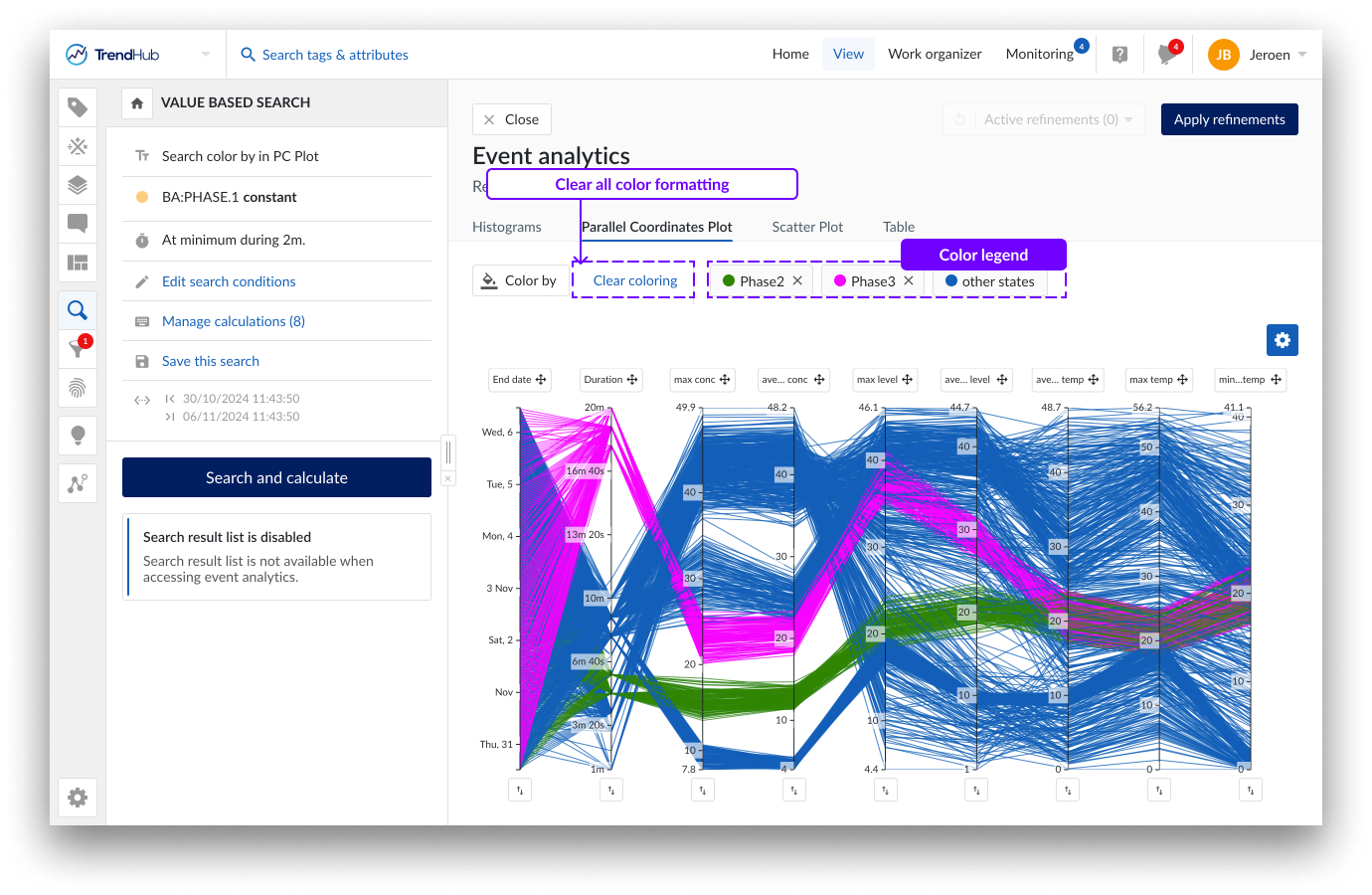
The selected states in the parallel coordinate plot and the scatter plot are always synchronized. Changing the selected states in 1 visualization will automatically be reflected in the other one.
Color formatting is remembered within an analysis. When the search is re-executed, the color formatting is reset.
A gear icon is visible on all tabs within Event analytics, containing 2 sections:
Scatter plot settings: Options to enable grid lines and correlation tiles as well as the units to be used in regression equations for time-related properties.
Visualized refinement options: A list containing all time based and numeric properties with the possibility to hide them from all event analytics tabs.
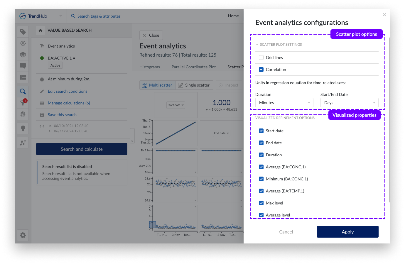
For time related properties the unit, which is used in the calculation of the regression equation, can be modified. For start date and end date the Epoch time is used in the regression equation. January 1st of 2024 at 4 AM GMT would therefore correspond to a time of 1704081600 seconds or 19723,17 days.
By default, all refinements options are visualized. The time based and numeric ones can be deselected in case a simplified visualization is preferred. Calculations on string or digital tags can not be deselected and will always be visible in the table overview.
These modifications are remembered within the current analysis. As soon as the search is re-executed, all modifications are reset.
Refining results
Refinements can be made on each visualization and will be carried to other visualizations. How refinements can be made differs per visualization type. The header is shared and contains all information regarding the active refinements and how it affects the total number of results. It also provides options to reset single or all refinements and to apply refinements to the search results list.
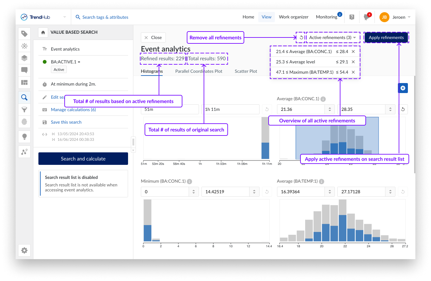
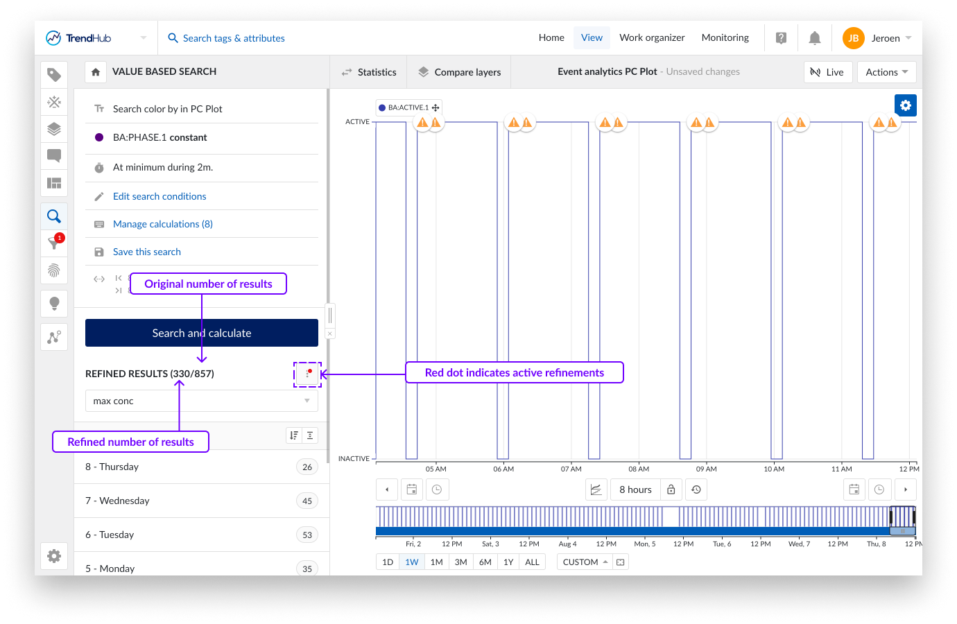
Refinements can be used for ad hoc analyses or to cleanse the search result list. Click "Apply refinements" in the top right corner to apply the ad hoc active refinements to the search result list. The search result list header will update to indicate both the number of refined results as well as the original total results. A red dot appears on the search options, indicating that the search result list has been refined. The set of refined results can now be used to continue your analysis in the time-series universe. The search result options, like filtering, creating context items, and exporting, will now only be applied on the refined results. See this article for more information on how to work with the search result list.
On re-opening the event analytics pane, these applied refinements will automatically be redrawn on the different charts and indicated in the active refinements dropdown of the event analytics header.
The number of bins for the histograms is set to a fixed value of 15 and cannot be adjusted.
No histogram can be shown if there is no variance in the resulting data.
Search refinements, as well as any applied configuration on the parallel coordinates plot or scatter plot are not saved and are reset after re-performing the search.