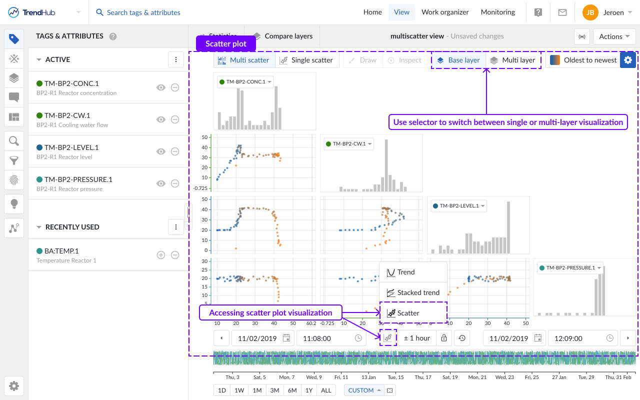
The scatter plot
The visualization mode in this article is focused on "Scatter" visualization. This mode can be selected by clicking the focus chart visualization mode button option below the chart. A multi scatter grid will be opened, where each row and column is assigned to one of the visualized tags or attributes. Each single plot shows the pairwise relationships between two tags or attributes which can help identify operational regimes.
Originally, the scatter plots only displayed the data of the base layer, even though additional layers had been added to the focus chart. From 2024.R2, scatter plots can be configured to display all visualized layers. The visualization options are different in multi-layer visualization compared to the single layer visualization.
By default, the scatter plot will open as a multi-scatter visualization (i.e. multiple tags), only showing the base layer. Use the buttons at the top right to switch to a multi-layer visualization.
In the single layer mode, scatter plots are shown solely for the data of the base layer. The pairwise relations of 15 different tags or attributes can be visualized at once, as well as the distribution of every single tag or attribute within the window of the base layer.
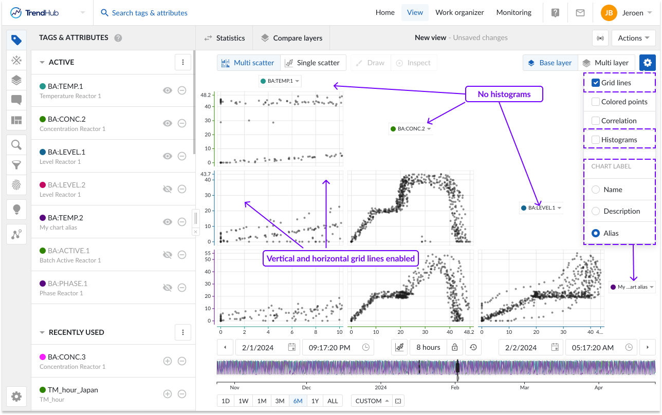
The visualization options are found at the top right of the focus chart under the blue settings button. For the single layer scatter plot the following options can be enabled or disabled:
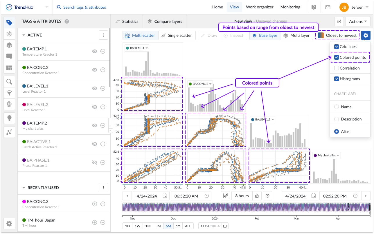
Colored points: When enabling the "Colored points" option, the color of the scatter plot data points are displayed in blue to orange, instead of the default grey/black color. The blue to orange color code indicates the transition from oldest to newest points in time. When enabled, a legend is added to the scatter plot.
Note
This option is disabled by default.
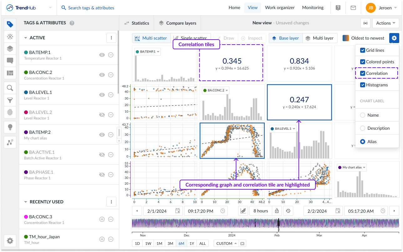
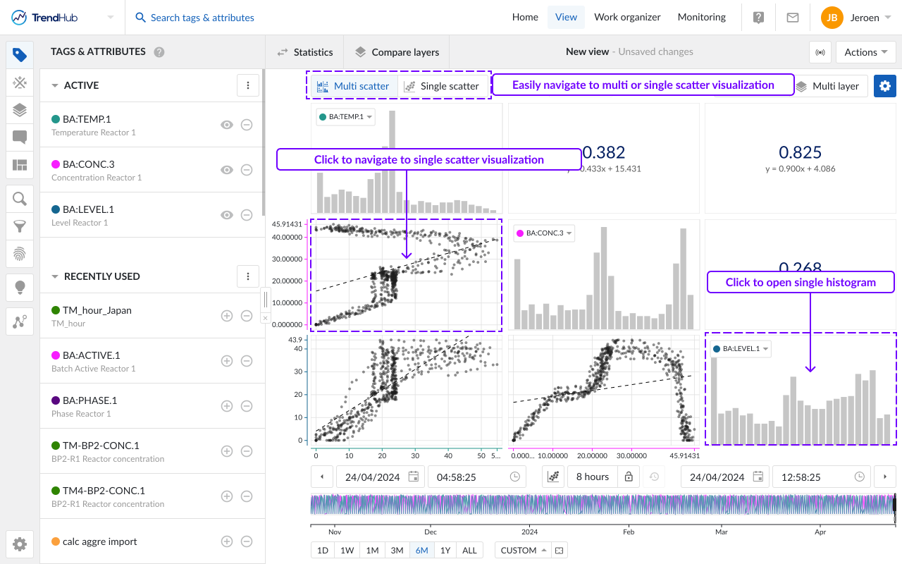
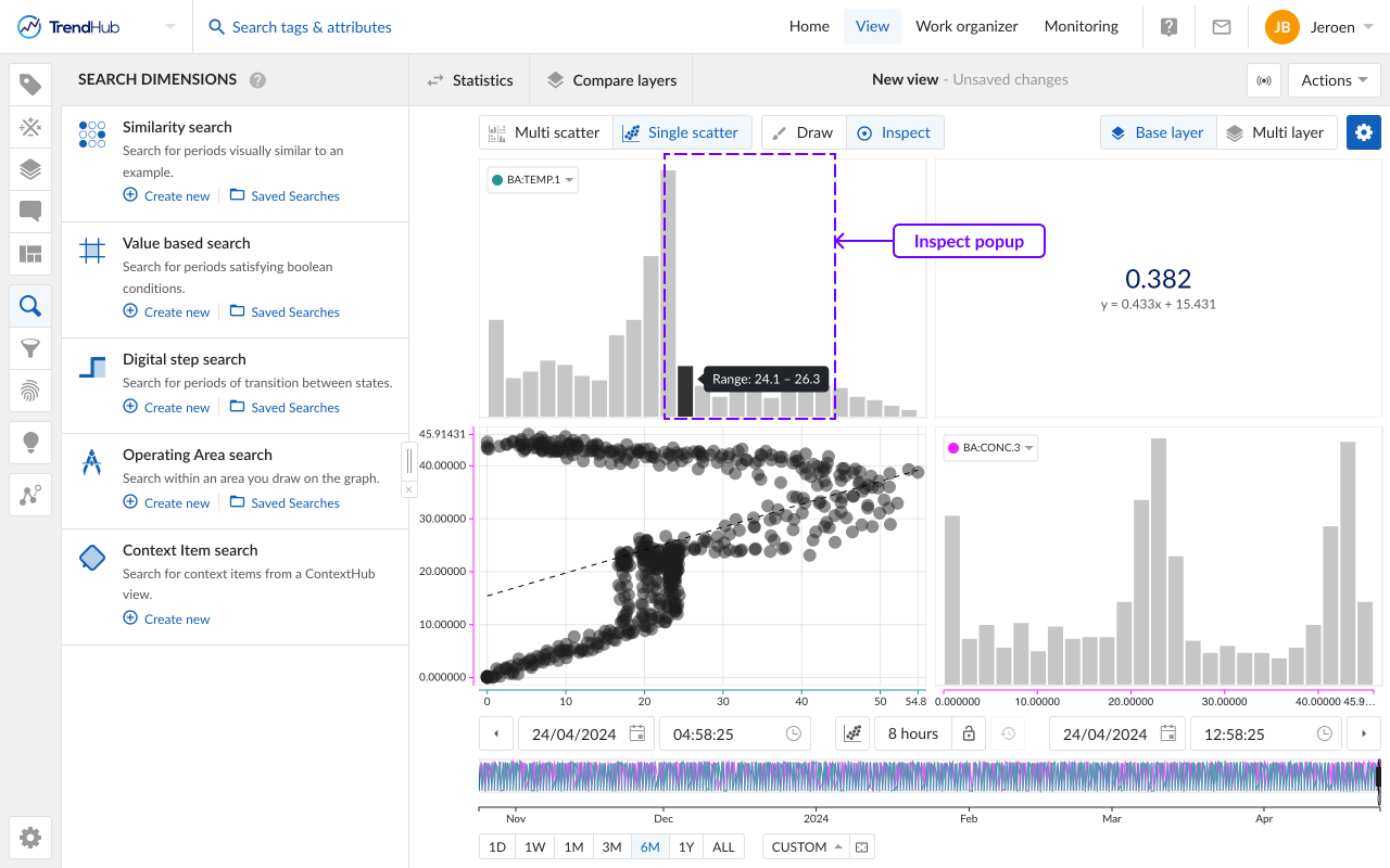
Correlation: When the option "Correlation" is enabled, additional tiles are displayed. These tiles represent the correlation coefficient together with its equation value for a specific scatter plot.
You can easily see which correlation tile is linked to which scatter plot by hovering over the tiles. The two linked tiles will be highlighted with a blue border.
Note
This option is enabled by default.
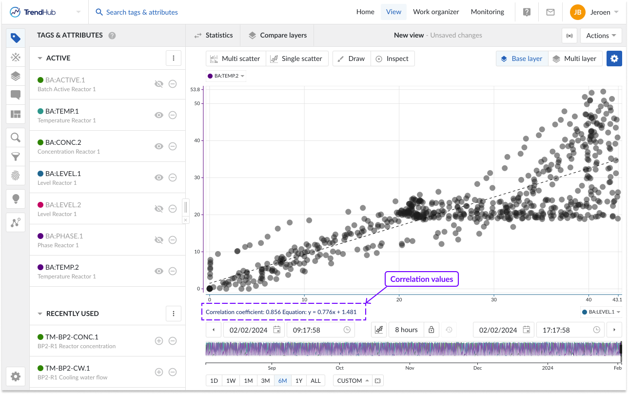
When a single scatter plot without histograms is visualized, the correlation tile is not shown. Instead, you can see the correlation coefficient and its equation value on the left below the chart.
Gridlines: Once the "Gridlines" option is enabled, gridlines appear on the single scatter charts, making it easier to read values on the chart.
Note
This option is disabled by default.
Show Histograms: The "Show histograms" option can show or hide the histograms. The histogram plots represent an approximate distribution, in bins, of the numerical data of the visualized tags or attributes.
Note
This option is enabled by default.
Chart Label: Specify how tags or attributes should be visualized on the scatter chart. The chart alias is selected by default. In case no alias is set, the tag name will be used as fallback mechanism.
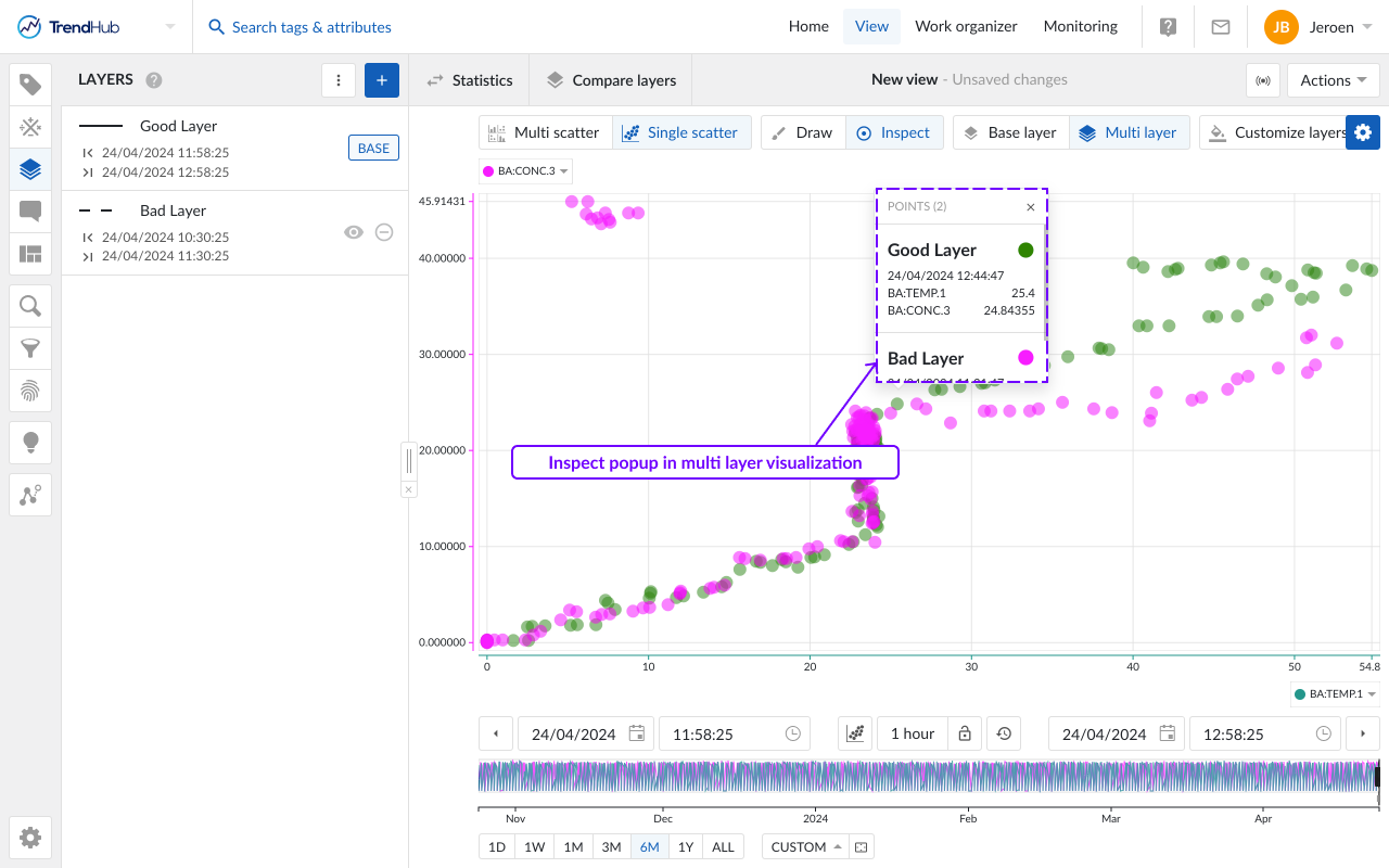
The multi-layer visualization allows users to visualize the data of all available layers at once. This visualization can only be accessed when at least 2 visible layers are present. A call to action will be shown when only the base layer is visualized. Up to 20 layers can be visualized. The number of tags or attributes is limited to 5 when entering the multi-layer visualization. When more than 5 tags are set as visible in the Tags & Attributes menu, the first 5 will be displayed. The chart labels can be clicked to easily change the visualized tag.
Note
In the multi-layer visualization, only 5 tags can be visualized at once.
Note
Similar to layers on the trend chart, all layers span the complete length of the base layer, even though they might be originating from search results which do not have the same duration.
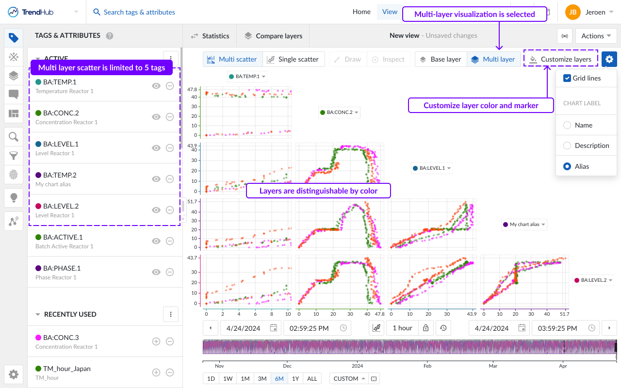
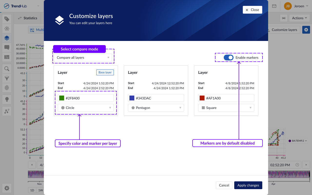
In the multi-layer visualization, data points belonging to one layer will have the same color. The customize layers button opens a popup. which allows you to define how all sublayers, will be compared to the base layer.
Compare all layers (default option)
One color can be assigned to every single layer.
Base vs the rest
Two colors can be defined: one for the base layer and one for the other sublayers.
In the 'Compare all layers' option, one color can be assigned to every single layer. For each layer, the visualized period of the layer is shown, as well as the layer’s name. By assigning the same color to periods representing the same ‘good’ or ‘bad’ behavior, this feature can be used to define deviating patterns between both behaviors.
In the Base vs the rest option, all sublayers will be visualized with the same color. This can, for example, be used to verify if the base layer’s behavior is deviating from other layers representing ‘good’ behavior.
Initial colors are automatically assigned based on a predefined set. When assigning custom colors to visible layers, these settings will be remembered in the current session.
By default, all data points are visualized as dots. To enhance the visual distinction of layers, the 'Enable markers' toggle can be activated, which will assign a unique marker to each layer.
Tip
You can change the name of a layer in the layers menu or via the compare table. Providing meaningful names will help you to easily identify layers when customizing their appearance in the scatter plot.
Other options
Gridlines: Once the "Gridlines" option is enabled, gridlines appear on the single scatter charts, making it easier to read values on the chart.
Note
Gridlines are disabled by default.
Chart Label: Specify how tags or attributes should be visualized on the scatter chart. The chart alias is selected by default. In case no alias is set, the tag name will be used as the fallback mechanism.
When enabling or disabling options in the blue gear icon, these personal settings will be stored and reused in your next TrendHub session.
Enabled options are also saved with a view and take precedence over the personal settings. This means that when you, or a colleague opens one of your (shared) views, the chart settings of the saved view will be enabled, and not the most recently stored personal setting.
Multiple levels of visualization are possible in both scatter plot visualizations. Depending on the number of visible tags or attributes, some 'levels' can be blocked and are not accessible until more data references are added.
Navigating through the levels can be done by clicking the plots themselves or using the available buttons called "Multi scatter" and "Single scatter" situated at the top left of the charting area.
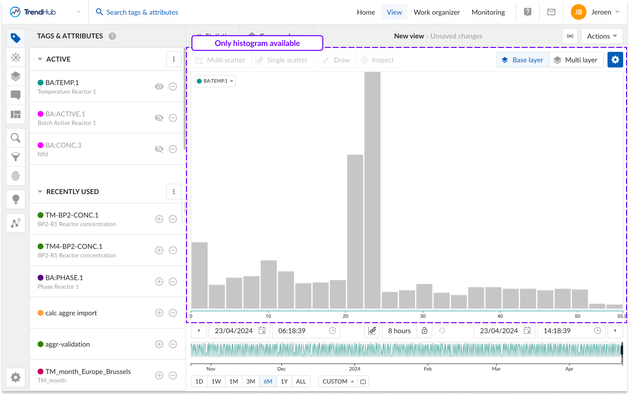
Single histogram plot: When there is only one visible tag or attribute present a histogram is visualized (Not applicable to the multi-layer visualization). In case the histogram selection is disabled, a call to action will be shown.
In the following example, only a histogram can be visualized, and both navigation buttons are disabled.
Single scatter plot: When the scatter plot is selected with two visible tags and/or attributes, a single scatter plot is visualized.
When histograms are enabled, a clickthrough is possible on the scatter plot and the histogram. Returning to the single scatter plot with both histograms is achieved by clicking the navigation button "Single scatter" (Not applicable to the multi-layer visualization).
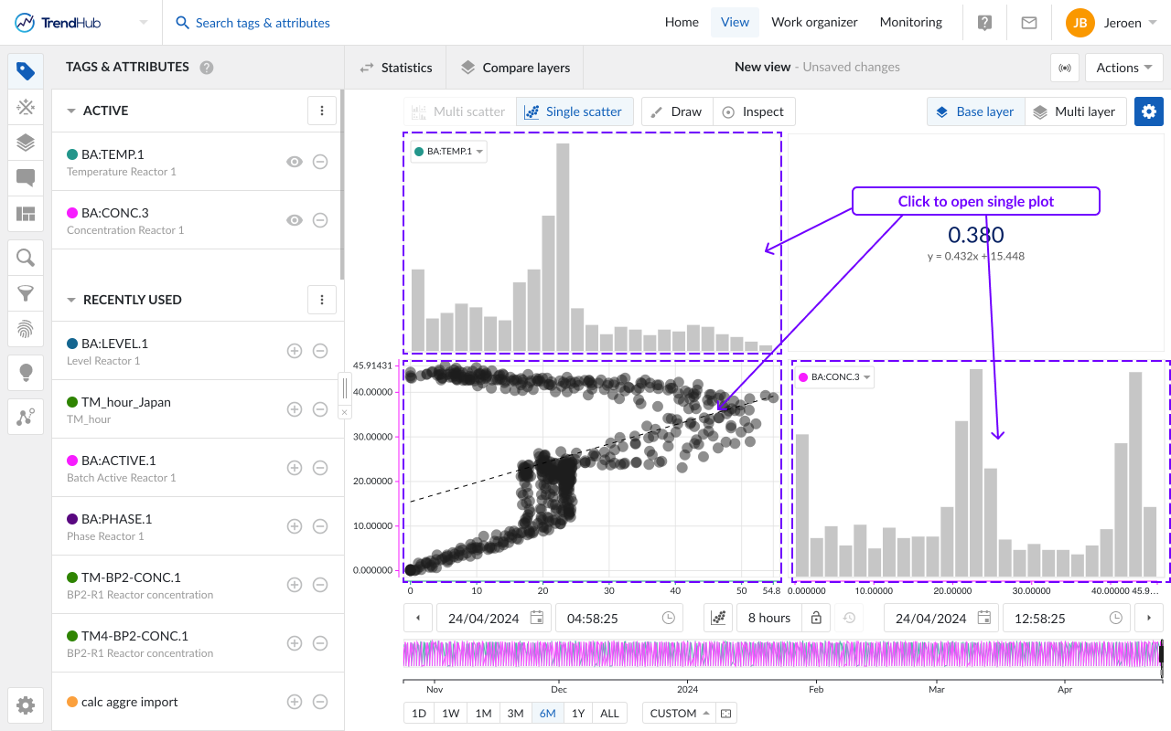
Multi Scatter plot: With two or more visible tags and/or attributes, a switch to scatter plot will visualize a multi scatter grid containing multiple scatter plots. As an indication, the 'Multi scatter' navigation button is highlighted when the multi-level is shown.
In this overview:
Clicking on a histogram, navigates to a single histogram plot of the corresponding tag or attribute (Not applicable to the multi-layer visualization)
Clicking on a scatter plot navigates to a single scatter plot with both corresponding tags or attributes. On this level you can again navigate one level deeper into a single histogram or maximize the scatter plot.
Returning to the other overviews (single or multi-level) is possible by clicking on any of the navigation buttons.
Note
A tool tip will be displayed when hovering on a disabled button, to indicate the required actions needed to unlock that button.
Next to the option to navigate through the multi scatter plots, the following options are available.
Draw and Inspect
Draw
The 'Draw' button gives you the ability to create, update or remove an area on a single scatter plot (with or without histograms), as long as the draw option is enabled (highlighted in blue). A drawn area is required when performing an operating area search.
Create an area by clicking anywhere on the single scatter plot. After the first click you will see a blue dot appearing, this dot (or corner) is connected to your mouse pointer with a line. The following clicks will place a new dot that interconnects with the previous dot and starts to form the area. To complete the drawn area, a double click is required. This will place a final dot and connects the first placed dot with the final dot.
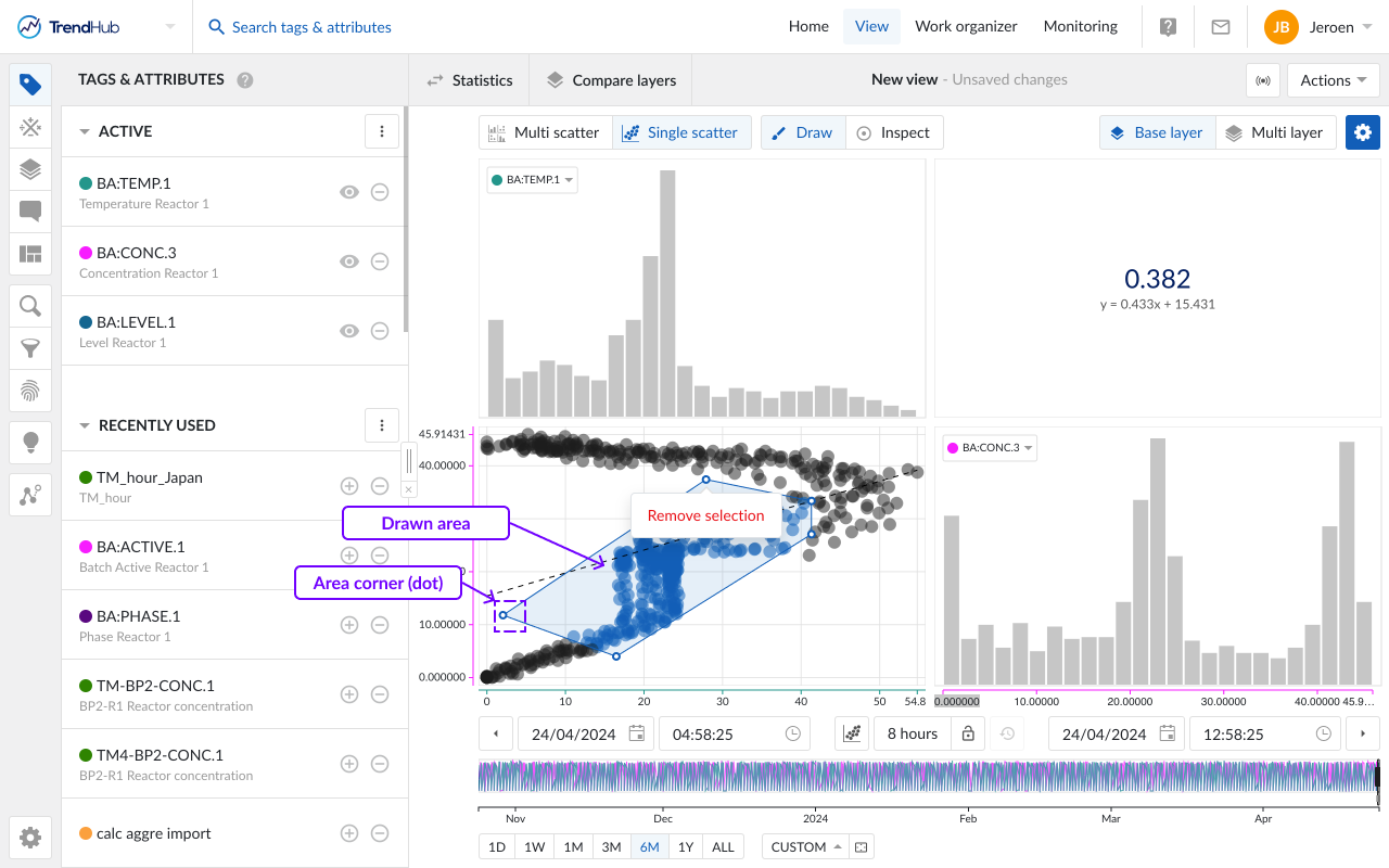
An area can easily be adjusted by dragging the corners of the area. While doing this, the dot (corner) will immediately move along and update the area. Once dropped, the area update is completed.
The area can also be moved to a better fitting location or for fine-tuning. This is done by clicking somewhere on the drawn area and moving it over to the desired location.
As a final option, you can remove the drawn area and start creating a new one. This is done by hovering over the drawn area which reveals a popup with a remove option.
Note
The draw mode can only be enabled when visualizing a single scatter plot and only one area can be drawn.
Inspect
The Inspect mode enables you to dive deeper into the details of the visualized data. The inspect mode can be enabled in the single scatter visualization as well as on the histogram visualization.
When enabled, hovering over data points in the single scatter plots, will activate a popup containing the values of both data references (tags and attributes) and the timestamp of occurrence. When multiple layers are visualized, the layer name, color and marker are indicated as well.
In case of overlapping data points, the popup will provide a list of all data points in that specific region.
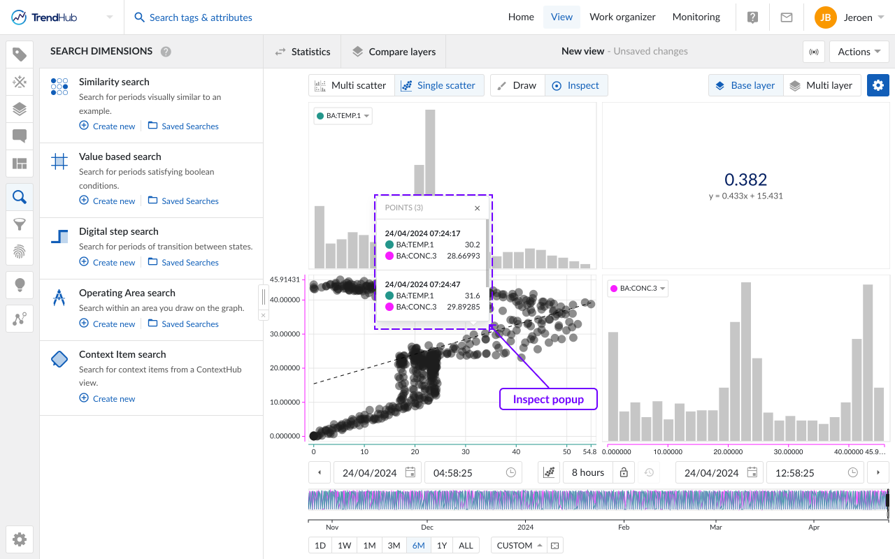
Hovering over the bins of the histograms will reveal the specific bin ranges.
Tag selection - All visualized tags will be shown in the multi scatter plot. To change the order of the charts, you can change the order in the tag list, or use the labels of visualized tags or attributes on the chart itself. A dropdown will appear, containing all visualized tags.
This dropdown is also available when viewing single scatter and when viewing multiple layers where the number of tags is limited to 5. This short-cut makes it easy to change the visualized tags in any visualization. The order in the Tags and Attribute list will change accordingly.
Time Navigation - The buttons underneath the focus chart remain fully functional in the scatter plot mode and can be used to modify the visualized time range. Read the time navigation article to learn more.