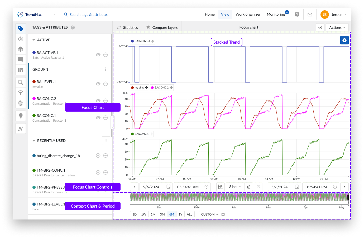
Focus Chart
Visualization modes
As soon as a tag or attribute is added and active, it's visualized on the focus chart. The focus chart can present your data as a:
Stacked trend plot
Trend plot
Scatter plot
The stacked trend plot is the default visualization mode. The mode can be changed by clicking the focus chart visualization mode button underneath the chart.
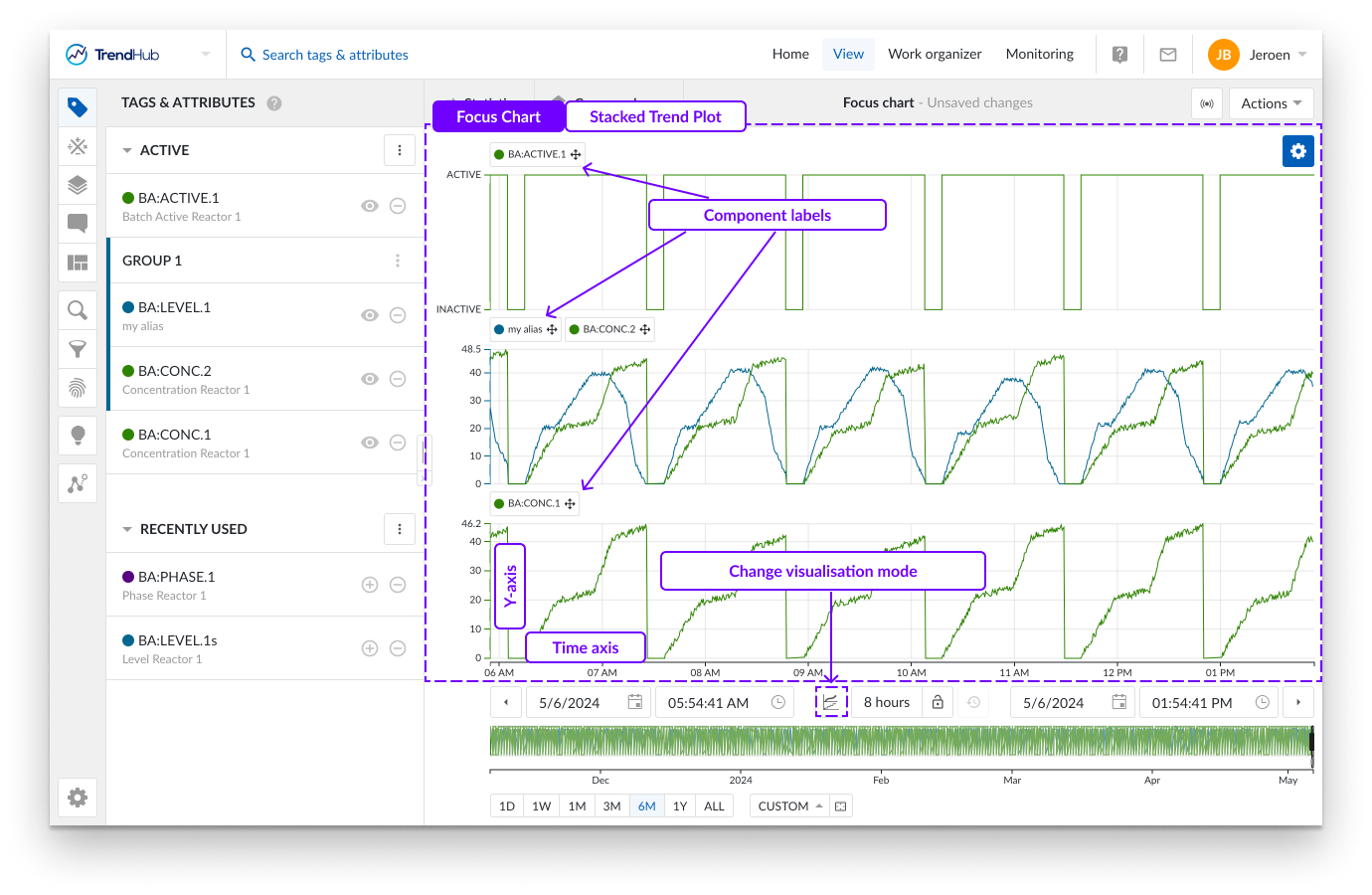
In stacked trend plot mode, each tag or attribute receives an individual swim lane on the chart to visualize its time series data.
As displayed on the image above, you can see three swim lanes. By default, each of these swim lanes represent one tag or attribute. On the left of each row, the y-axis is located. By default, the y-axis of each tag is set to the auto scale setting which makes sure all data is visible. The auto scale updates when needed.
The scale setting can be changed for each tag individually (auto or manual scale) and will be remembered for future sessions. Underneath the swim lanes an x-axis is shown, which represents the date and time range of the visualized focus chart.
A second visualization option is called Trend.
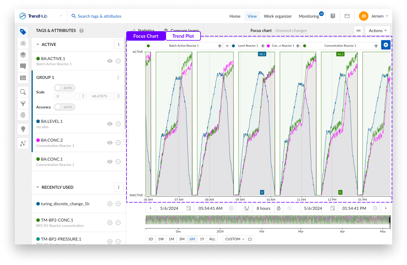
All tags and attributes are shown in one large swim lane with labels set above the chart, which is the main difference compared to the stacked trend plot.
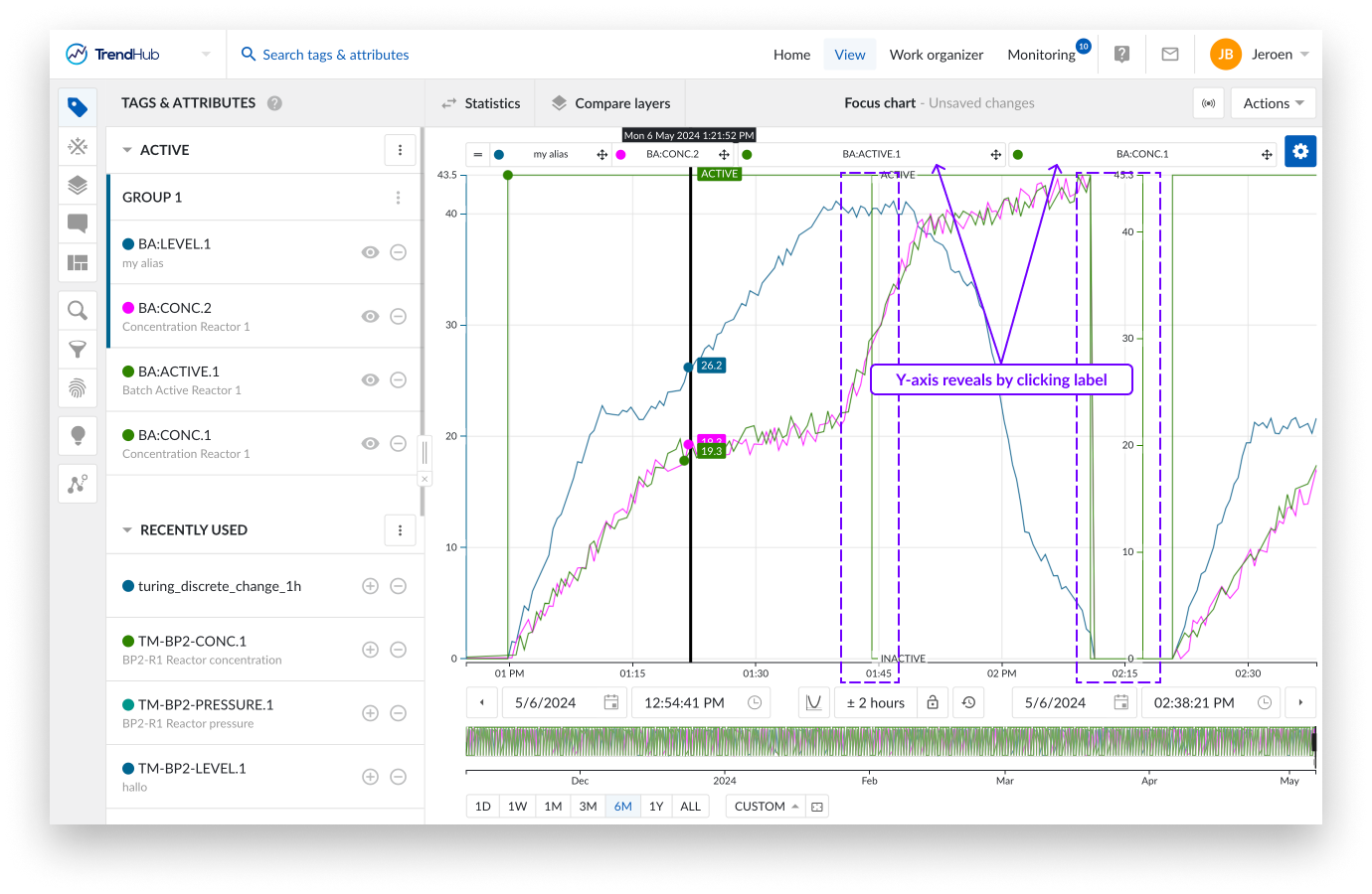
To avoid clutter of the chart, the regular trend chart offers the ability to hide (or visualize) a y-axis for the second and following tags or attributes on the chart. This is done by clicking the label of that tag in the focus chart.
The third visualization option is the scatter plot. The (multi) scatter mode highlights correlations between the different visualized tags for the selected time period. More details about the scatter plot can be found on this link.
Per chart there are different settings you can modify to fine-tune the chart to your liking. The settings are found at the top right of the focus chart behind the blue settings button.
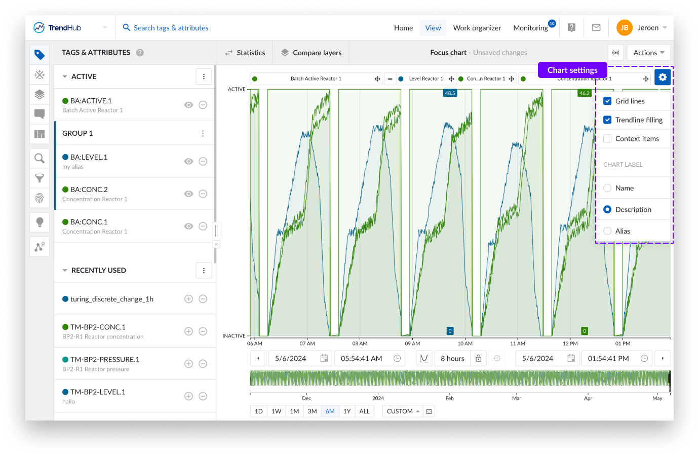
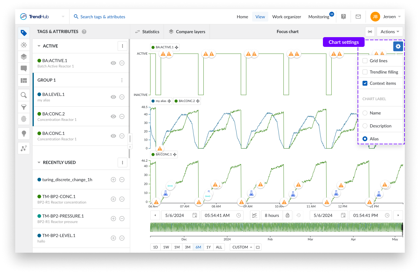
For the 'Trend' and 'Stacked trend' chart the following settings are available.
Context items: When enabling the "Context items" option, the context items associated with the period you have visualized will appear on the chart. This option is enabled by default for both time series visualization modes.
Note
Many context items will impact the performance of the chart.
Trendline filling: By checking the 'Trendline filling' option, the area under the curve of each tag and attribute will be filled with a shaded color. This option is enabled by default for the Trend charts.
Gridlines: Selecting this option places gridlines onto the chart, making it easier to read the values. This option is disabled by default for both time series visualization modes.
Chart label: This section allows you to specify how tags or attributes will be indicated on the focus chart (Name, Alias or description). The alias is selected by default. Tag or attribute names will be used as fallback in case there is no chart alias or description available. A custom chart alias can be set in the tag details. See this article for more information.
Note
The settings of the different visualization modes are saved separately for your user, which means you can have one setting enabled for one mode while that same setting is disabled for the second mode. The options will be saved and reused in your next session.
Note
All chart settings are saved inside a view. Meaning, when a colleague opens one of your shared views, your chart settings will be enabled for that view.
Reorganizing tags, attributes
In both trend modes you can reorganize the tag labels on the chart by grab and drop to another location. In the trend plot you move a label next to another, while in the stacked trend plot you move the labels in between different swim lanes.
By doing this the order of tags and attributes will be changed on the plot as well as in the Tags & Attribute list.
Creating groups is also possible. You can do this by dropping a label on top of another label. Once a group is created, the scale setting of the first tag in the group is used for the whole group. Group scale settings can also be adjusted. Click the group in the Tags & Attributes list to do this.
Note
For more information about grouping please check the following link.
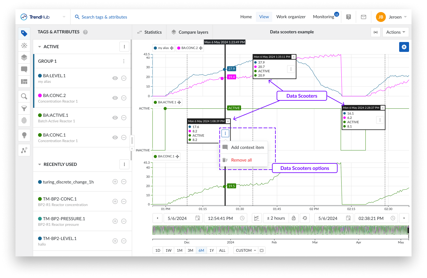
Creating data scooters
Data scooters are boxes on the focus chart that contain the values of all the visible tags and attributes at a specific time on the base layer. For analog tags, values are linearly interpolated. For discrete, string and digital tags, the value of the last recorded point is displayed. You can create an unlimited number of data scooters to compare your values of the base period at every moment in time.
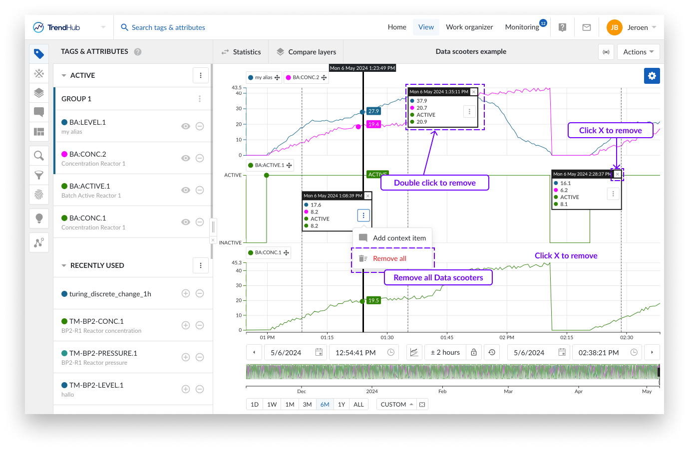
Adding data scooters is done by double clicking anywhere on the focus chart (Trend and Stacked trend plot). Each data scooter can be grabbed and dragged to another position on the focus chart as desired. A single data scooter can be removed in two ways. Double click anywhere on an existing data scooter or click on the cross button in the top right corner of the data scooter.
Note
When data scooters are used on large zoomed out periods with rapidly varying data, the accuracy of the values displayed on the data scooters are limited. Best results are obtained by zooming in on the desired period.
When a data scooter is created, you will see the three vertical dots button. Clicking this button reveals the options for the data scooter:
Add context item - Is a data scooter showing the start of something that is going wrong? Mark it with a context item. Clicking the data scooter's 'Add context item' button will start the creation of a context item.
The advantage of creating a context item in this way is that the start date and time are automatically filled out for the context item you are trying to create, after entering a context item type. An end date and time can be set after the creation of the context item.
More information about the creation of context items can be found here.
Remove all - A single data scooter can be removed in two ways. Double click anywhere on an existing data scooter or click on the cross button in the top right corner of the data scooter.
It is also possible to remove all data scooters at once. To do this, click on the three vertical dots button in any of the available data scooters, which reveals the data scooters option list. Click the 'Remove all' option to remove all data scooters.
Focus chart selection
You can create a selection on the focus chart by dragging and dropping your mouse over the focus chart. While doing this you can immediately see a grey box appear on the top left corner of the length of period you are creating.
Once completed, you can see a highlighted period, and a popup that provides you with actions that can be applied to the highlighted period.
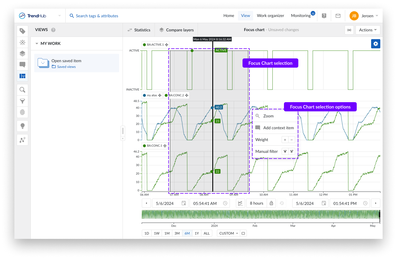
You have the following options:
Zoom: This option will zoom into the selection on the chart you have created.
Add context item: Did something happen in the selected period? Mark it with a context item. Clicking this option will start the create context item flow.
The big advantage of creating a context item in this way is that the start / end date and time are automatically filled out for the context item you are trying to create, after you enter a context item type.
More information about the creation of context items can be found here.
Weight: Increase the density of the tags and attributes in that period. Weights are used in similarity searches, to increase the importance of that selected period.
More information about weights and similarity search can be found here.
Manual filter: With this filter option, you can exclude the selected period (or include it again). Filtering out periods removes them, ensuring that they are not used in any subsequent analyses in TrendHub (e. g., statistics / compare layer table, searches, etc.)
Filtered out period settings can be saved, meaning you can use them in later sessions.
More information about filters can be found here.
Navigation
TrendMiner's easy to use time navigation will help you move quickly through all your data that is being visualized, to find trends that help you define a problem or to confirm a hypothesis.
Data is visualized on the Focus chart and the Context chart. The Context chart sets the scene and defines the data on which specific searches and filters will be applied. The Focus chart represents the biggest part of the application and shows the time series data for the period of interest. Both levels can be used to navigate in time.
The focus chart itself offers various controls for time navigation.
Chart zooming (in and out) can be done in scroll fashion with your mouse or touchpad.
You can also zoom in on the chart when a selection is created on the focus plot. This is done by a click and drag action on the focus chart, creating a greyed selection. By doing this you are highlighting your interest in the period. When the area is selected, a selection menu appears including a zoom option.
Panning is another way to quickly move through time or to increase the current time period. This is done using drag and drop functionality added to the time axis.
Depending on the state of the lock (Focus chart controls) the behavior is different.
Closed lock
The whole period is moving to the left or right (period stays fixed).
Moving to the right shows older data.
Moving to the left shows newer data.
Open lock
The period gets bigger, loading more content on one side.
Moving the axis to the right adds older data to the focus chart, the end date stays fixed.
Moving the axis to the left adds future data to the focus chart, the start date stays fixed.
Note
Note: The default value of the lock button is set to unlocked.
Below the focus chart there are options which give you the ability to move through the time on the focus plot.
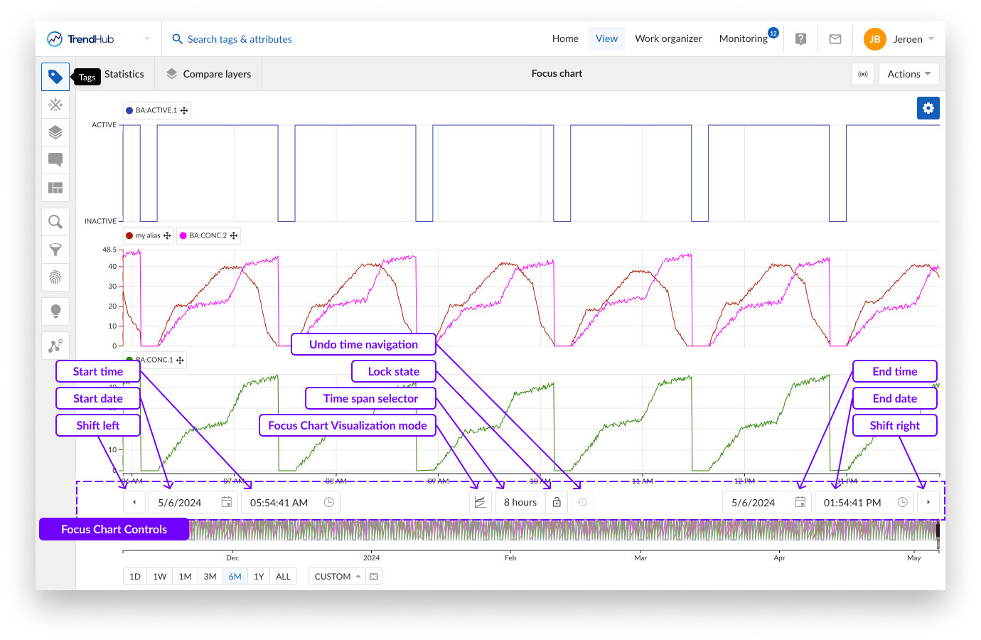
The shift buttons (left and right arrow buttons) will shift the focus chart into their respective directions. The response here depends on the state of the lock button, mentioned earlier.
When the button is unlocked, both buttons will add 20% of the current window size to the period. When the lock button is locked, the buttons will move the chart to the left or right, by 20%.
Next to the shift buttons on the left and right, you will find the date and time pickers. Use these buttons to select the start and end time of the focus chart.
To the left of the focus chart visualization button, sits the time span selection option. By selecting the time span picker, you open an option to apply preset time frames to the focus chart, enabling a quick and effortless way to frame the time span you wish to analyze.
The start time is updated when using this option, but the end date remains the same.
The following time frames are included: 1 - 2 - 8 hour(s), 1 - 7 - 30 day(s) or the possibility to enter specific time periods.
With the custom time period you can select the exact period you wish to see displayed on the focus plot. To input a period simply use y for year, M for month, w for week, d for day, h for hour, m for minute and s for second.
E.g.: for a period of 1 week, 2 hours, 2 minutes, and 10 seconds, simply input the following:
1w 2h 2m 10s, then press enter.
Once you press enter, the focus chart expands or contracts to the period you requested.
The lock button itself is located to the right of the time span selection button.
The final chart control button, is the undo time navigation button, located to the right of the lock button. This option is by default disabled but can restore any functional change to your current view regarding the previous state of the date and time settings, thereby undoing any time navigation action.
Note
When you load a new view, enable predictive mode, or enable a live mode view, the undo time navigation button is reset.
The context chart shows an overview of the relevant data to examine (applicable on searches and filters). Below the chart you will find tools that can help you set your context chart, and also help you understand the link between the context and focus chart.
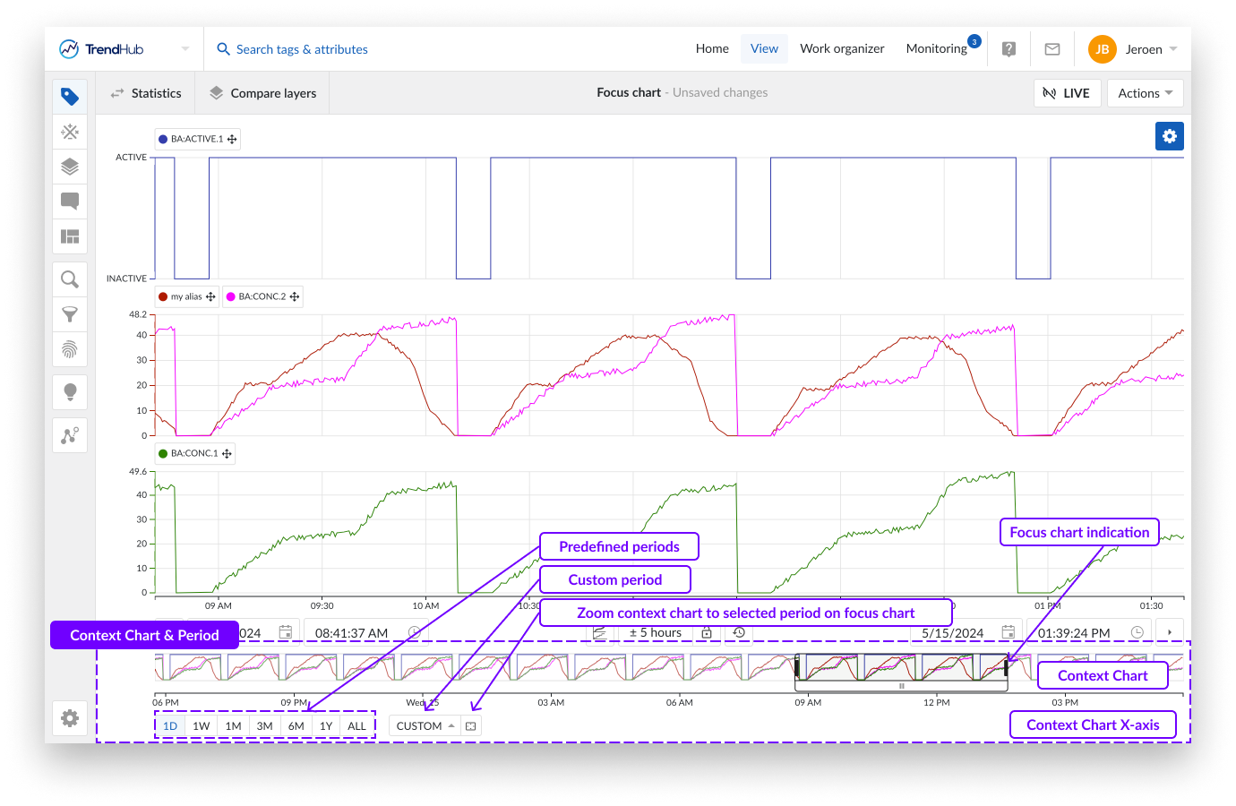
The context period is the period that is visualized in the context chart and is the period that is used when performing searches or activating filters in TrendHub.
There are multiple ways to change the context period.
Note
Each update with these buttons immediately adjusts the context period and chart. Any changes made can be reverted with the "undo time navigation" button.
Note
The default value of the context period, when logging in to TrendHub, is set to 6 months.
Beneath the context chart, you will see options that indicate a period of time. The first group of options are predefined periods. Clicking these buttons zooms the context chart into one of the following periods:
One day (1D), now moment - 1 day
One week (1W), now moment - 7 days
One month (1M), now moment - 1 month
Three months (3M), now moment - 3 months
Six months (6M), now moment - 6 months
One Year (1Y), now moment - 1 year
All data (ALL), Start of index horizon to now moment
Note
The months / year durations mentioned are effectively a month or a year. E.g.: 3 months --> from 2nd of January 2022 08:30:00 to 2nd of April 2022 08:30:00.
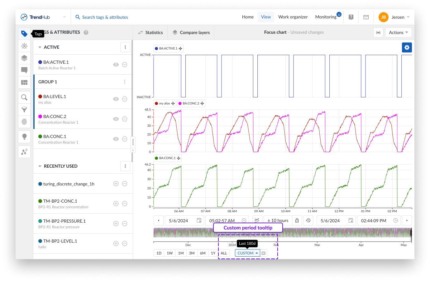
On the right of these predefined buttons, a "Custom" button, allows the setting of a customized context period.
With the first option "Context period range", you can enter a custom period which behaves the same as the predefined buttons. Meaning, you can set the desired last 'custom range' (E.g.: 5d 8h 50m 42s) which results in the now moment - entered value.
The second option "Custom context period" lets you define the start AND end date, and time for the context period.
Note
When the custom button is set, the entered value will be displayed in a tooltip when hovering on the button.
Another way to update the context period is to use the button "Zoom context chart to selected area" which is located to the right of the "custom" button. Clicking this button will zoom your context chart into the period you have visualized on the focus chart.
As a final option you can adjust the context chart by dragging the time axis of the context chart. Similar to the focus plot, where you can increase or move the time axis depending on the state of the lock.
The context chart provides a rough indication of the evolution of the time series data in the selected context period. The period which is visualized on the focus chart is indicated on the context chart.
The following actions can be used to modify the focus chart:
Selecting a region on the context chart.
Adjusting the selected region by using the edges.
Moving the selected period by moving the white box underneath.
Selecting the complete context chart by clicking on the outside of the selected region.
Note
For easy navigation to a period of interest, it is often best to first select a longer period by using the context chart, then work a more accurate selection on the focus chart.
Exporting data
Data represented in the focus chart can be exported in multiple ways (e.g. as an image or an Excel file). More information on data export can be found here.