Scatter View
View modes
The scatter visualization enables you to view correlations and distribution of your context data fields to gain insights from events using a scatter plot.
This option can be selected by clicking the “Scatter” tab option in the top bar above the chart.
Note
Scatter is currently only available with a “Type” filter in place.
Note
Scatter is not currently available when using the “Creation date” time filter.
Context Scatter Settings
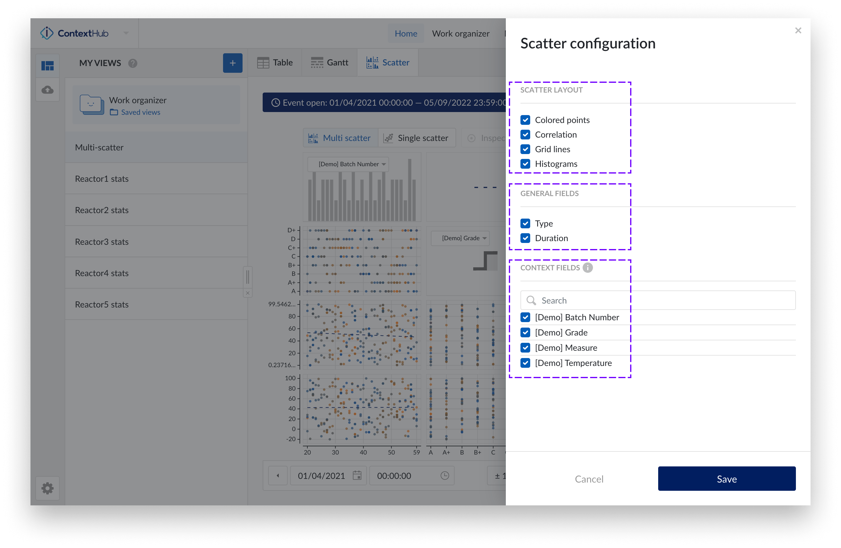
The image below shows an overview of the scatter settings side panel. In this panel you can configure the “Scatter layout” as well as select the relevant context item type fields to be plotted. When all necessary changes are in place the configuration can be saved by clicking the “Save” button, located in the bottom right on the side panel.
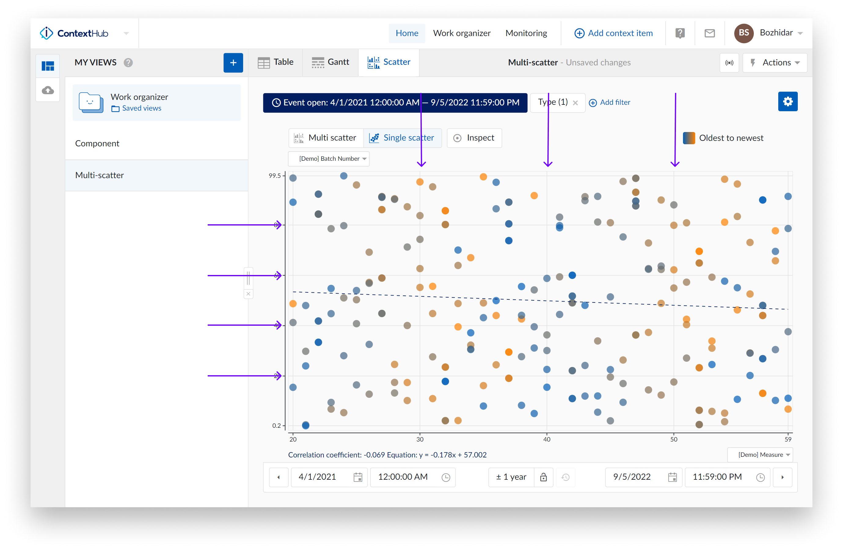
Access the settings by clicking the blue settings button at the top right of the chart.
Note
When opening a scatter for the first time in a view – the settings side panel opens by default.
Note
When there are more than one context item types selected in the present type filter, only the fields that are present on all specified context item types in the filter can be selected to be plotted on the chart.
Note
When a change in the type filter is made that affects the chart, a confirmation dialogue will appear providing the possibility to reverse the changes or confirm. If the changes to the filters are confirmed, fields that are not present on all specified context item types will be removed from the scatter chart configuration.
For the Scatter chart we have the following available layout settings:
Colored points: When enabling the "Colored points" option, the scatter plot data points are displayed in a color scale from blue to orange, instead of the default grey to black color scale. The blue to orange color scale indicates the transition from oldest to newest points in time.
Note
This option is enabled by default.
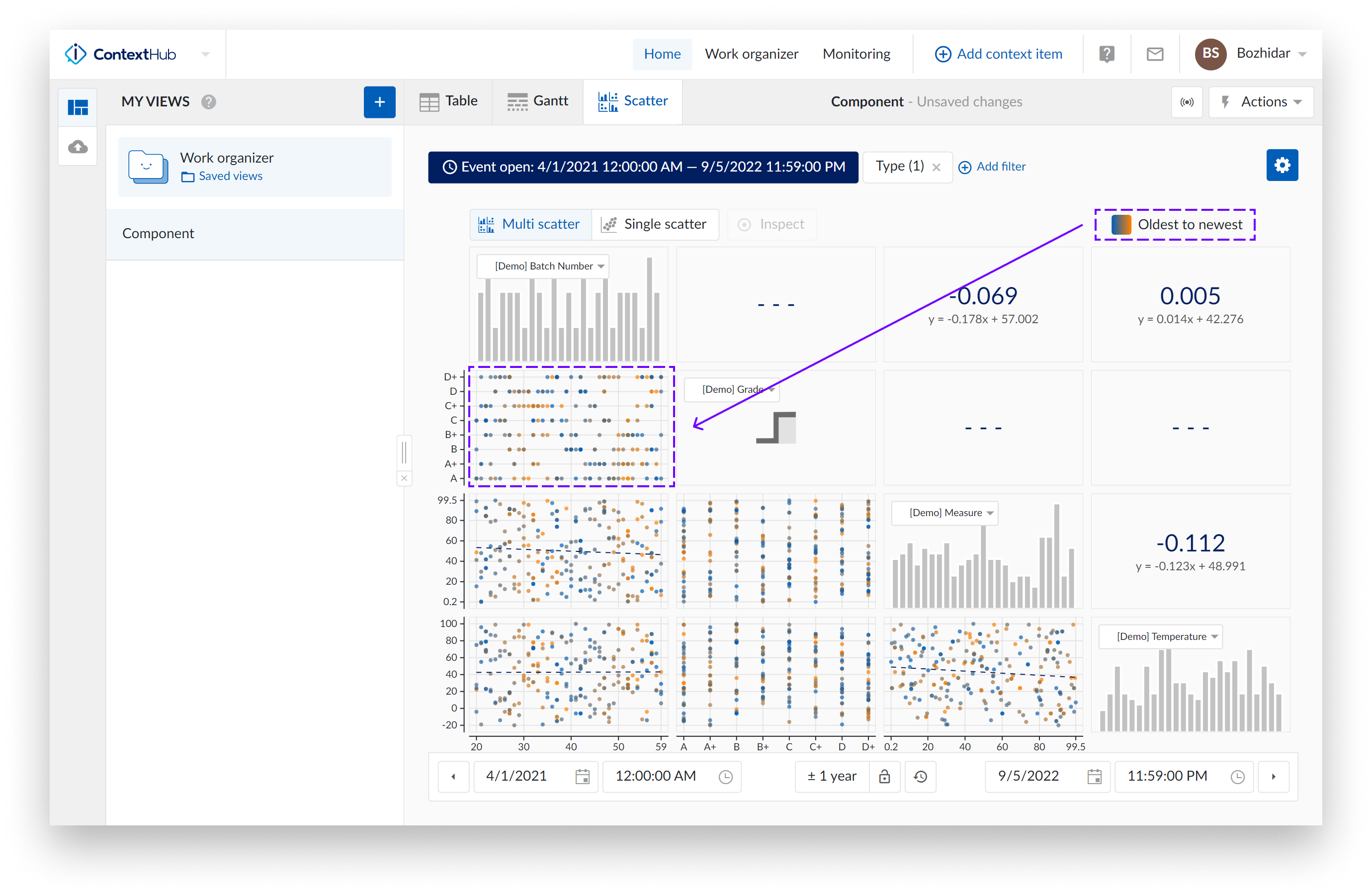
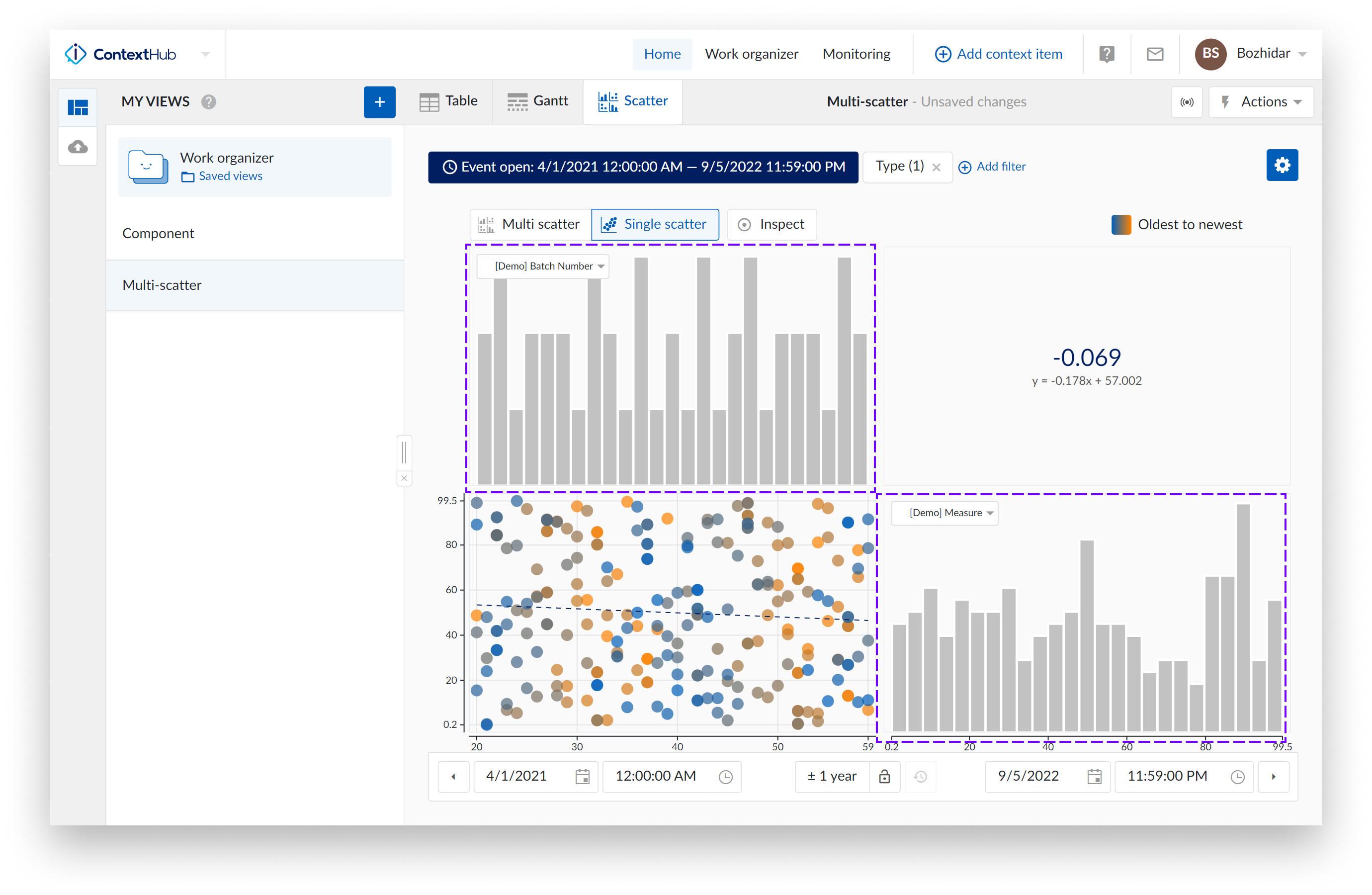
Correlation: When the option "Correlation" is enabled, additional tiles are displayed. These tiles represent the correlation coefficient together with its equation value for a specific scatter plot.
You can view which correlation tile is linked to which scatter plot by hovering over the tiles. The two linked tiles will be highlighted with a blue border.
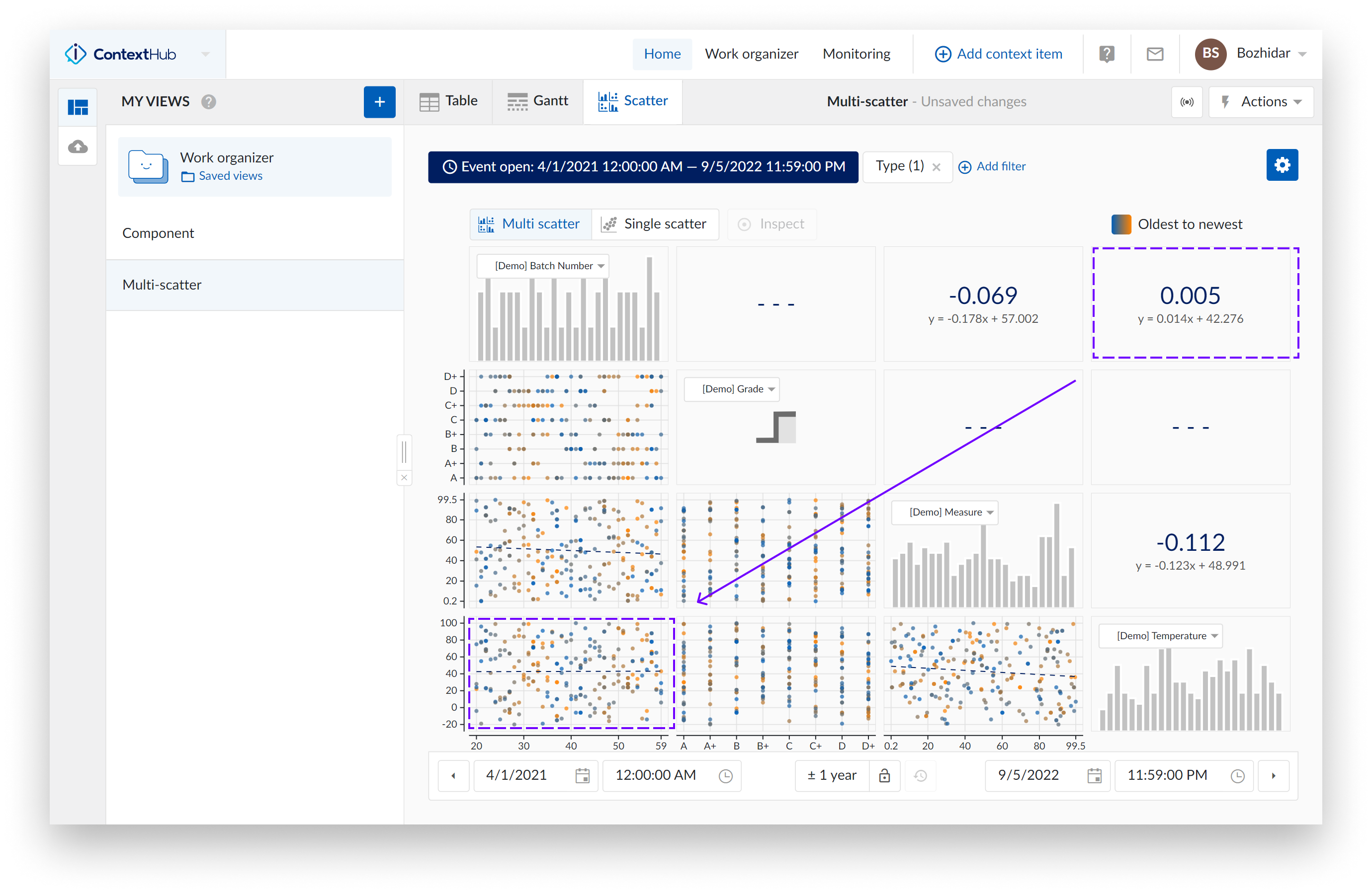
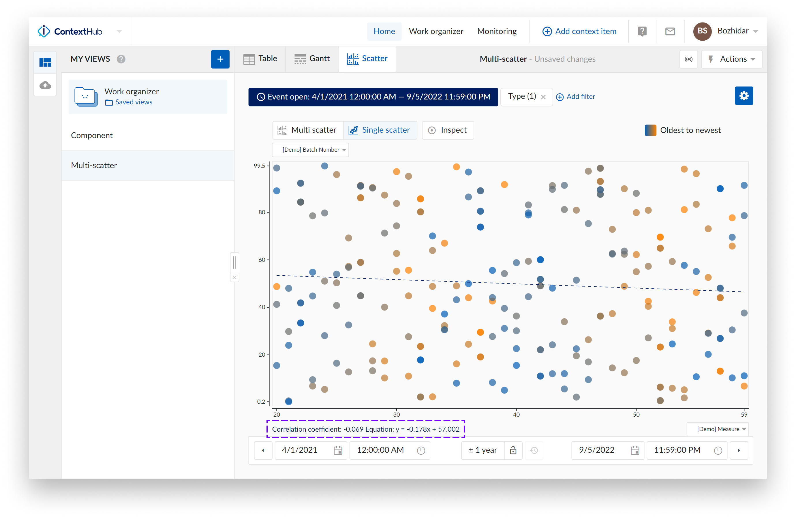
When a single scatter plot without histograms is visualized, the correlation tile is not shown. Instead, you can see the correlation coefficient and its equation value on the bottom left of the chart.
Note
This option is enabled by default.
Grid lines: Once the "Gridlines" option is enabled, gridlines appear, making it easier to read values on the charts.
Note
This option is enabled by default.
Histograms: The "Histograms" option can show or hide histograms.
Note
All the settings of the chart are saved for your user only, and options selected will be saved and reused in the next session.
Important Note: When a colleague opens one of your views, your chart settings will be enabled for their view. Your settings are yours, providing your colleague does not save that view as one of their own.
Time range selection: The time navigation bar at the bottom remains fully functional in the scatter plot mode.
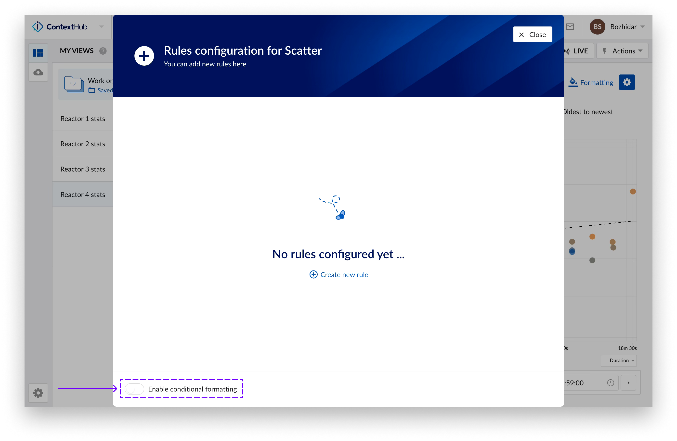
Conditional formatting on the Context Scatter Plot
The conditional formatting feature allows you to format the color and shape of points on the Context Scatter Plot, based on a set of defined rules.
To define and configure rules, click on the formatting button top right, next to the configuration button.
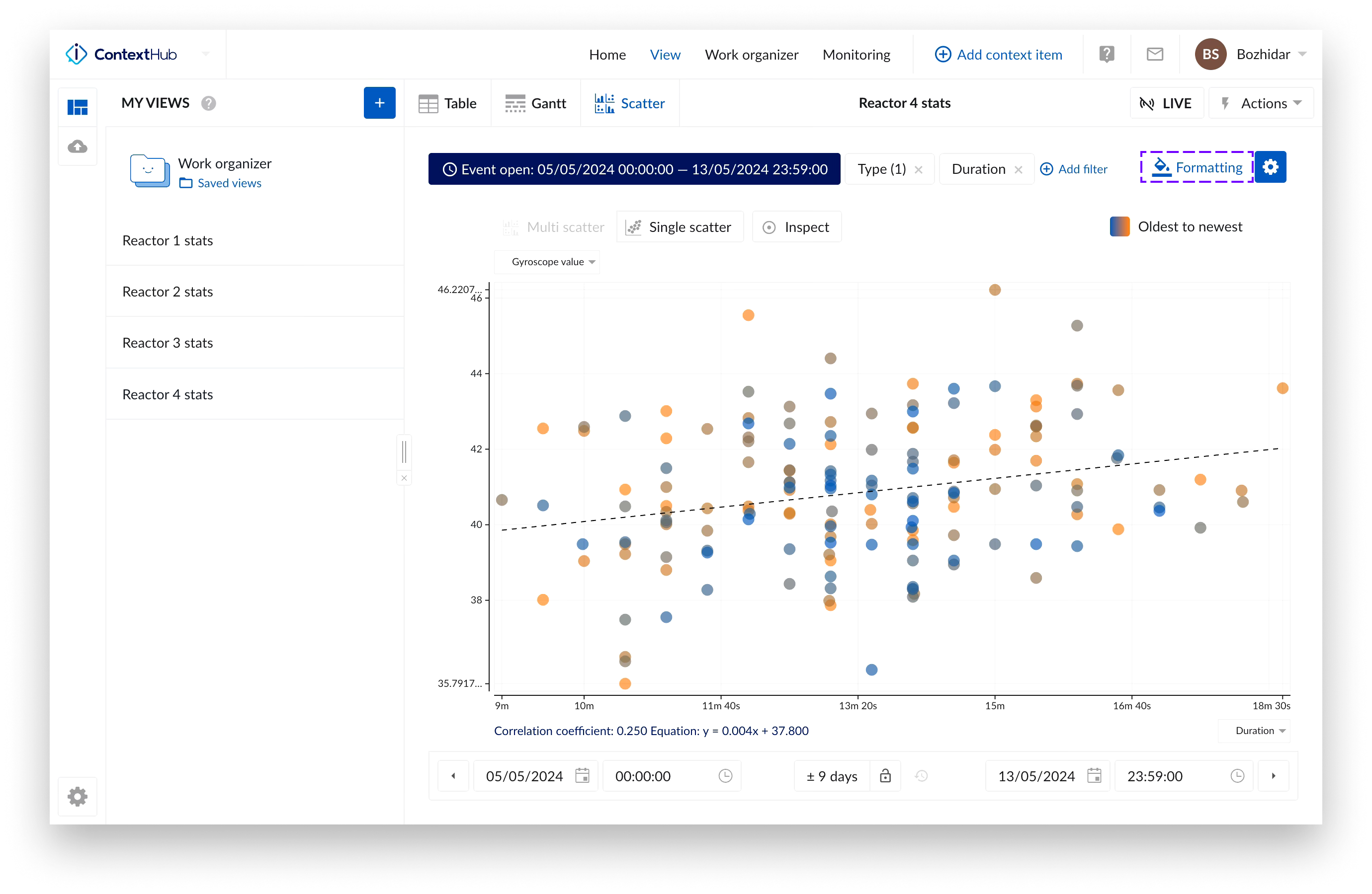
You can enable/disable the conditional formatting on the Context Scatter Plot by toggling the switch located bottom left of the “Formatting” screen or by switching the option in the Context Scatter Plot configuration.
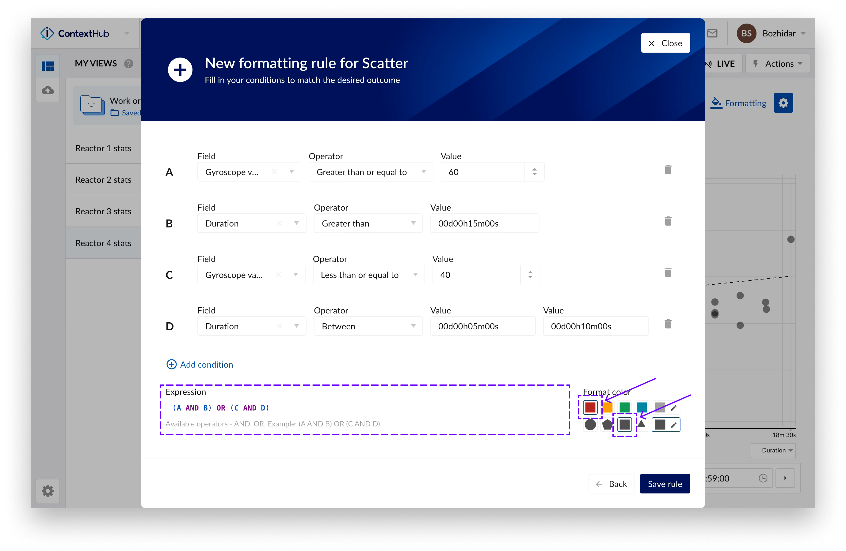
Multiple conditions forming an expression can be defined in a rule. The operators for building the expression are “AND”, “OR” and brackets - “(“, “)”.
Color and shape to mark the data points satisfying the defined rule can also be defined here.
Multiple rules can be configured. The rules can be arranged by drag and drop, so it’s possible to define a rule hierarchy with the topmost rule taking precedence.
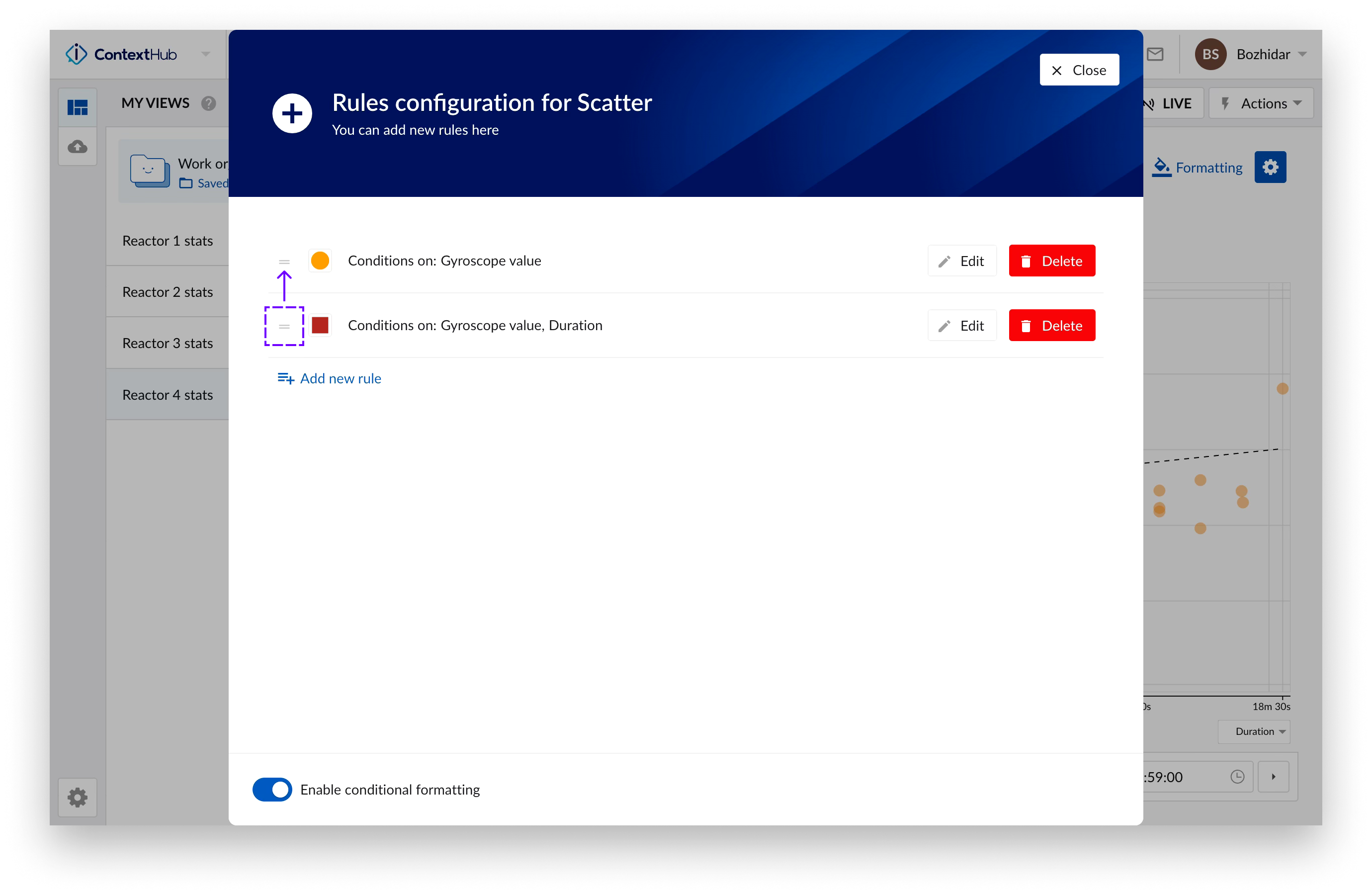
When a data point on the Context Scatter Plot satisfies a rule – its color and shape changes to the color shape defined in the rule.
Note
Conditional formatting does not consider changes incurred during live mode. Refresh the plot for the rules to apply on the newest data.
Note
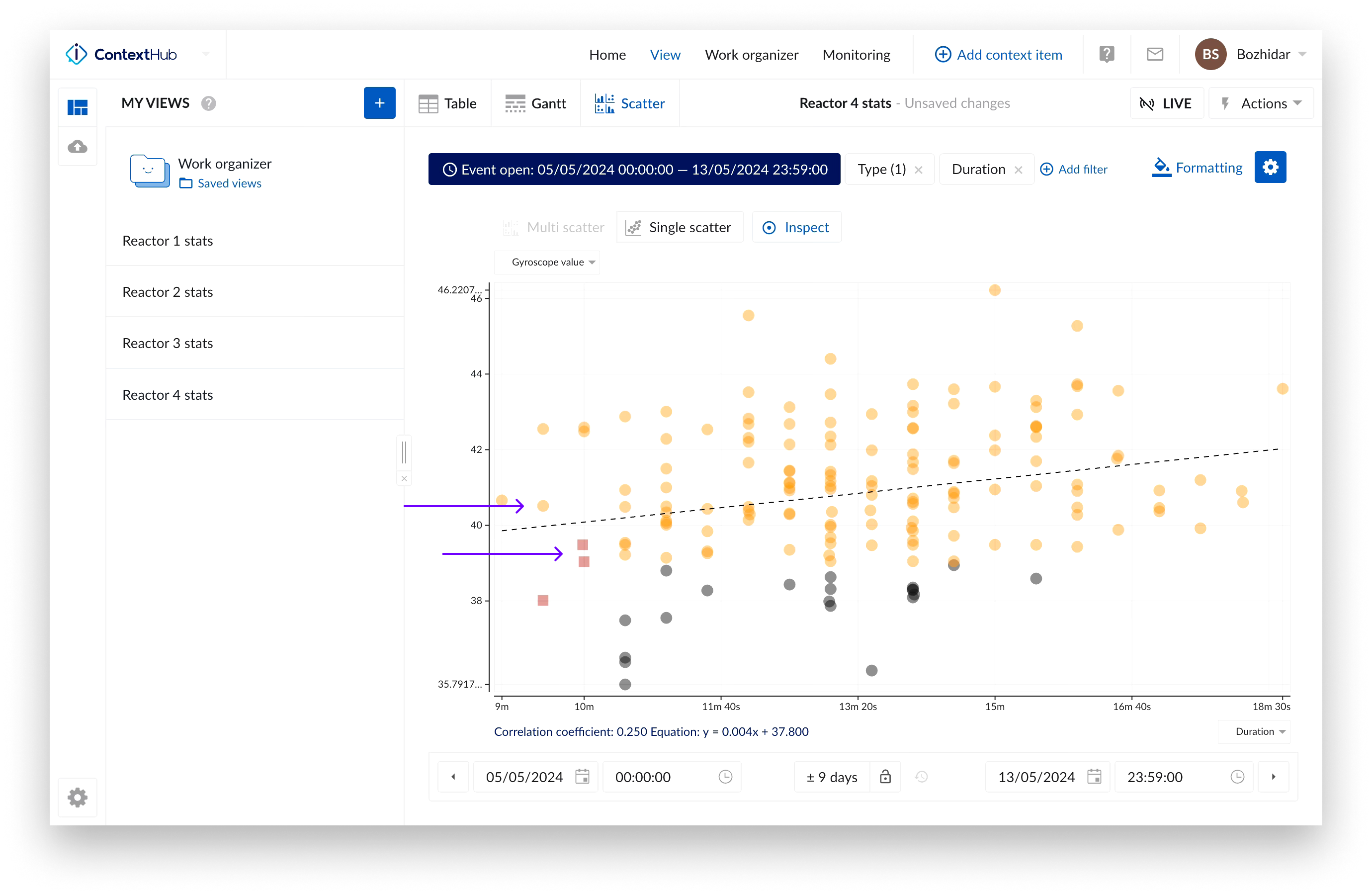
Conditional formatting cannot be used in combination with the “Colored points” option. When conditional formatting is enabled the “Colored points” option will be disabled (and vice versa) and the points on the Context Scatter Plot will change to the default color - gray. The points on the plot will change their color with respect to the defined rules.
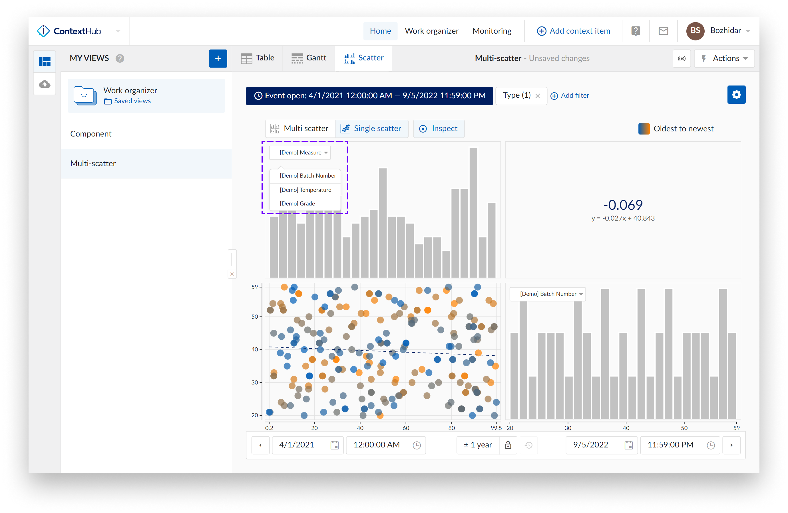
Context Scatter Plot
The following image shows an overview of what the multi-level scatter plot looks like.
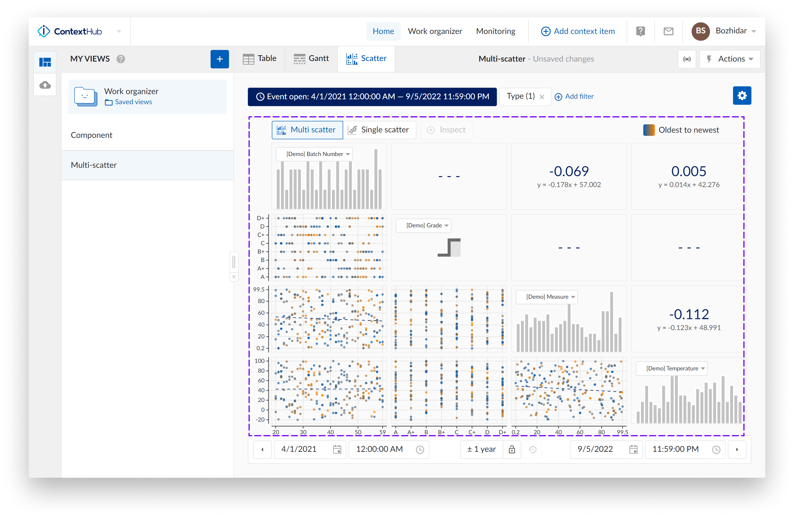
The scatter plots visualize the correlation between the values of two context item type fields.
The histogram plots represent an approximate distribution, in bins, of the numerical data of the visualized values.
Note
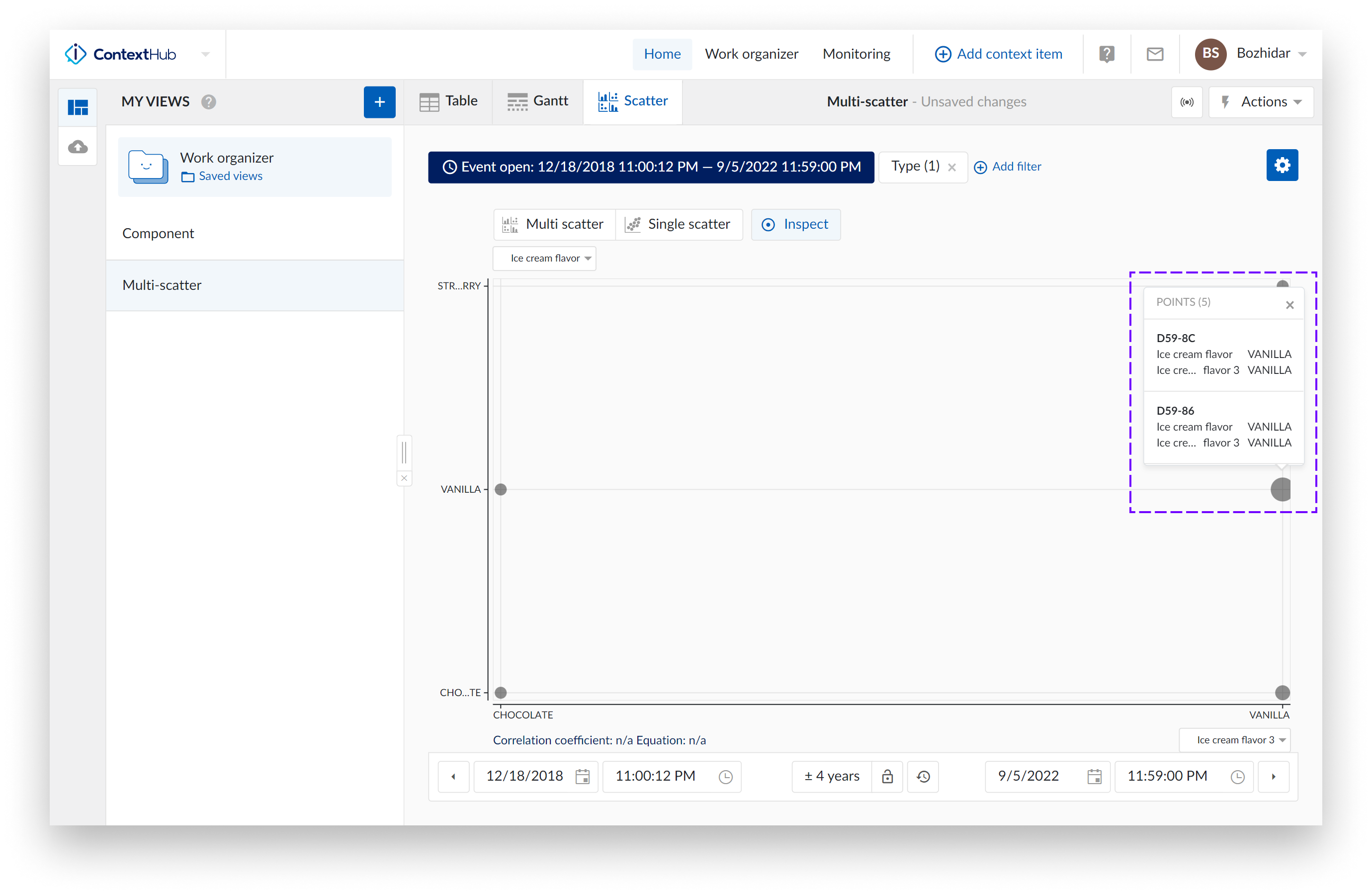
For two dropdown fields the scatter chart will appear as a bubble chart – the bigger the point on the chart, the more data point it contains.
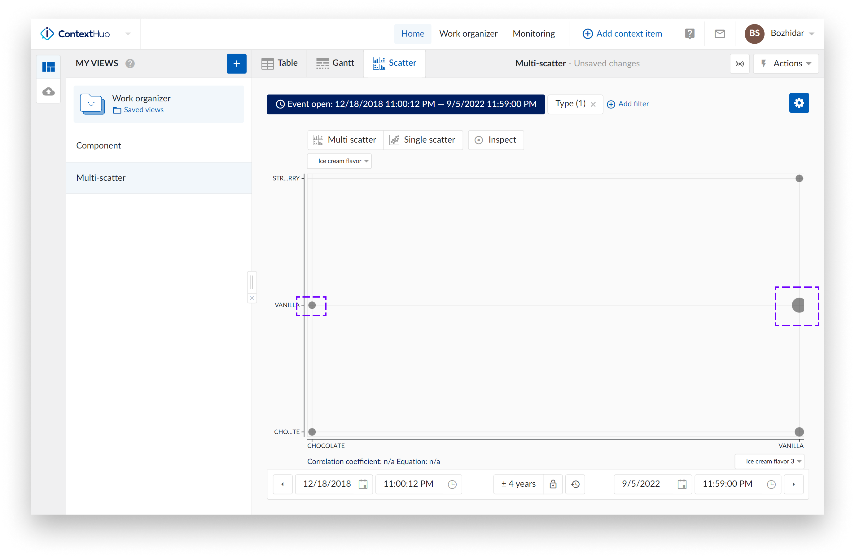
If we inspect both points on the chart, the one on the left highlights one data point:
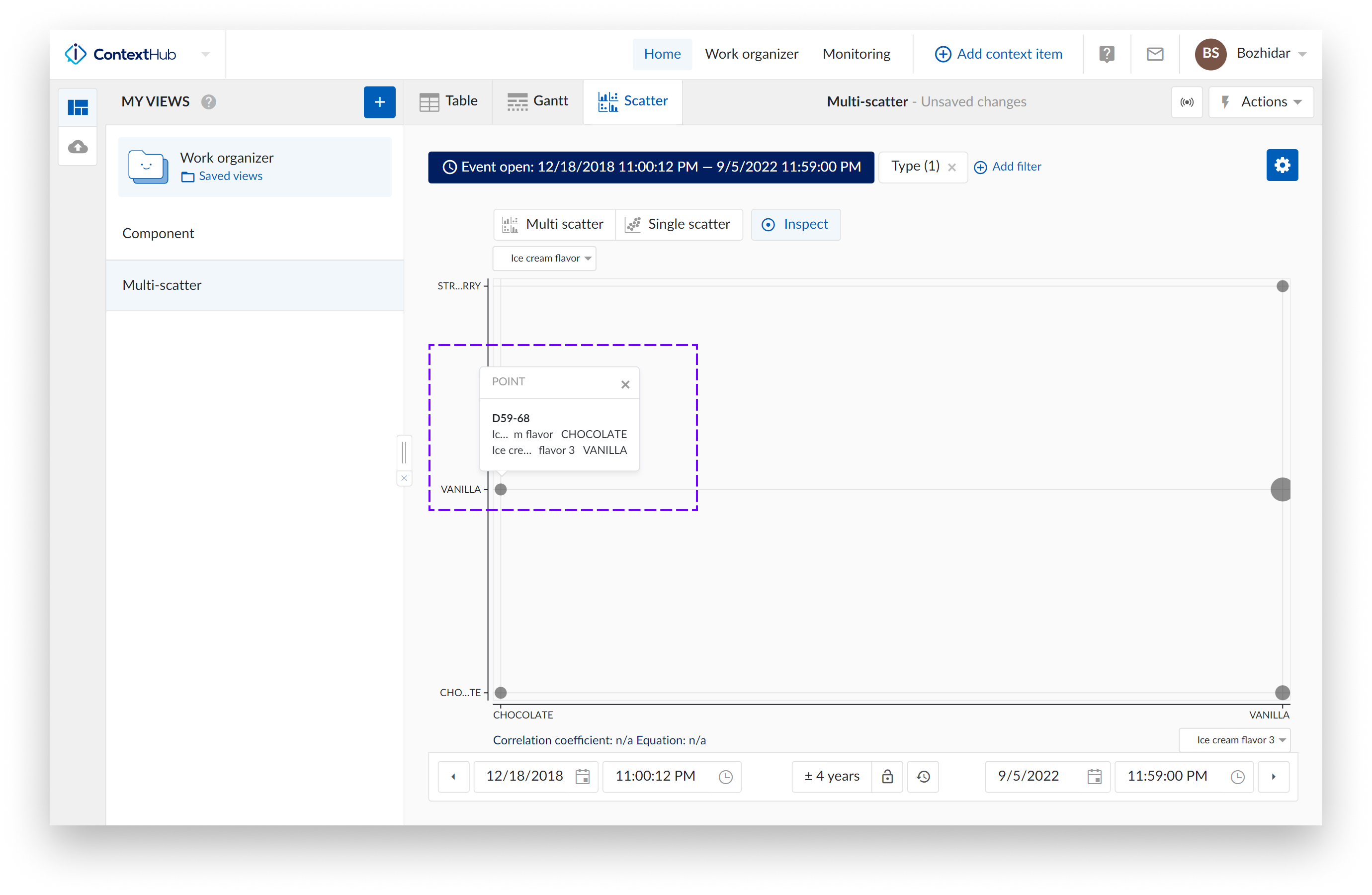
The one on the right would have 5 points:
Note
The scatter plot is currently limited to querying a 1000 context items.
Levels of Scatter Plot visualization
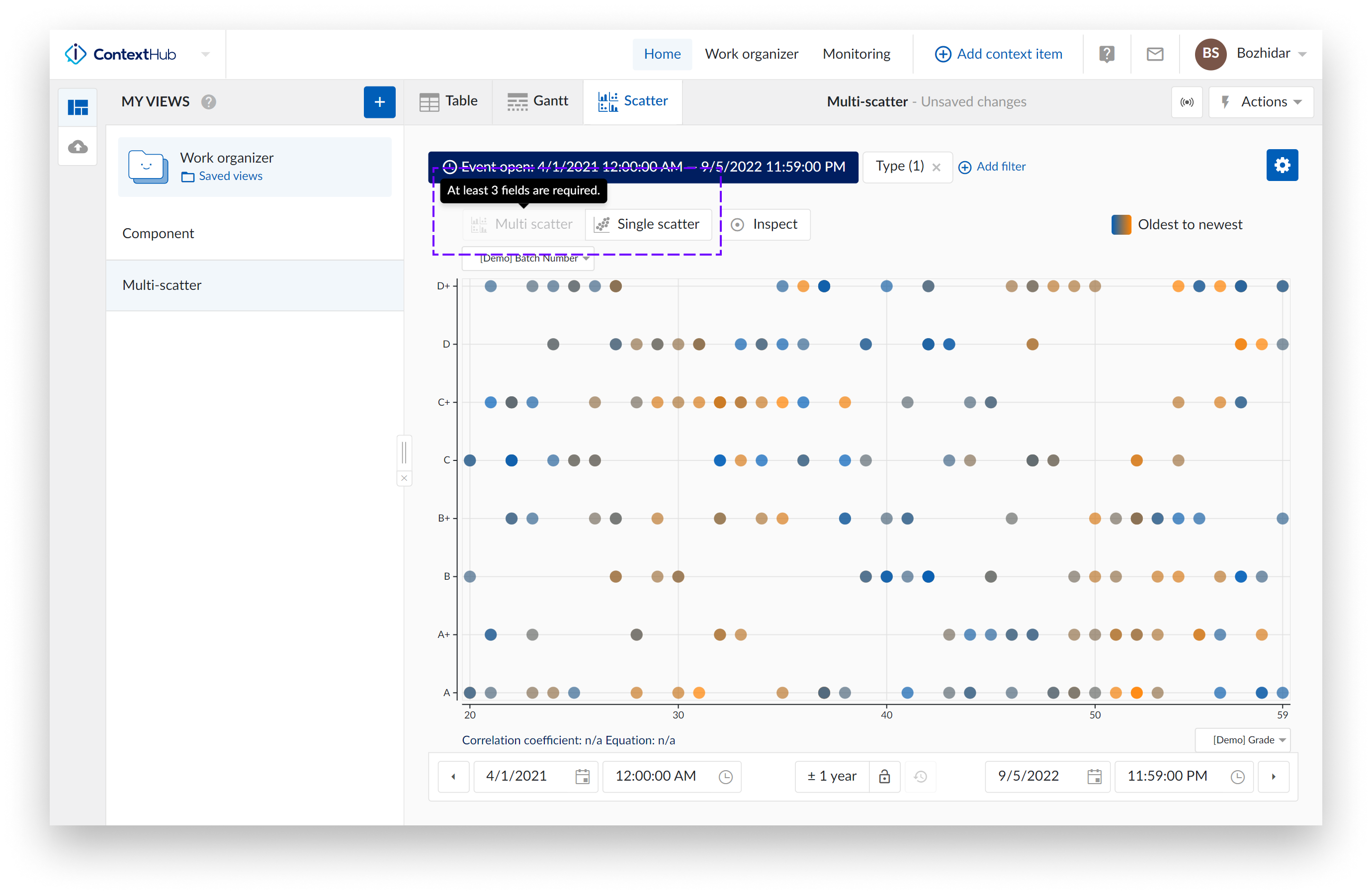
Multiple levels of visualization are possible in the Scatter plot visualization mode. Some 'levels' may be blocked and inaccessible until more data references are added.
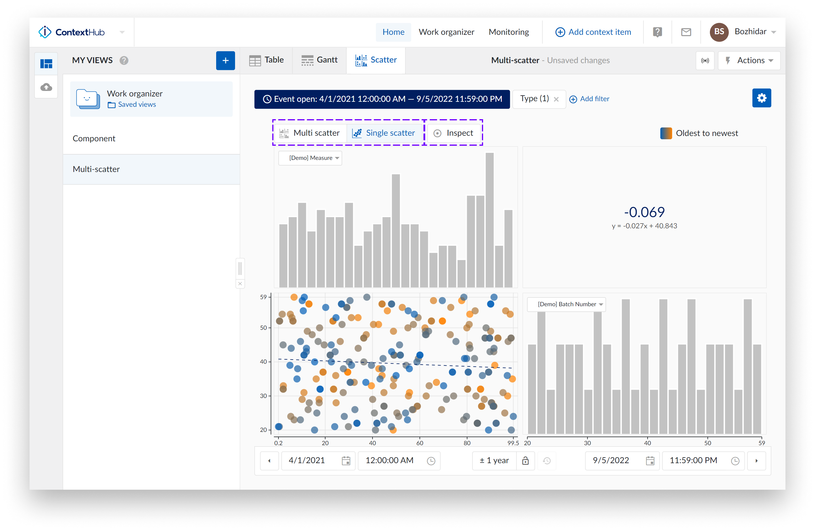
Navigating through the levels can be done by clicking the plots themselves or using the available buttons named "Multi scatter" and "Single scatter" situated at the top of the charting area.
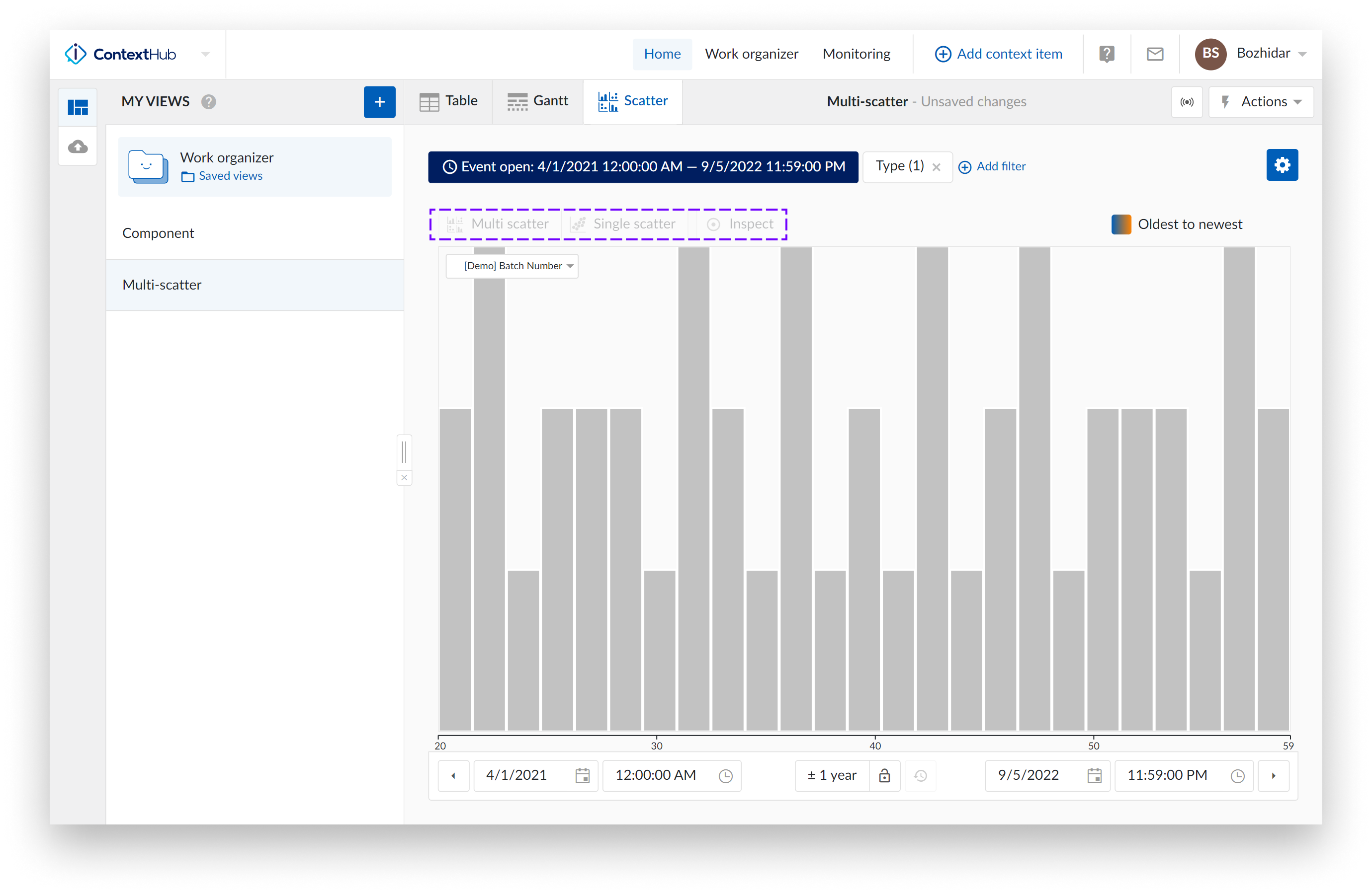
Single histogram plot: When there is only one visible context item type field present, and the scatter plot visualization is selected, a histogram is visualized.
In the following example, only a histogram can be visualized and thus “Multi scatter” and “Single scatter” level buttons are disabled.
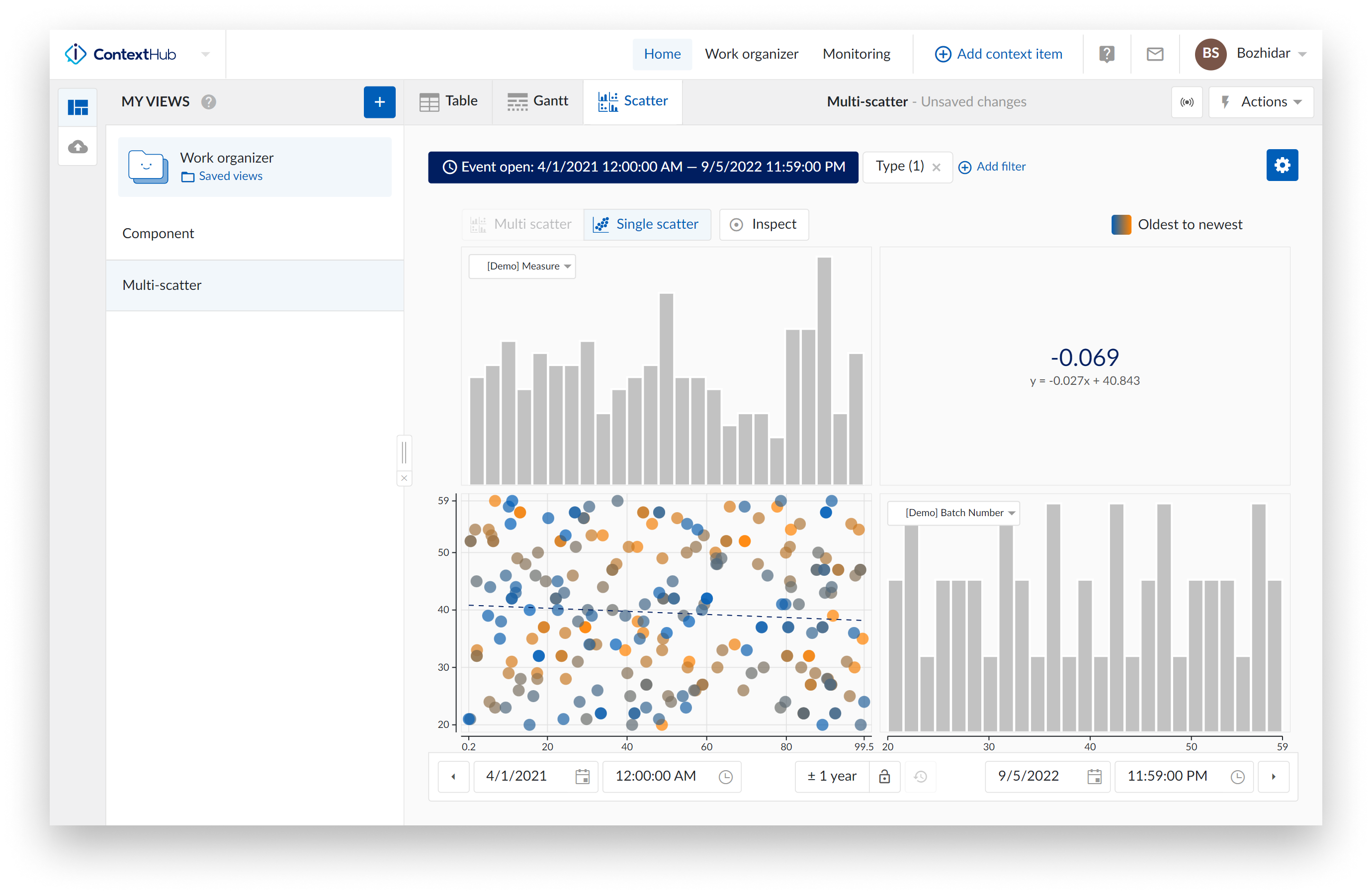
Single scatter plot: When the scatter plot is selected with two visible context item type fields, a single scatter plot with two histograms is visualized.
As an indication, the "Single scatter" navigation button is highlighted when the single level is shown.
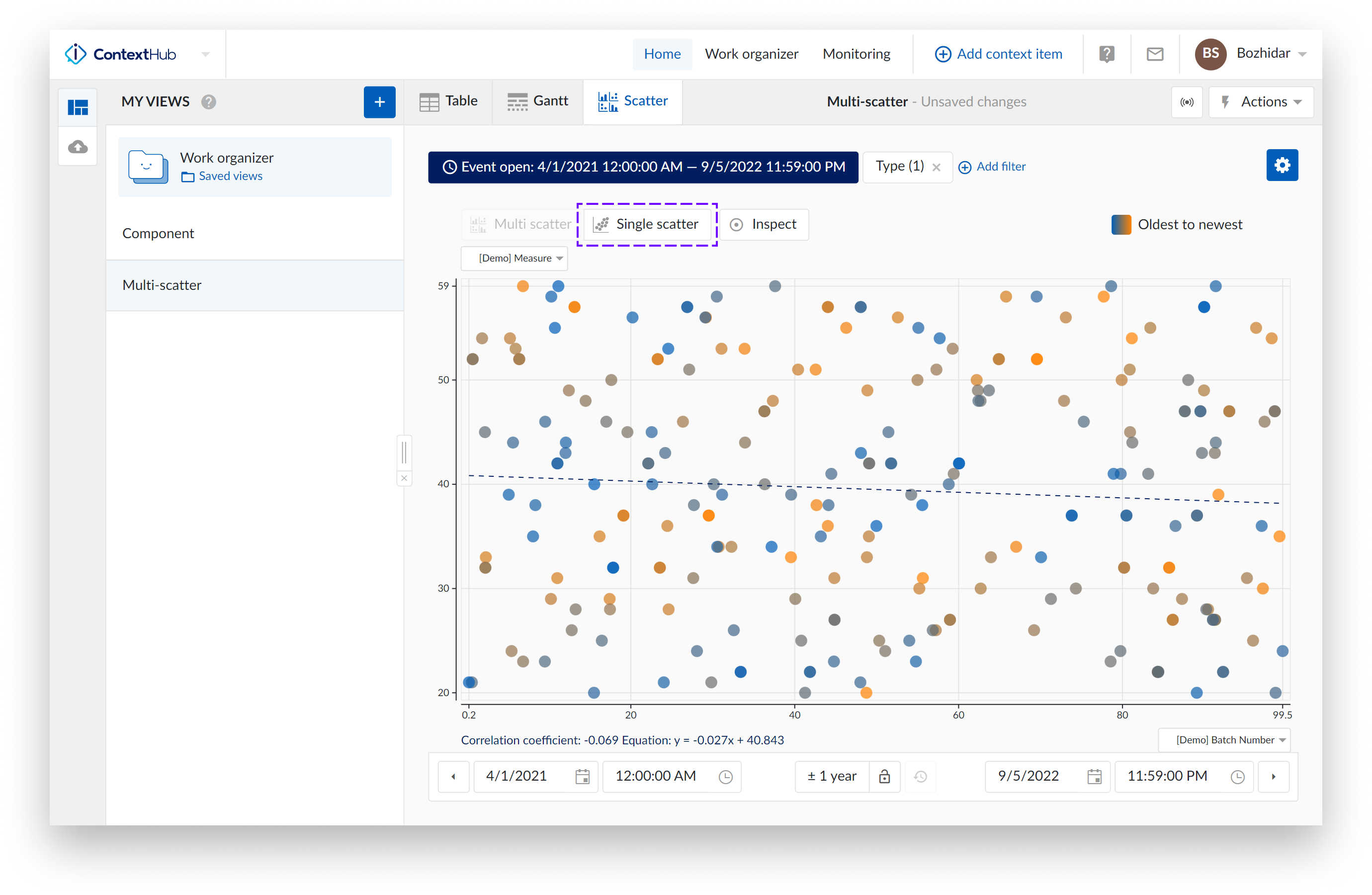
In this case, you can clickthrough to visualize any of the two histograms or to maximize the scatter plot on the charting plot. Returning to the single scatter plot with both histograms is done by clicking the chart level navigation button "Single scatter".
Multi Scatter plot: When three or more context item type fields are selected, a multi-level scatter plot overview would be visualised. As an indication, the "Multi scatter" navigation button is highlighted when the multi-level is shown.
In this overview:
Clicking on a histogram, navigates to a single histogram plot of the corresponding context item type field.
Clicking on a scatter plot navigates to a single scatter plot with the corresponding context item type fields. On this level you can again navigate one level deeper into a single histogram or maximize the scatter plot.
Returning to the other overviews (single or multi-level) is possible by clicking any of the navigation buttons.
Note
A tooltip will be displayed when hovering on a disabled button, to indicate the required actions needed to unlock that button.
Scatter Plot Actions
At the top of the scatter plot multiple actions are available.
Navigation
These buttons are highlighted when you have open one of the scatter view types. Choose between multi scatter overview or single scatter overview.
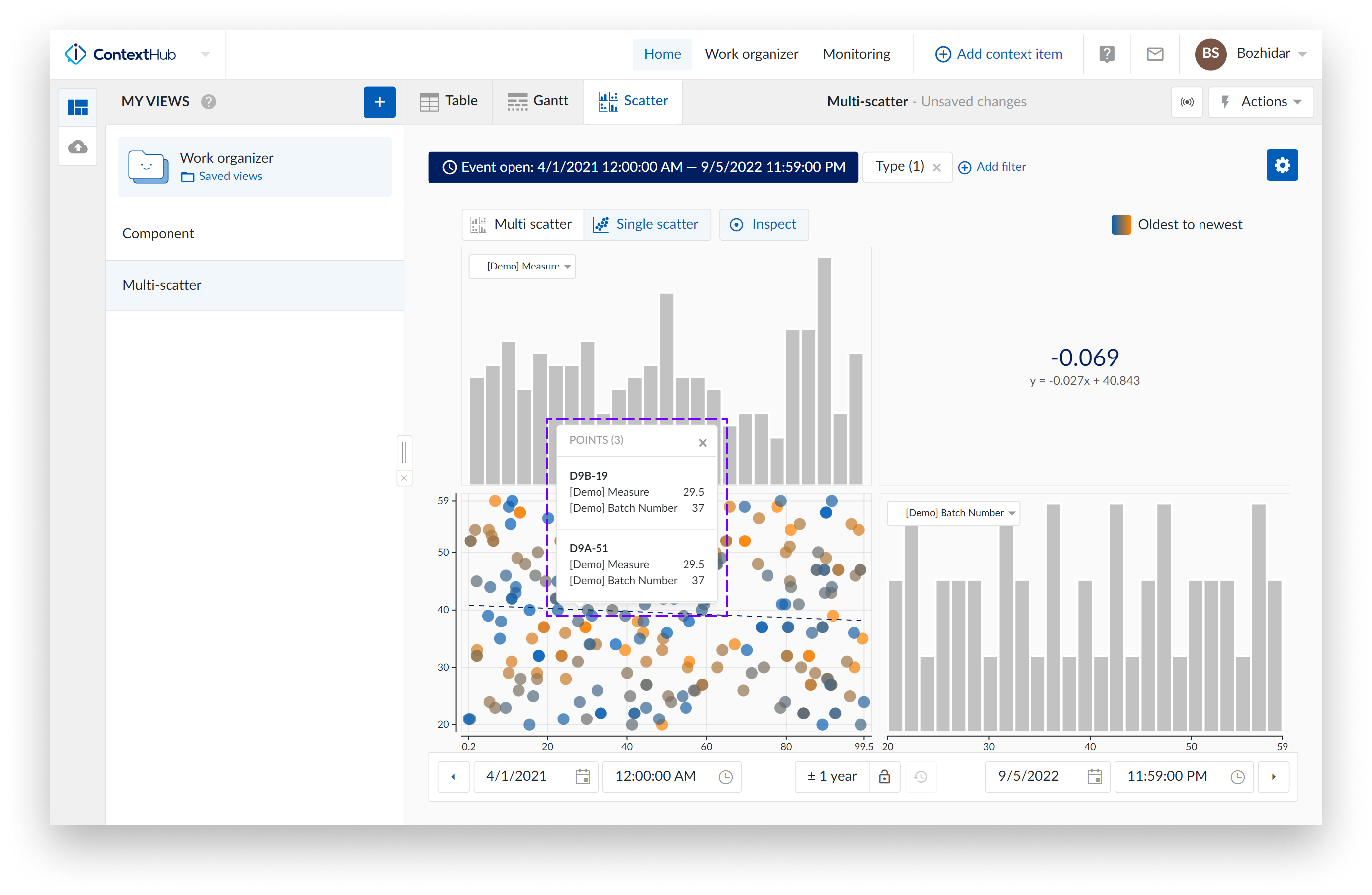
Inspect
Inspect enables you to dive deeper into the details of the visible data points on single scatter plots (with or without histograms).
When this option is enabled, more detail and information is shown. On the single scatter plots, a popup is shown where you can see detailed information about the data point that is being hovered over.
Hovering over several data points will trigger a popup that will contain information, in the form of a scrollable list, that refers to all data points in the area you are hovering over.
Note
You can click the popup to make it sticky. You can close the popup using the small close button, located at the top right corner of the popup or by clicking on another data point (or several data points).
When your single scatter plot also presents two histograms, hover over the bins of the histogram to reveal bin range.
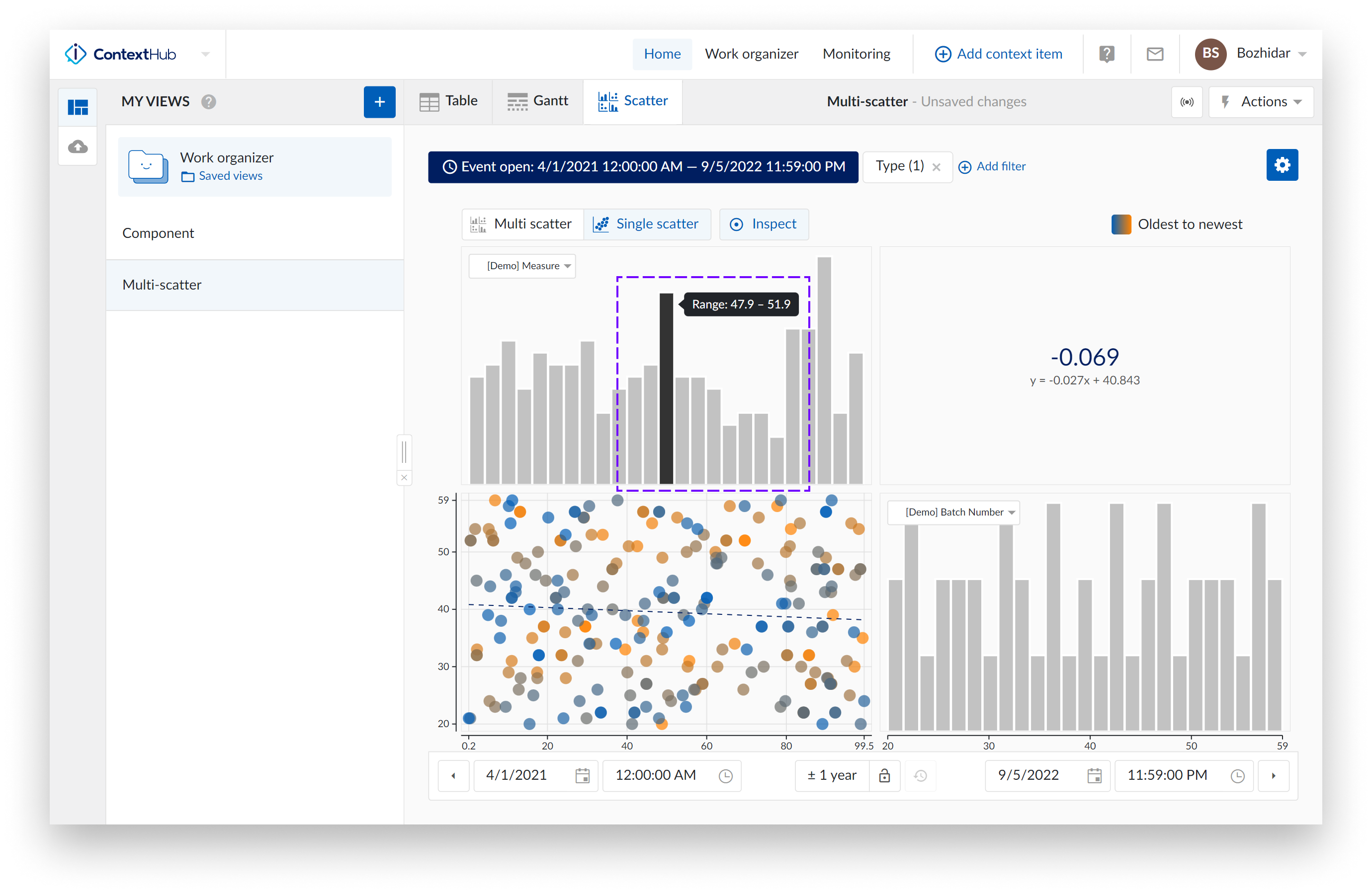
Chart Actions
On the scatter plot update context item type fields using their labels. This comes in handy when you have a single scatter plot, or a fully visualized histogram shown. In these cases, you can simply switch to another context item type field using their label.
Clicking on one of the labels shows you a list of all other visible context item type fields. Selecting one of the other data references in the list will update the current scatter plot or histogram with the data of the newly selected context item type field.